

How to tell real poll movement from noise
Democrats' lead on the House generic ballot "dropped" 1-2 points over the last month. It will likely go back up, but this is a good reminder that even polling averages can fake you out

Strength In Numbers is on a reduced ~1x weekly schedule while I’m on paternity leave. I am very appreciative of the time I’m getting to take with family, and grateful to have this job. Thank you readers!
Later this week I’ll have the results of our monthly June poll with Verasight. This month’s poll covers the generic ballot, Iran-U.S. peace “deal,” updates our annual politician popularity index, and fields several questions direct from subscribers.
A reader named Tyler writes in with a question I’ve received a few times over the last week:
G what’s your take on the generic ballot dropping from +7 to +5 now
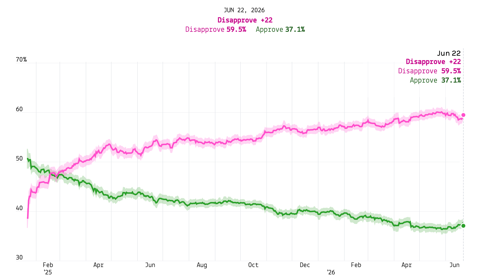
And over on the Strength In Numbers Discord, a couple of readers have asked the same question about Trump’s approval rating ticking up from about 36% to 37% over the last couple of weeks, with his net rating bouncing by 2-3.
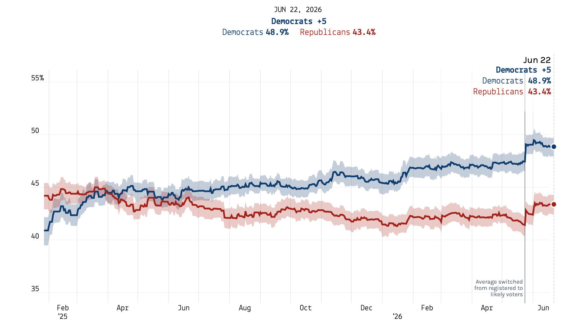
Here are the current generic ballot and Trump approval polling averages at SIN sister site 50+1, where my polling averages are hosted. (You can get to the site very easily by bookmarking it, or by typing “fpo.news” into your browser’s URL bar.)
Generic ballot:
Trump job approval:
Look at those recent mean reversions! People are worrying: have we reached peak Democratic wave? Are the party’s hopes of, for example, taking back the Senate dashed?
The short answer to these questions is no and no. That’s because this particular movement is mostly noisy polling pulling around the polling averages (especially the less methodologically robust ones), and I walk through why below.
But I imagine this question is going to come up again in the long term. It is best to be prepared; If you’re going to watch the polls between now and November — or if this is the type of thing you do as a hobby anyway — you need a way to separate poll movement that matters from movement that doesn’t. So let’s do just that.
In this week’s Deep Dive I take the historical generic ballot polls and show you what level of day-to-day (or week-to-week) noise is typical over the course of a cycle. I then combine the generic ballot with presidential approval polls and other data to build a first-of-its-kind “Cost of Ruling” index for measuring the strength — or, in this case, weakness — of the party in control of the White House.
There’s no perfect way to communicate about polls
Polling averages are a very cool innovation in political journalism, but they are not perfect. The “miracle of aggregation,” as I call it in my book, is not really a miracle (I was being cheeky when I wrote that) so much as an opportune use of statistics and especially marketing: Before the Americans had “polling averages” the British were making “polls of polls” — CNN adopted the practice in the 1990s.
When it comes to the actual math of averages, the good news is that taking the mean of some set of polling data typically offers a better prediction of elections than taking a single poll in isolation. The bad news is the average is only as good as the underlying data and the statistical model used to “average,” or “aggregate,” it — and as good as the journalist presenting it.
This post takes these challenges in reverse order. Start with the journalism of it all — because this is the easiest part of the story. In our 50+1 generic ballot average, the published Democratic margin across polls read about D+7 a couple of weeks ago and reads D+5 today — a paper loss of two points that reader Tyler was asking about. But take the raw numbers for the parties (Democrats at 48.9% and Republicans at 43.4; a change from 49.1 and 42.4 two weeks ago), and the drop is only from D+6.7 to D+5.49 — a drop of about one point, not two.
Unfortunately, this incident of exaggeration is inherent to a tradeoff we made when deciding how to present the data. The general practice in polling analysis is not to show decimals on differences between percentages, because a number like “D+5.4” implies a precision the polls just don’t offer (see: 2024, 2020, 2016, etc). Or, if you’re going to publish decimals, you should include a margin of error either visually it in the text.
The tradeoff is that a small move in the margin between the parties sometimes looks bigger than it is, which is exactly what caught Tyler’s eye here. A 1-point change became 2.
Strip out the rounding, though, and a sliver of real movement is still there. What’s behind that?
Even polling averages can fake you out
Here’s where we get to the data of it all. Part of the 1-point decrease in the Democratic vote margin in the generic ballot is likely real reversion in the party’s vote share, with the average drifting back toward where it was in April and May. And honestly, that’s to be expected, since the party’s lead had been running a little hot during the fallout from Trump’s war against Iran and the ensuing 50% inflation in gas prices.
You can see this reversion across pollsters. YouGov, for example, found the party dipping in its own apples-to-apples comparison. In polling from Echelon Insights, a GOP-aligned firm, the party lost a point as well. There are other examples.
But much of that 1-point decline is likely mechanical — a product of what data is available for the average. Over the last 2 weeks, new polls have tended to come from firms that lean to the right and produce numbers that are typically on the lower end for Democrats — Quantus Insights, McLaughlin & Associates (Trump’s pollster), and Morning Consult are a few examples. The average I publish for 50+1 tries to account for some of this availability bias (see my methodology) but there is only so much you can do if your trend is being bogged down by biased data. The high-quality New York Times/Siena poll that had Democrats up 10 points is now over a month old.
This is a dynamic of poll-aggregation that people often miss or ignore. A smart polling average can remove a lot of noise from polling data, but the tool inherently still wiggles around from sampling error and house effects even when the “truth” of public opinion is stable. A poll of 1,000 people has a margin of error of roughly three points — and you’re blending at best half a dozen of those from the last week, and usually less.
This doesn’t mean polls are useless — they are still the best tool we have for predicting elections, and the only one we have for directly measuring how people feel about public life. But it does mean that averages tend to move around somewhat predictably. So how much movement is worth paying attention to? Let’s boot up the historical polling averages and take a look.
Movement that actually matters
The chart below shows my average of U.S. House generic ballot polls for every election cycle going back to 1998. We published a slightly different version of this at 50+1 last week when we made the case that the Democratic lead was now about as large as in 2018.
The rest of this piece is for paid subscribers. Paying members of Strength In Numbers get every Tuesday’s Deep Dive sent straight to their inbox, access to other premium posts on a 1-2x weekly basis, and early access to data like the new polling index coming below. Their support helps fund my original polling efforts and keeps this newsletter running. If you are not already a paying subscriber to Strength In Numbers, you can become one here.
