


This is a follow-up post to yesterday’s article about the polls in Wisconsin. In that piece, I argue that polling primaries is a big challenge, and distinct from polling general elections – and people need to lower their expectations of accuracy in the primaries to come.
For a follow-up on this follow-up, see this updated analysis: KILL THE VAMPIRES.
The average error of a Senate or governor primary election poll is about 13 points. This is because pollsters have fewer benchmarks for variables that correlate with vote choice in a primary, and because the race can change very quickly late.
As of now, no pollster who was in the field in Wisconsin has published a full retrospective of their numbers based on a reanalysis of their data. In this article, I’m going to do just that.
Last year, a non-profit called State Navigate contracted me to develop a flexible survey weighting program that they could use on any poll of a statewide or state legislative district primary or general election. This program let them adjust the data they got back in their polls to be representative of the population they were trying to sample.
I did not ask for money from State Navigate, but instead to have access to the raw data and to be able to analyze it publicly for posts like these. State Navigate has agreed to let me publish the analysis below. I did not share it with them beforehand. (For what it’s worth, State Navigate was the most accurate pollster in both the Virginia and New Jersey governor elections in 2025.)
Based on the analysis below, I conclude:
Most of the miss in polls in Wisconsin is attributable to faulty demographic targets (too many young people). This inflated Hong’s vote margin by somewhere between 5 and 10 points.
My best guess is that the race moved 6-10 points toward Crowley after pollsters released their final surveys.
Non-ignorable non-response within demographic categories likely further inflated Hong’s vote margin by 2-5 points.
I would usually paywall an analysis like this, but I am releasing it for the public so readers can have better-informed expectations for the accuracy of primary polls in the future.
If you learned something from this, please consider upgrading your subscription to a paid membership to make sure I can continue publishing analysis like this in the future. Paying readers make original data journalism like this possible.
Act now and get 25% off an annual subscription — before prices go up for the election season.
Three types of errors in Wisconsin polling:
State Navigate fielded two polls of the Wisconsin Democratic Primary in late July and the first week of August. The August survey was partially a recontact survey, where respondents from the July poll were asked their vote likelihood and candidate preference again.
State Navigate’s July poll had Francesca Hong at 44% and David Crowley at 15% — a 29-point lead. Their August poll, which finished interviewing on August 6, still had Hong up 44-22. (Five days later, Crowley won, 39.8% to 39.3%.)
A 22-point error on the final published margin is not a normal polling miss, even by the standards of primaries.
One thing I can rule out immediately: this was not a data-processing problem. When I take State Navigate’s raw files and re-weight them to the actual weighting targets they shared with me, I reproduce their published toplines almost exactly (Hong 44.0 / Crowley 23.3 in August, against a published 44 / 24). Instead, the problem is mostly with what the poll weighted to.
I have identified three big problems in this pollster’s data.
1. The actual primary electorate was older and more moderate than pollsters assumed
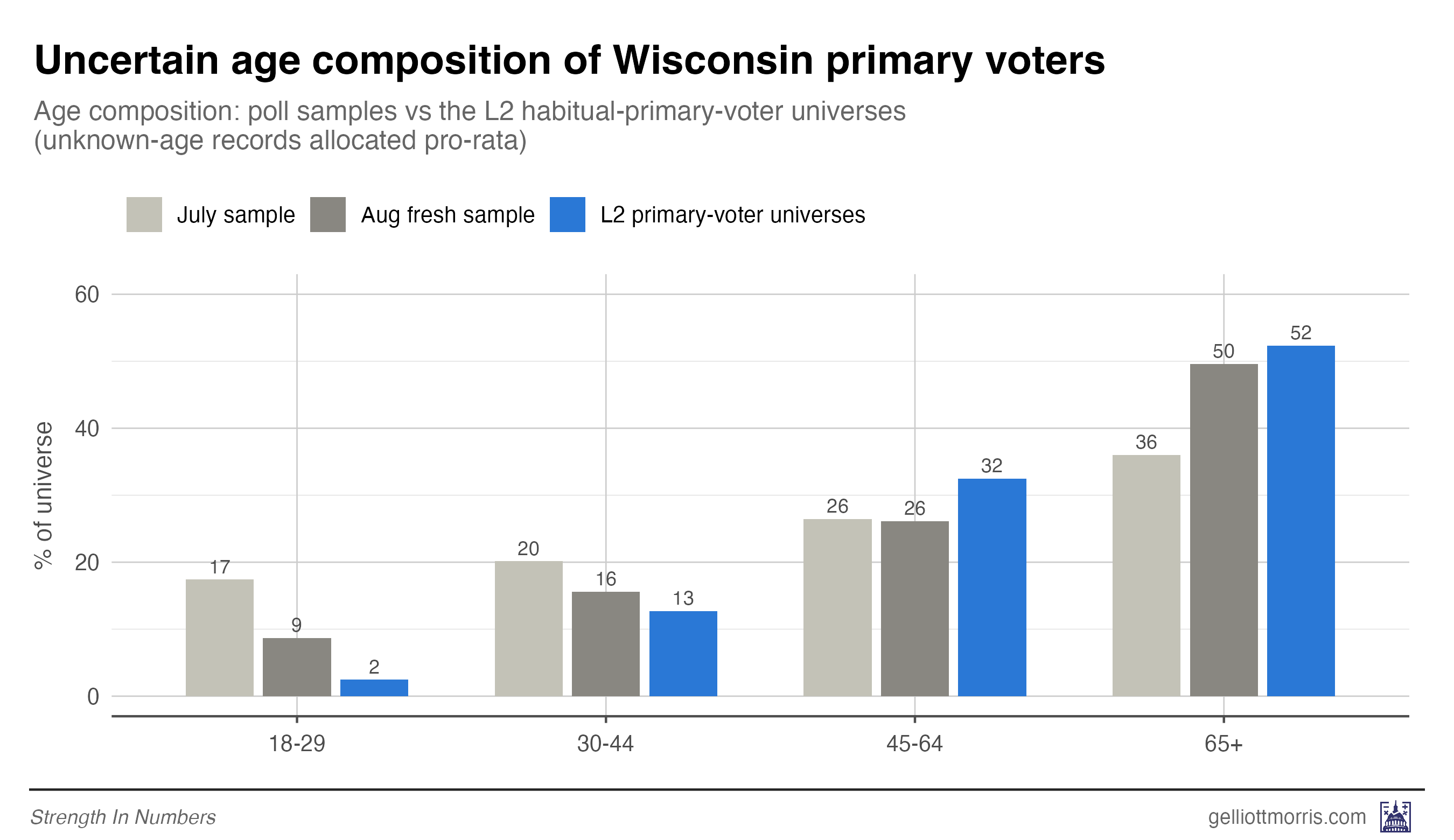
Chaz Nuttycombe, Executive Director of State Navigate, said the demographic benchmarks for his organization’s surveys were generated to be representative of state voters by predicted primary participation. First, he used the state’s voter file to compute demographic breakdowns for the race, education, region, race by region, age, gender, and registration status of participants in past Wisconsin primaries. Then he adjusted those targets based on recent primaries in 2026 and 2025. (This adjustment looks to have increased the percent of young voters in the sample — with 9% 18-29-year-olds in the poll vs 2% in the voter file.)
Other pollsters appear to have produced their primary polls in a two-stage process. First, samples were adjusted by known demographic factors to be representative of the total pool of Wisconsin registered voters. Then, respondents were given the chance to self-select into either voting in the Democratic or Republican primary (or not at all). This means the accuracy of the polls was dependent on getting a representative sample by which party’s primary voters were opting into. It looks like the voters pollsters got, however, were too young and too liberal.
It looks like both of these processes failed to anticipate an older, more moderate primary electorate. Or, at the least, weighting to a slightly older benchmark would have improved performance.
The chart below shows the August State Navigate poll under four different sets of weights, as well as the unweighted breakdown of support for each candidate and the unofficial results of the election:
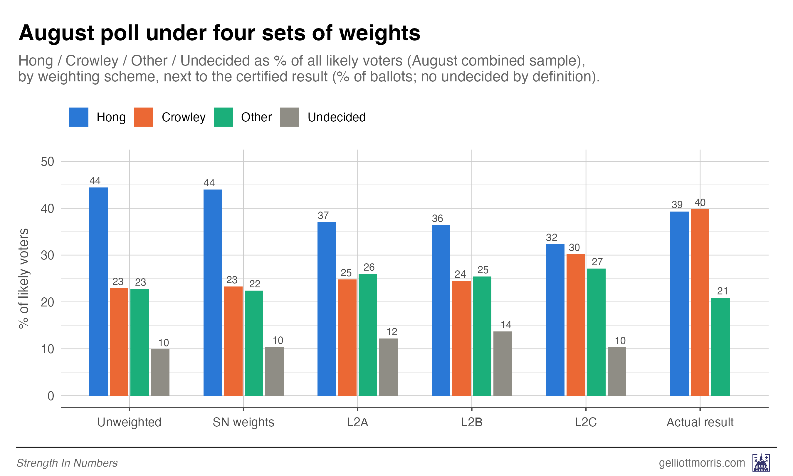
Two things jump out. First, the poll’s published weights are nearly indistinguishable from applying no weights at all. That’s not because State Navigate failed to hit their targets, but because their sample already looked like their targets on age, gender, race, education, and region — so the weights had almost nothing to do.
The problem is that the targets from State Navigate themselves described a much younger electorate than the one that shows up to a low-turnout August primary — which looks like the small, old, habitual-voting slice of the state’s registered voters.
To check the impact of weighting decisions, I pulled two different pictures of the Wisconsin electorate from the L2 voter file. One universe consisted of of Democrats and nonpartisans who have voted in at least 11% of the even-year primaries they were eligible for. The other was built by taking the L2 list of active voters who cast a ballot in at least one Democratic primary since 2016. The two universes agree with each other almost exactly, which should give us some confidence in the targets being used. Among voters with a known age, both say the primary electorate is about 52-53% seniors and 2-3% under 30.
The poll samples were nowhere near that. The July sample was 36% seniors and 17% under 30 — roughly half as old and eight times as young as the electorate it was trying to measure.
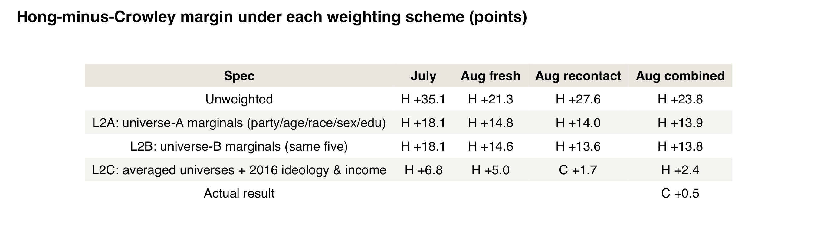
When I re-weight the polls to the L2 universes (weighting by party, age, race, sex and education, all from the voter file), the August margin error drops from 24 points to about 14. These results are shown in the table below as L2A and L2B for the two universes.
Pollster performance may have been improved further by weighting on ideology. State Navigate’s published toplines showed 17% of respondents identified as Democratic Socialists, for example, and 43% additionally called themselves Progressive, Very Progressive, or Extremely Progressive:
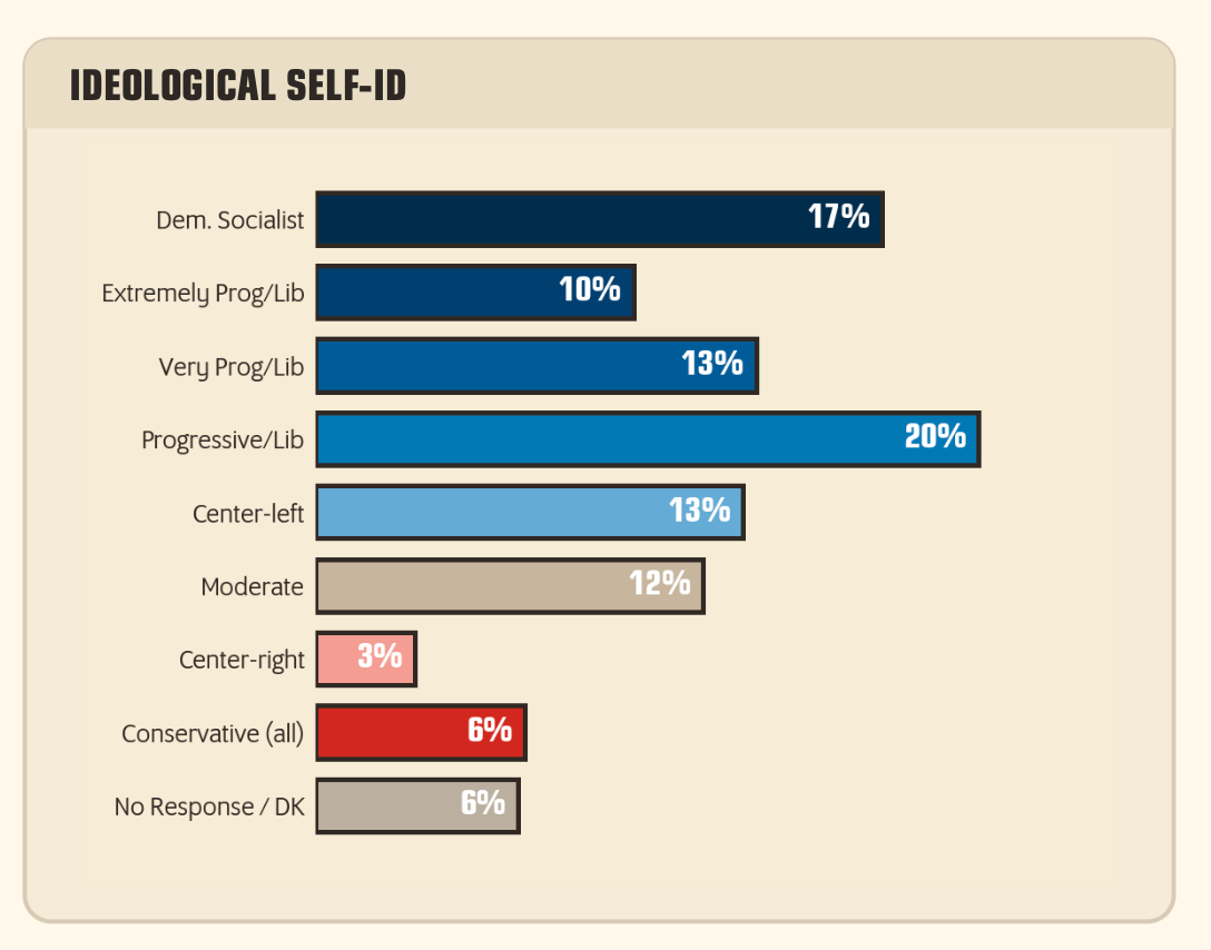
Even after pinning age, race, sex, education, and party to the voter file via our L2A or L2B weights, the weighted sample still self-identifies as about 38% “very liberal.” I don’t have a gold-standard benchmark for what that number should be (nobody does, which is the whole problem) but when I pin it to the ideological profile of 2016 primary voters (25% very liberal — per an exit poll, so your mileage may vary), the error on vote margin collapses.
Of course, official population benchmarks for ideology do not exist, so weighting by ideology adds some researcher degrees of freedom into the pipeline. But if one does not want to weight final estimates by ideology, they could create a set of several different poll toplines assuming different ideological makeups from past exits, primaries, etc. This at least gives readers something to bite into in understanding how assumptions in the poll impact accuracy. But it is understandable that a pollster would not want to be perceived as putting their thumb on the scale and weighting a survey on an attitudinal variable without a population benchmark.
Adding targets for income brings the error to about 3 points. The recontact portion of the August sample under that final weighting scheme actually had Crowley ahead.
2. There was a lot of late movement toward Crowley
Because part of the August State Navigate poll was a recontact survey, I calculated how voters interviewed in July who said they were undecided, or supported a candidate that then dropped out, said they were voting in August. I estimate Crowley was gaining about two-thirds of a point a day in the final weeks of the race — a number that could’ve been higher on the final election weekend, and likely tipped the scale.
The recontact design is frankly the coolest thing about what State Navigate did in Wisconsin this year. The August poll re-interviewed 633 of the July respondents, which I can match across polls person-by-person using a standardized ID from the voter file. That lets us watch individual voters change their minds — which they did.
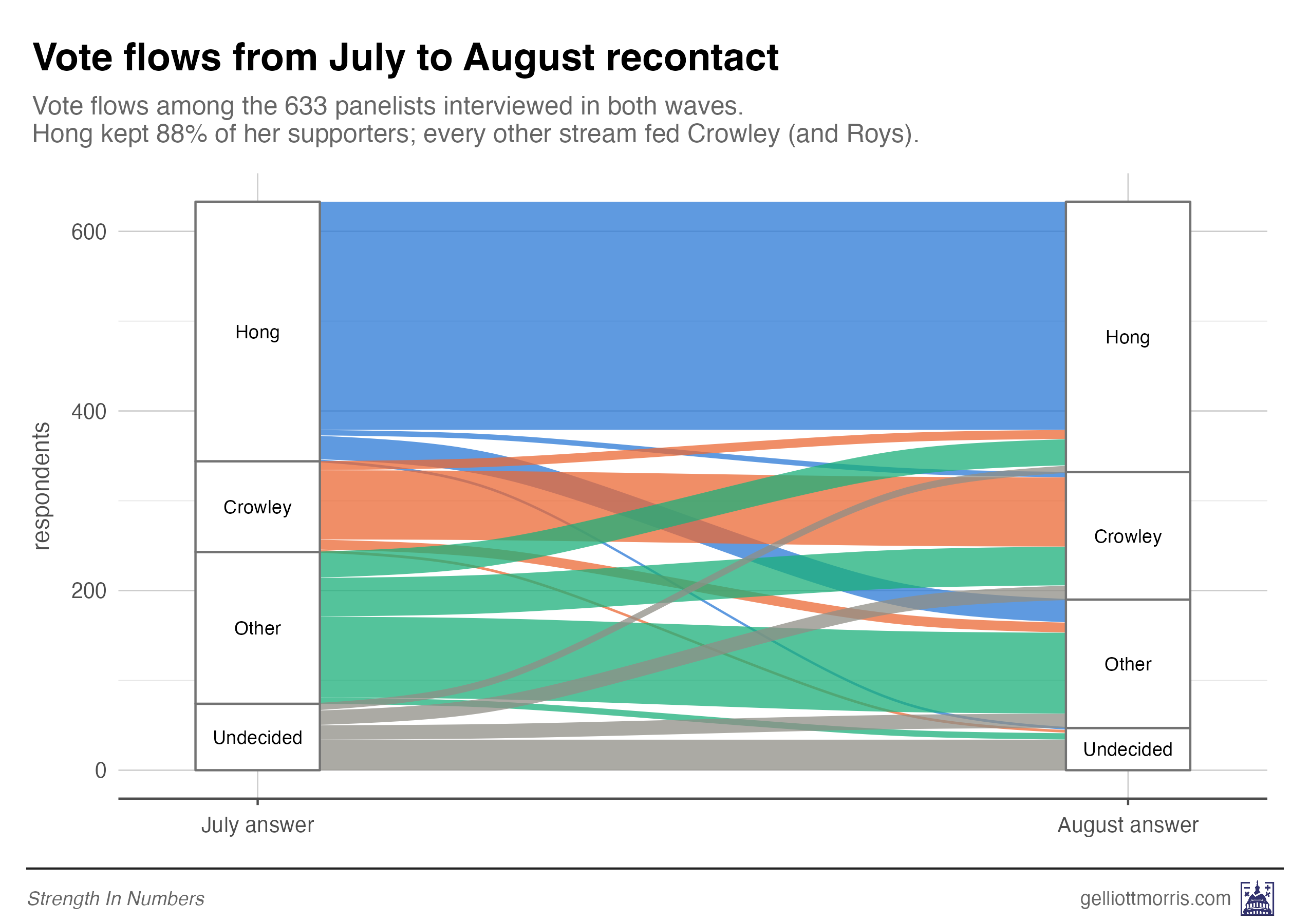
Among 633 recontacts, the Hong-Crowley margin fell about 7 points in ten days, from +33.6 in State Navigate’s July interviews to +27.1 in their August ones. And that was still five days before voting day.
Where was Crowley’s growth coming from? Basically everywhere. Mandela Barnes withdrew between the two waves, and his voters in the panel went to Crowley 25% to 19% for Hong (another 14% went to Kelda Roys). Undecideds who made up their minds broke 40% Crowley, 40% other candidates, and just 20% Hong. And nearly half of them were still undecided on August 6 — providing for a mass of anti-Hong votes to flow Crowley’s way by Tuesday, August 11.
If you remove undecided voters from the survey, you can see this consolidation at work. Hong’s weighted share was within about 3 points of her actual result. Crowley’s was 6 short — and Kelda Roys was 6.6 too high and Joel Brennan 4.1 too high. The moderate lane hadn’t finished consolidating when the poll stopped calling. It finished on Election Day.
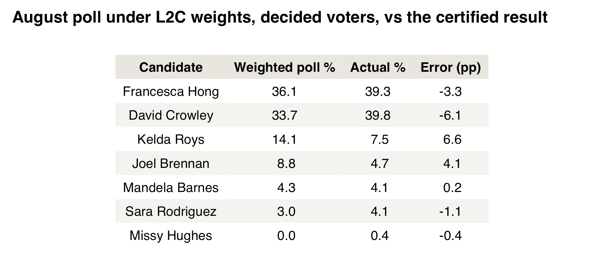
Because we have the polling microdata, we can go one step further: What if we take all the undecideds in the August poll, and then allocate them to remaining candidates based on the vote flows of respondents who were undecided in July but had decided by August?
Warning: small sample size! Among the 633 recontacted panelists, 40 were undecided in July but had picked a candidate by August. Those respondents broke 40% for Crowley, 20% for Hong, 20% for Roys, 17.5% for Brennan, and one respondent for Hughes. Apply that same break to the 10% of the weighted August poll that was still undecided, and the race becomes a dead heat: Hong 34.4, Crowley 34.3 — a 0.1-point margin, against an actual margin of 0.5. In other words, the L2C weights plus a realistic undecided allocation reproduce the closeness of the race almost exactly.
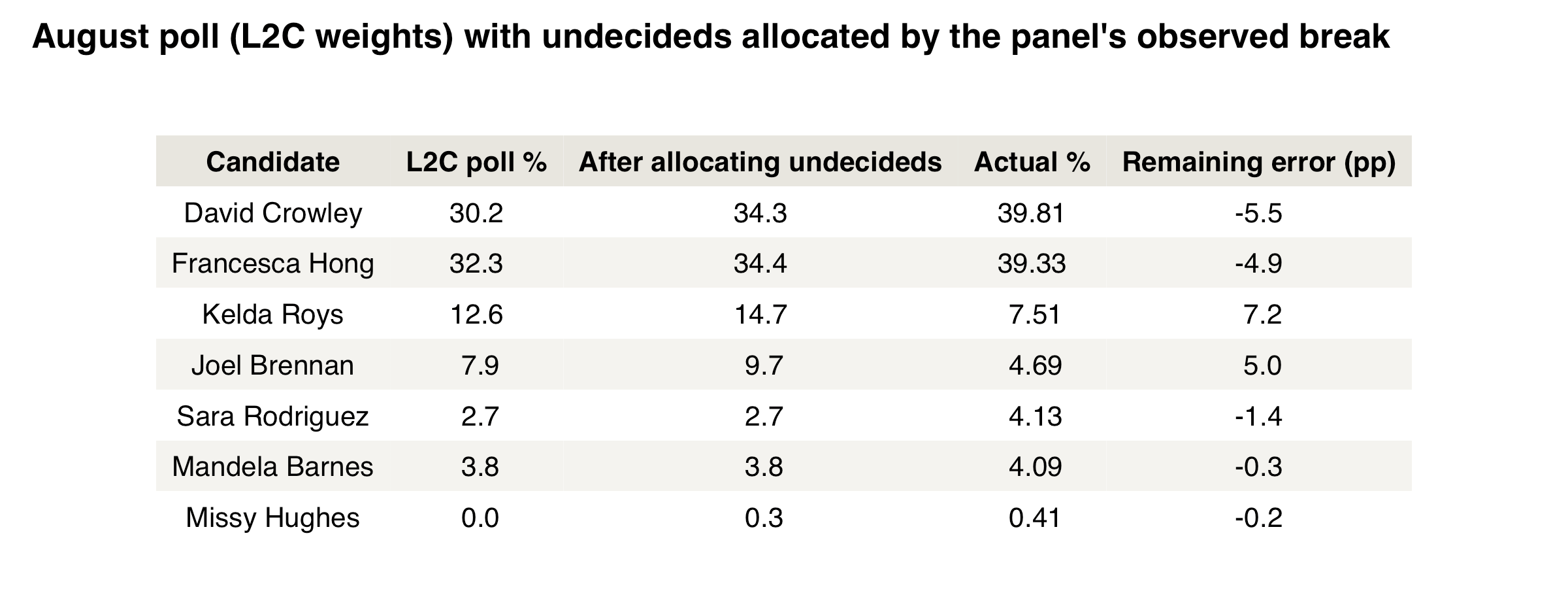
Yet even after allocating undecideds, Both frontrunners remain about 5 points below their actual vote shares, because Roys (+7) and Brennan (+5) are still holding a lot of votes that flowed away in the final days.
3. There is mixed evidence of higher survey non-response among more moderate Democrats.
In 2016 and 2024, polls overestimated support for Democrats even if a pollster accounted for party, past vote, demographics, and geography in their samples. That is, the types of Democrats and Republicans answering polls were unrepresentative of those who turned out on election day. Or, put the other way, the Americans who refused to answer polls were more pro-Trump, conditional on every demographic and political factor, than respondents to polls.
The evidence below suggests non-responders to primary polls were pro-Hong by about 2 points on vote margin vs Crowley. (That’s not so bad for a primary.)
There are a few different ways to try to measure non-response. To start with the easier one: First, I took the August poll with State Navigate’s weights and added one more weighting variable: the election result itself. In effect, I forced the poll to “predict” the outcome perfectly, and then looked at what that did to its demographics.
Not much changed. Seniors rose from 43% to 46% of the weighted sample; self-described “very liberal” voters fell from 41% to 36%.
This suggests the non-response (and late movement) favoring Hong was within demographic cells. If the poll’s error had mostly come from interviewing the wrong demographic mix, forcing the poll to match the results of the race would have reshaped the sample dramatically. Instead, matching the result required upweighting Crowley voters within every demographic group. The older and more moderate voters who did take the poll were still more Hong-friendly than the older and more moderate voters who actually showed up.
Second, we can look at the recontacts and see if Hong’s supporters were more likely to answer the poll.
Among July’s 1,284 unique respondents, 51.2% of Hong’s supporters completed an interview in the August recontact — as did 51.2% of Crowley’s. No evidence here of Hong supporters being more likely to take surveys, at least IF you already condition on taking the first survey.
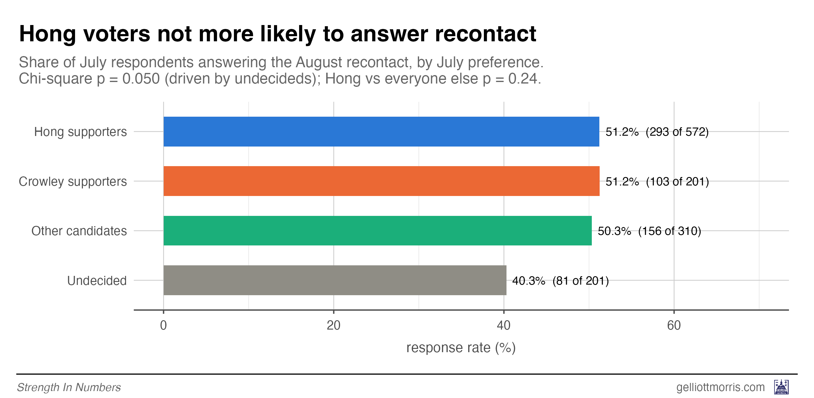
But that’s a really big if! Even if Crowley supporters were just as likely as Hong supporters to respond to a poll a second time, that doesn’t mean they were just as likely to get on the horn the first time.
For that, we need a much more sophisticated analytical strategy. (Alert, it’s about to get really nerdy.)
3b. Detecting potential non-response bias ahead of time
And thus enters the “measure of unadjusted bias for proportions,” or MUBP. In a 2019 paper published in the Journal of the Royal Statistical Society, Rebecca Andridge, Brady T. West, Rod Little and co-authors propose a method for (1) combining everything observable about a respondent — demographic, geographic, and political traits — into a single score and measuring how well it predicts the survey outcome (in this case, a vote for Hong, Crowley, etc.), and (2) projecting what the true electorate-wide number would be if people’s decision to take the poll depended not just on those observable traits, but partly on their vote itself (eg, Hong voters being more eager to answer a poll about the race). Dialing that assumption up from “not at all” to “entirely” traces out the range of results different amounts of non-response bias could produce.
The MUBP, in other words, is a stress test for non-response bias. It works in four steps:
First, I take everything we record in the poll about each respondent — their age, race, education, income, party, ideology, region, how likely they say they are to vote etc — and boil that down to one number: a score that predicts how likely they are to vote for Francesca Hong v David Crowley. This score is produced by a statistical model called a regularized elastic-net regression, which is trained in such a way as to not overfit the data. In our poll, this score is strongly (but not perfectly!) predictive — it correlates with actual vote choice at about 0.6 — meaning most but not all of what makes someone a Hong voter is visible to a pollster.
Second, we take the model that generates those scores for respondents and score the electorate we believe will show up on Election Day. Then, we can measure the difference between the score for the electorate and the survey. That gap tells us how much the poll over-recruited Hong-looking people — similar to the same exact calculations you could make by, e.g., raking weights to population marginals:
Ignoring undecideds, respondents were 49.2% Hong (unweighted) in the August poll. Projecting the predictive model for Hong Score onto the L2C electorate, we get an implied 38.8% — so the over-recruitment of Hong-looking people is worth ~10.4 points of her share even in the most weighting-friendly reading.
This is roughly the same correction the weights themselves deliver: the L2C weights put Hong at 36% of decided voters (32.3% of all respondents — see the first chart of this post). The small difference is model-versus-crosstab bookkeeping.
So far, we have just rediscovered survey weighting. But now we do something really cool: we can calculate what the gap between the electorate and poll says about non-responders. That depends on an assumption no one can verify, which makes this a simulation analysis or sensitivity test, rather than a prediction. These assumptions are:
Data is missing at random: Your weighting model has adjusted for all the things that might influence response, so you’re in the clear! Don’t worry about non-response bias!
Data is missing not at random: There is some variable that is exerting a Jupiter-scale gravitational force on selection into taking your poll. If there is unexplained variance between survey response and the Vote Score you give to your respondents, be scared.
Everything in between 0% MNAR and 100% MNAR.
Imagine, to editorialize a bit, a big dial from “Your survey is good” to “You might be totally screwed.” At one end of the dial, people answered the poll because of visible traits that flow into the Hong/Crowley/Etc Score — young, very liberal people just answer more surveys. If that’s the story, the missing voters differ from respondents only as much as the score predicts, and good weighting can fix everything.
At the other end, people answered because of how they planned to vote — the score is only a proxy for the real differences between voters, and the missing voters are far more different than they look, and no weighting can fix it. Each point on the dial thus implies a different “true” result of a survey if you had a better proxy for selection into the sample. Sweeping the dial from left to right generates a curve of possible poll results.
That’s basically what’s happening in the chart below. Against the voter-file electorate with ideology in the weighting scheme, Hong’s curve crosses the result right at the left, non-problematic end of the non-response dial: her overstatement was ordinary, observable selection, no spooky mechanism required. That’s the dark blue line. If you use different weights, however (the other dashed and dotted blue lines), you have to assume some amount of spooky uncaptured non-response force increasing Hong voters’ likelihood of taking a survey in order to get her estimated vote share back down to what it actually was (39.3%). And under State Navigate’s own targets (the dotted line), even the maximum amount of spookiness doesn’t get her there: because their weights barely moved the sample, the curve sits at about 49% no matter what you assume about non-response.
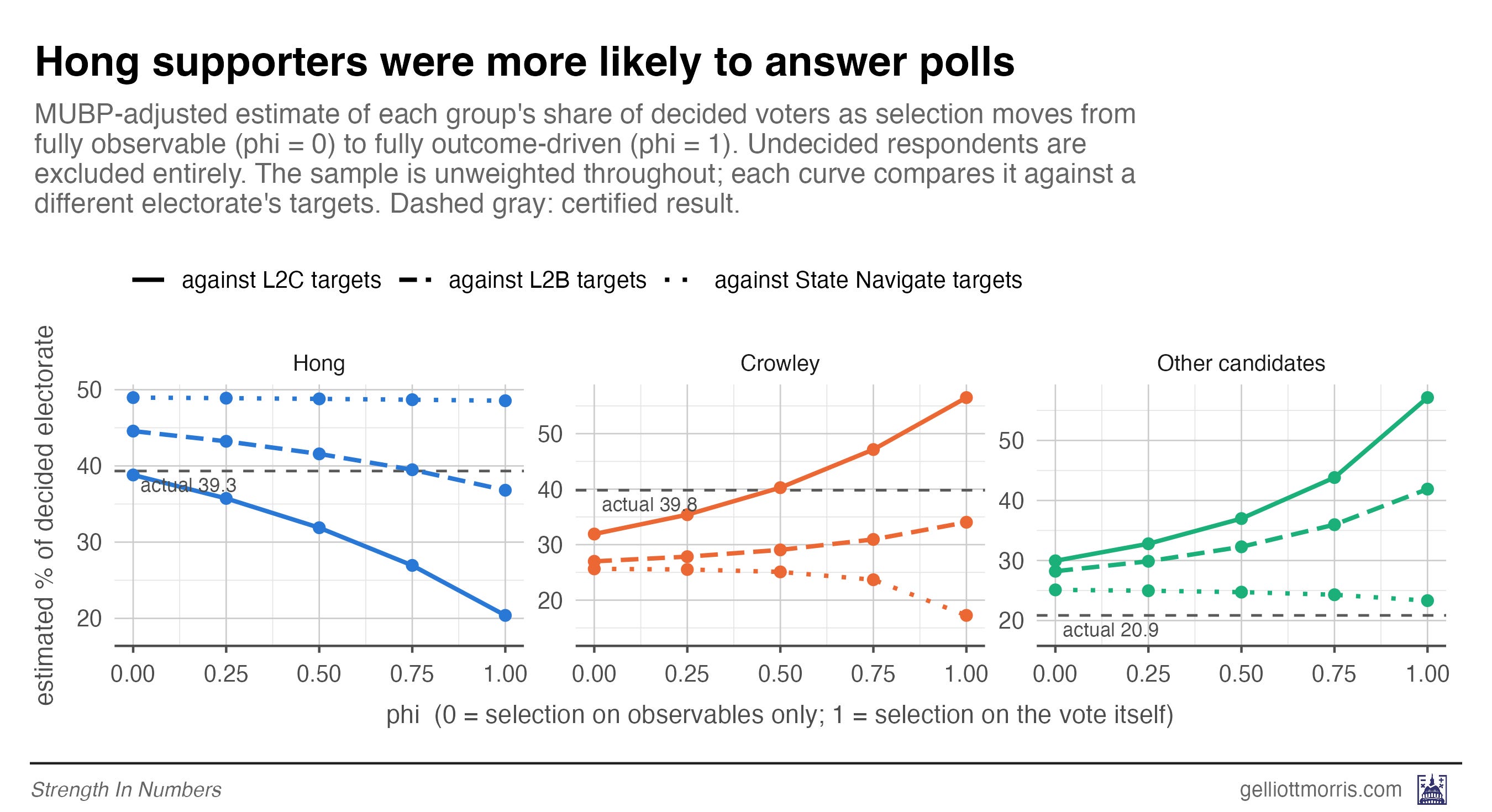
But in terms of relative probability, it does look like Hong voters were more likely to answer the poll. Crowley’s lines (orange) only reach his actual vote share about halfway up the “you’re screwed” dial — and that’s under the friendliest electorate, the L2C targets. Under the L2B and State Navigate targets, his curve never gets there at all.
This table (for the nerds) tells us what level of non-ignorable selection bias we have to assume (column 3) to explain the misfire in the polls, after controlling for demographics. A phi (the dial) of 1 is the worst-case scenario. The authors say a phi of 0.5 is a good guess for unobserved bias in your data. You have to use a phi of 0.7 to recreate Hong’s actual vote share using the data — which is not great but not terrible.
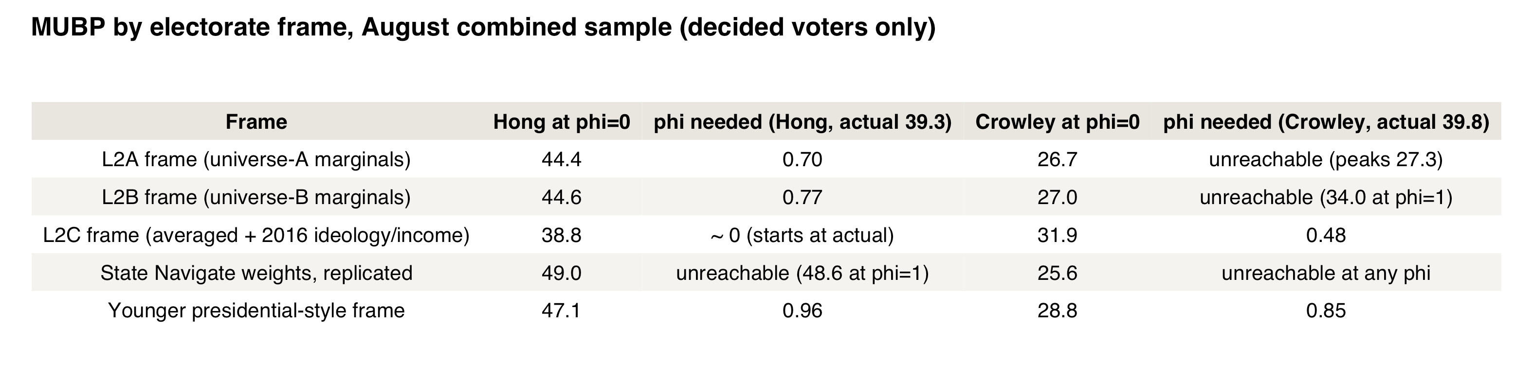
But before you get carried away, there are two caveats to the MUBP approach. First is that (because it’s just using poll results) it doesn’t take into account late movement in the election. The method is a snapshot, so it can’t distinguish “people wouldn’t answer” from “people changed their minds after the poll ended.” Second, the amount of non-response needed to explain the election result also depends entirely on what you think the electorate will look like (which is exactly why I ran it three different ways).
Using only the weights with only demographic and political variables (L2A — eg, no ideology or income in the targets), my best guess from the MUBP is that non-response was increasing support for Hong by something around 0 to 5 points, depending on whether a pollster weighted by ideology. Graded against the actual results, that explains about a tenth of the gap between the polls and the election result (the unweighted August sample had Hong up 23.8 points among decided voters; she lost by half a point). The rest was a combination of late movement and (fixable) weighting problems.
That last finding is why I think this method belongs in pollsters’ regular toolkits. You can run it before publication to assess the potential error in your poll that could be attributed to non-response bias for a candidate, as proxied by the correlation between the variables in your weighting model and the survey response.
The bottom line
It would be easy to read all this as an indictment of one pollster. I don’t think that’s the right reading. State Navigate hit their weighting targets, published their demographics, ran a genuinely valuable recontact design, and — to their great credit — handed over their raw data and let me publish whatever I found. Very few pollsters would do that.
The right reading of this is that primary polling is hard in ways that general-election polling is not. It is reassuring that most of the 20-point miss by the polls came from two problems that are either (1) fixable (weighting model) or (2) unavoidable in primaries (late movement), rather than, e.g., pervasive non-response by moderates.
The first problem is fixable with accurate voter-file targets (and bias is further reduced with some handy guesswork about ideology and income). The second is fixable by fielding later — and by everyone, poll-readers included, treating a primary poll as a snapshot with a very short shelf life.
But don’t conclude the data is useless: re-weighted with corrected targets, these polls missed by about as much as the average primary poll. And the smart recontact sample also helped indicate late movement that should have prompted readers to treat the poll as less precise in the final days of the campaign.
Recommendations
Based on all of this, I would give pollsters four recommendations:
Weight primary polls to voter-file data on primary voters — not to an all-registered-voters frame with a screen on top, or to targets derived from other states or sources. On State Navigate’s end, adjusting weights is common practice, but appears to have driven additional error in this election (maybe by coincidence). That is an unfortunate error.
But many pollsters also used demographic benchmarks that made the poll sample representative of Wisconsin’s registered voters generally, and then trusted respondents to self-select into the Democratic primary at random. The sample likely skewed young, ideological, and hyper-engaged — over-representing the Hong coalition. But weighting data to targets from the L2 voter file largely fixes the observed error. Weighting choices alone were worth roughly 10 points of margin here.
Field into the final weekend. When the race is moving quickly, being in the field as late as possible can generate more accurate data.
Assess sensitivity to ideology targets — if they impact results, increase uncertainty. The results of this analysis also hint at an oversampling of progressive Wisconsinites. But because there is no official population benchmark for political ideology to weight to, pollsters don’t use it (in one specification above I use the ideological makeup of 2016 primary voters, which helps). But that doesn’t mean pollsters can’t use the variable at all; a sensitivity analysis can be done without a hard target. I find that adding ideology to the weighting scheme moved the August margin about 11 points even after weighting by demographics and political party. This can be a clue to pollsters that their results are susceptible to error from the ideological makeup of their survey. One possibility is to produce multiple estimates with various ideological benchmarks.
Run a non-response analysis as a routine diagnostic. Above, I also apply a newer method from academic survey research — called the “MUBP,” a diagnostic for nonresponse bias — that lets a pollster stress-test a poll for non-response before publishing it. The idea is simple (the execution is not). First, combine everything you can observe about each respondent — age, education, party, ideology, and so on — into a single score that predicts how they’ll vote. In this data, that score is strongly but not perfectly predictive (it correlates with vote choice at about 0.6): most of “who you’ll vote for” is visible in traits a pollster can see. Second, use the same score to compare the poll’s respondents against the electorate you believe will show up. If the weighted poll still looks different from that electorate on the score, there is bias left over that better weighting could fix. You can also adjust how a candidate’s response score might be correlated with taking the survey at all, which allows the pollster to simulate different poll results given different levels of non-response. If the result of the poll changes under high non-response (because your support score does not fully capture support for a candidate), that’s another opportunity for exploration — and explanation to the public.
Thanks to Chaz at State Navigate for sharing his data.
In the end, the polls in Wisconsin don’t look so bad — or at least, no worse than the average primary poll in a race with a lot of movement in the final days.
Strength In Numbers is a reader-supported publication. If you read this far, you will definitely get a lot out of the additional exclusive posts each week, and our private community caht on Discord.
Footnotes
The Wisconsin voter file is notorious for having a lot of missing and incorrect data. One of the variables that is particularly errant is the age variable.
In their methodology report State Navigate wrote:
“many voters in Wisconsin have a birth year of 1800, and we don’t believe in vampires. These generally are newer voters who skew very young; about half of voters who we polled with a birth year of 1800 say they are in the 18-29 age bracket. Thus, if you were to simply take the voter file’s birth year data, you’ll get a Democratic primary electorate that is majority 65+ and has less than 2% of voters under the age of 30. Absentee requests for the Wisconsin primary (which includes requests for Republican ballots) are 5-6% 18-34. Given that this age group has been notorious for voting late/on Election Day, we find it hard to imagine a Wisconsin Democratic primary electorate that is <8% 18-29. Maybe it is; we don’t know for sure due to the ridiculousness that is the Wisconsin voter file”
Well, I am more than a little wary of using polling data that had too many responses from young people to make any sort of predictions about what age numbers would be on the voter file, so is another opportunity for sensitivity analysis.
In the plot below, I re-raked the August survey with the under-30 target set by increasingly aggressive assumptions about how old the “vampires” are — from my baseline a priori estimate (unknown ages allocated in proportion to the known ages) up through State Navigate’s estimate (half of unknowns under 30) and past it (70%) — under both the L2C weights and the ideology-free L2B weights.
Notably, stepping up the share of voters who were <30 increases error linearly. Under the L2C weights (which account for ideology and income), the margin goes from Hong +2.4 at my baseline, to Hong +4.9 using State Navigate’s stated floor of an 8%-under-30 electorate, to Hong +6.6 if you assume half of unknowns are under-30, and Hong +8.4 at 70%.
Under the L2B weights (which don’t have ideology in the targets) the same exercise runs from Hong +13.8 up to Hong +19.7, nearly all the way back to the unweighted poll’s +23.8. The reason is simple: the young people who actually answered this survey were overwhelmingly Hong voters (likely too pro-Hong, as the non-response analysis suggests), so every additional young voter you add to the electorate model pushes the poll further from the result.
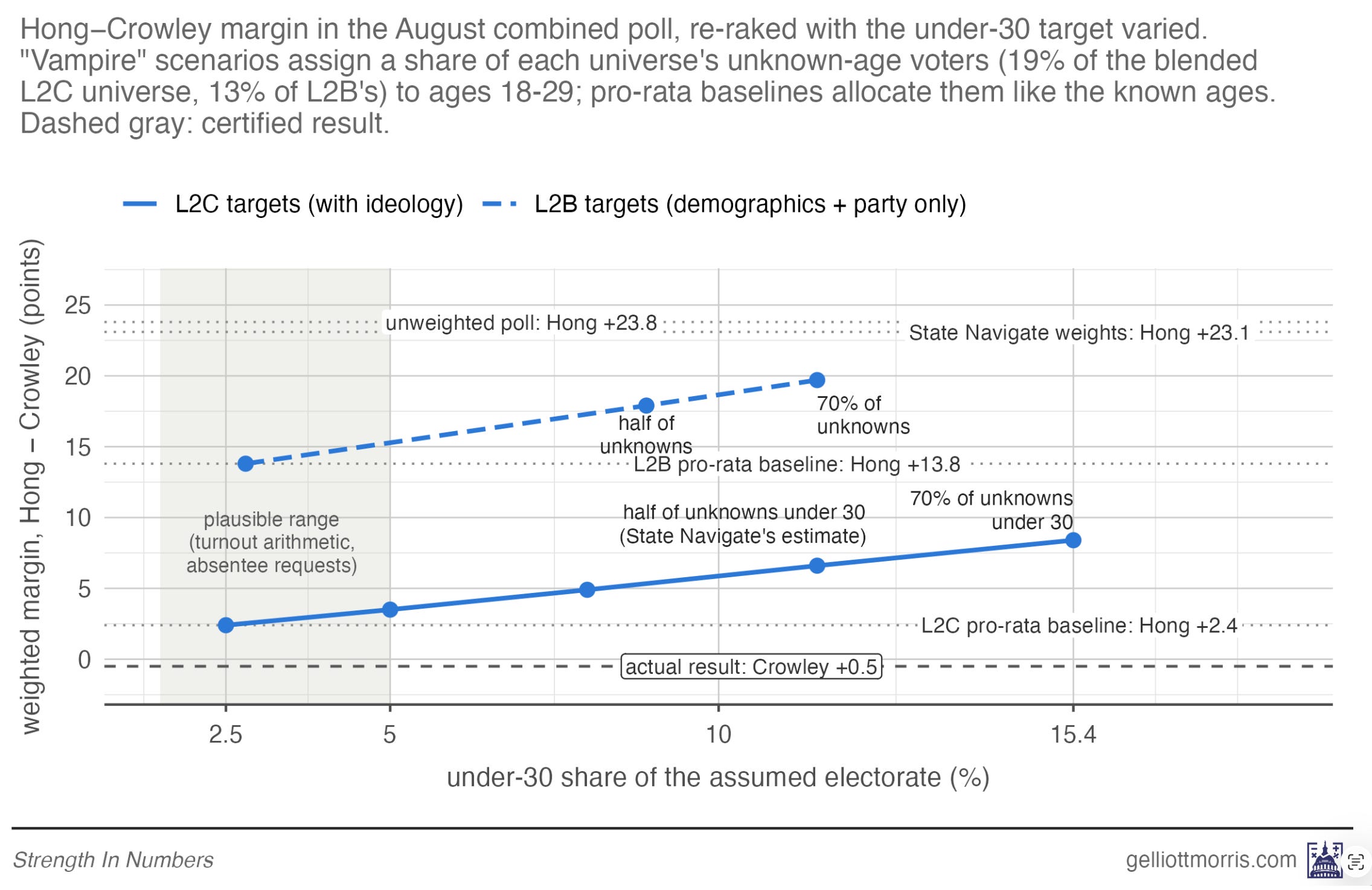
Notably, the adjusted weighted estimates I present — even at a 7-10% under-30 percentage — are still much closer to the result than the original weighted or unweighted numbers.
Whatever the true age of Wisconsin’s vampires, the topline takeaways from the analysis stands: the polls had too many progressive in them, and a large amount of late movement toward Crowley.
I also don’t see why pollsters couldn’t present sensitivity analyses like this in their reports. It would add a lot of context for consumers of their estimates.
Wow, what an article! Great reporting, Elliot, and even a non-pollster like me understood what I was reading. Thank you for this, it helps explain yesterday's piece much better.
For a non-nerd, a tough read. But the result is remarkable. Could the diagnostic be run in the future on other sample polls to show whether or not the weighting corrections that brought the State Navigate poll results close to the actual results? Can you later comment on responses to your analysis from other pollsters (or even other nerds)? Thanks to you and State Navigate for this discussion.