

More Census graphs! (showing higher political polarization by county population growth rates)
Here's a fun post combining new Census estimates with political data

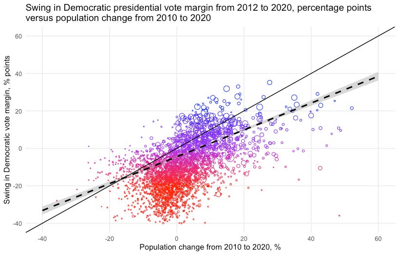
I shared the following graph of the relationship between county-level population change and swing in Democratic presidential vote share in last Saturday’s subscribers-only thread:
Today I want to dig into this a bit more, mainly by showing the data relative to 2008 levels too.
But first, some context. Points on a graph are fun and all, but what are we really looking at? Here is my recreation of the Census Bureau’s graph of which counties gained or lost population from 2010 to 2020. Note the broad decline in rural areas, especially in the northeast, as well as some former manufacturing hubs (Detroit pops out):
