


When it comes to health care and economic policy, what do voters in each congressional district want their representatives to vote on? What about a path to citizenship for undocumented workers, or expanding Medicaid?
Unless you have enough money to fund a poll of each U.S. House seat in America (given prevailing polling rates, I estimate this would cost between $5 million and $10 million — donors, hit me up!), the answer to this question has so far been elusive to most researchers and wonks.
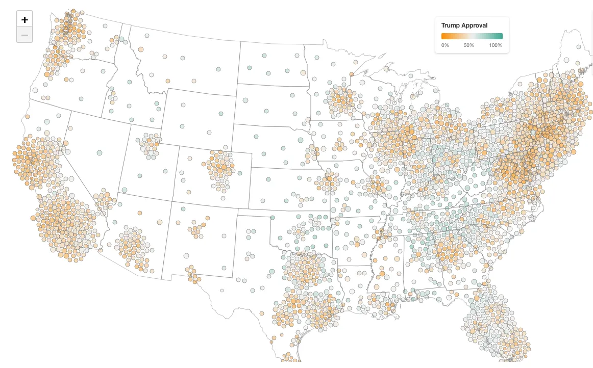
One overlooked solution, however, is to use the raw data pollsters gather for national surveys — which are cheaper and faster to conduct — and estimate opinion at lower geographic levels. Longtime readers of Strength In Numbers will be familiar with a method called MRP that I’ve used in the past to estimate things like Donald Trump’s approval rating and even election outcomes. For instance, here’s my map of Trump’s approval at the county level:
We can also use MRP to estimate what people think on the issues. Here’s one good approach that includes a lot of issues in a fun dashboard. But it only updates every couple of years with data from academic surveys.
That’s where the Strength In Numbers/Verasight poll comes in. Using the survey data we have collected over the past year, I am now publishing estimates for dozens of questions on issues, the parties, and election results, and updating it monthly (or more often, depending on demand). These are available today via Strength In Numbers Pro, my premium data service for political professionals.
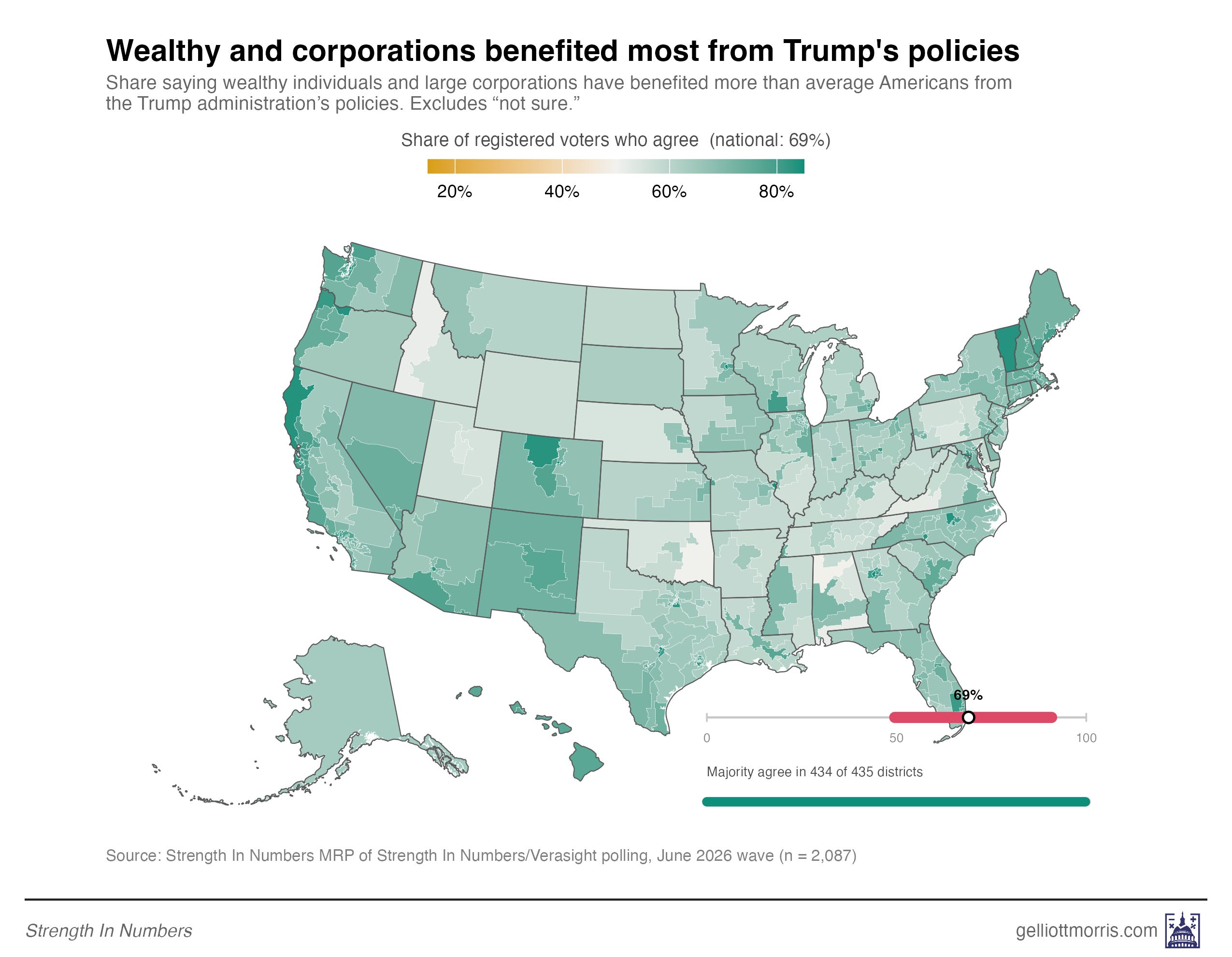
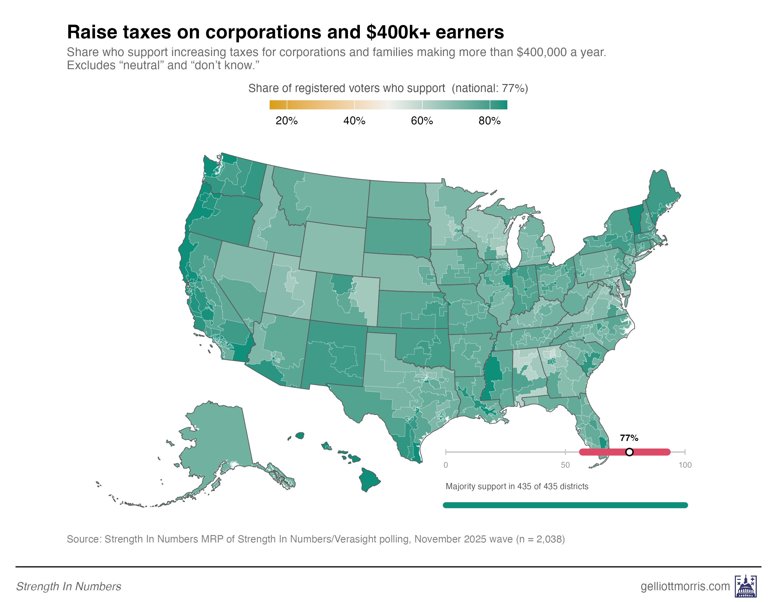
Here’s a sampling of district-level maps showing estimated opinions from recent SIN/Verasight polls:
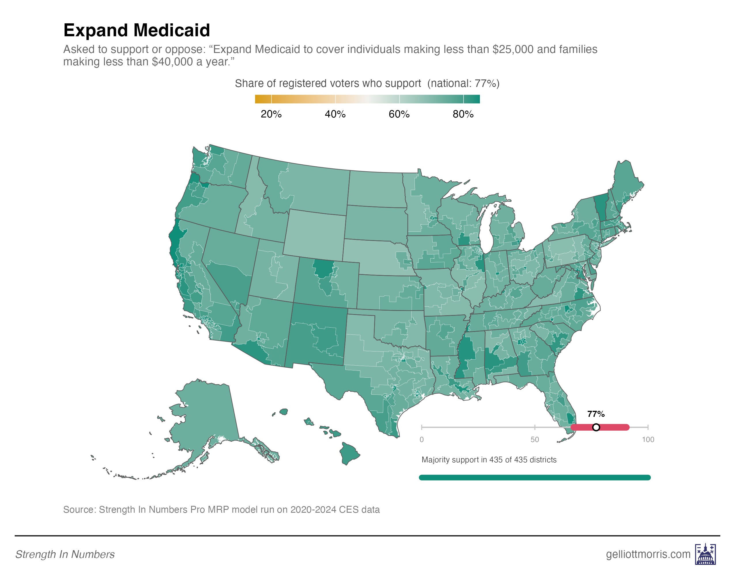
And I can also run these algorithms for other public polls, such as the 2020-2024 Cooperative Election Study surveys. Here are some MRP’d questions from that:
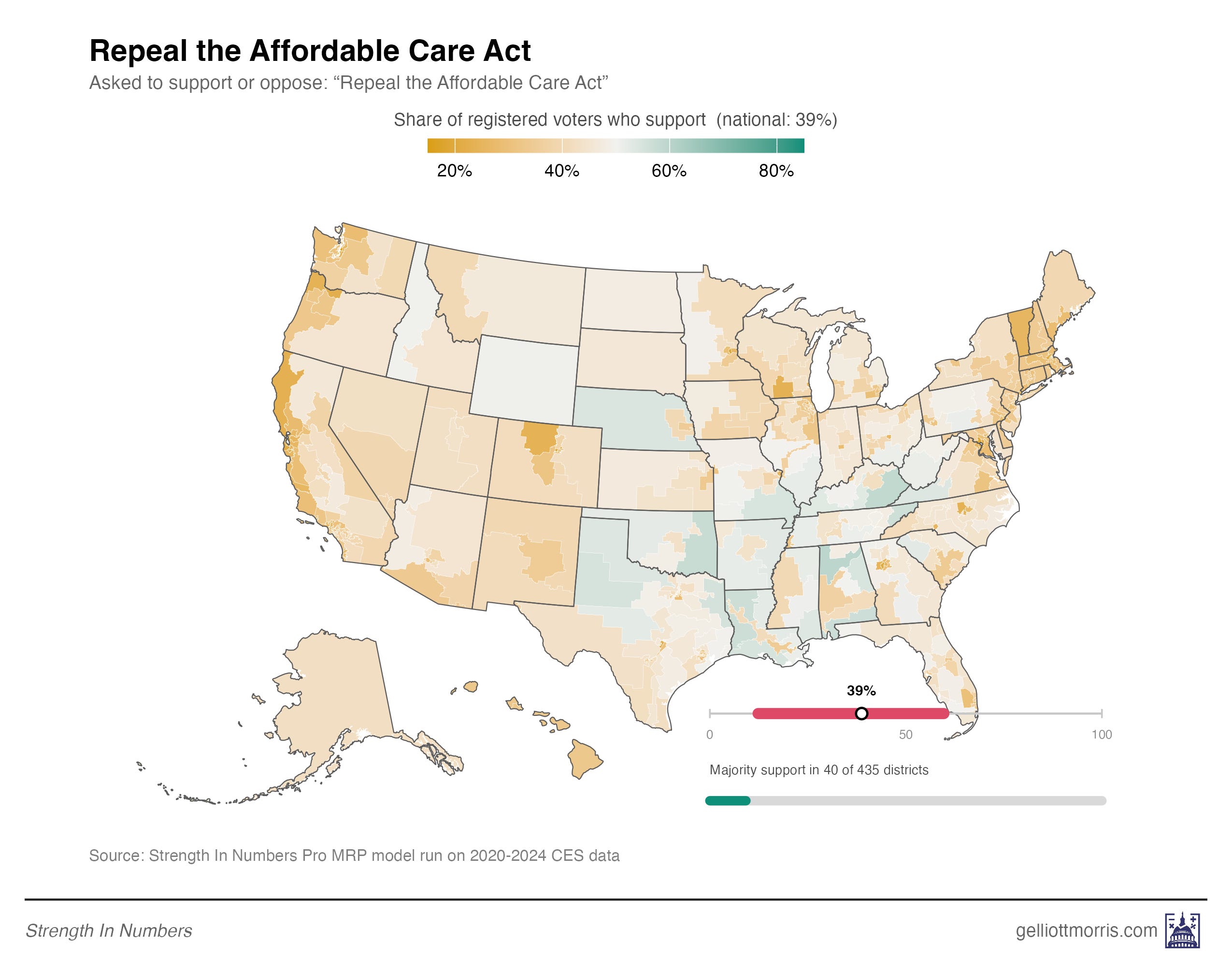
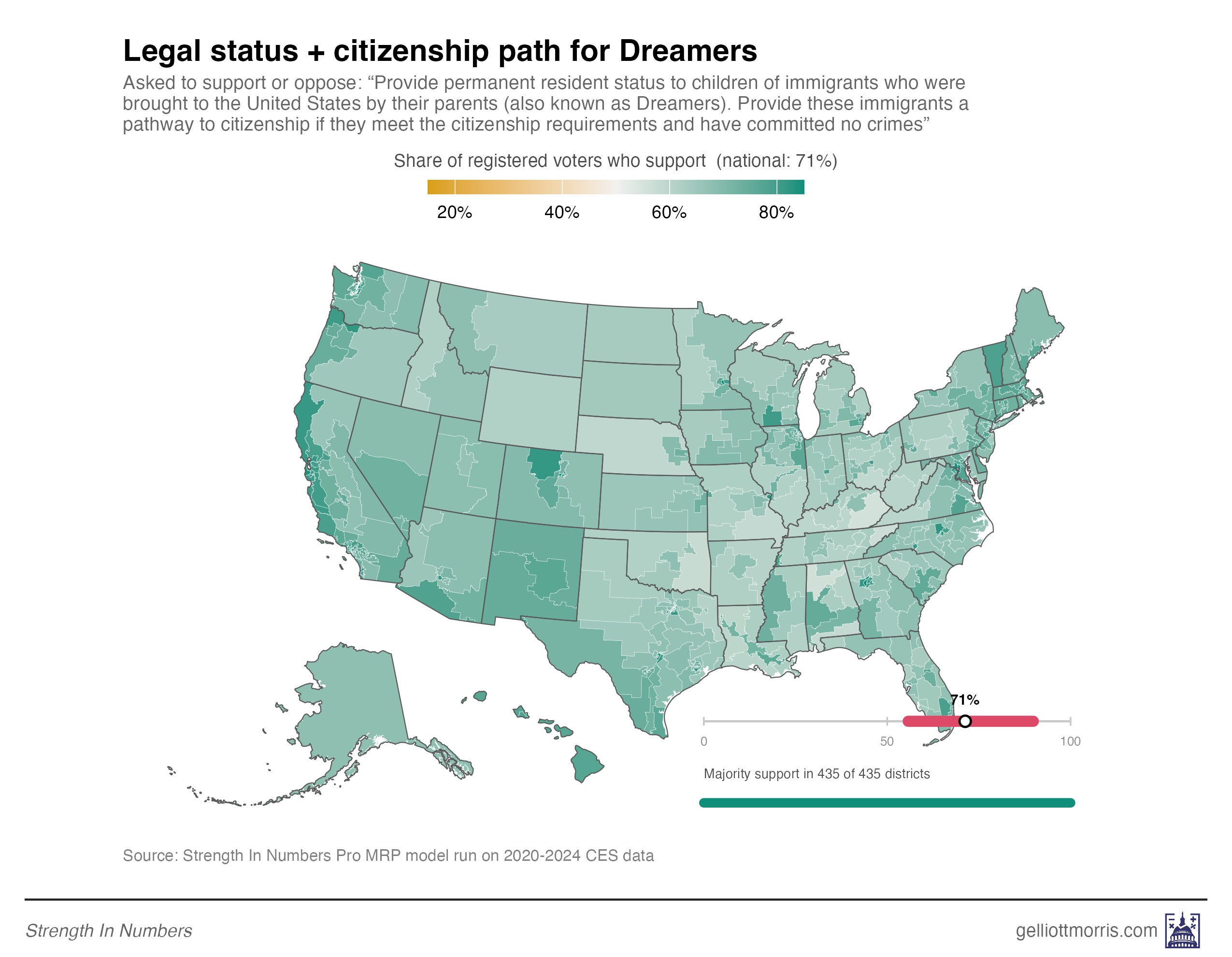
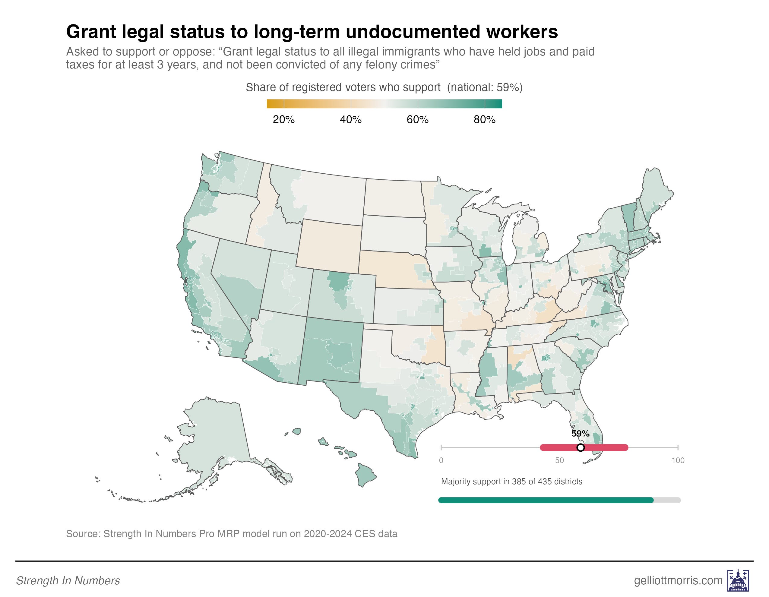
The MRP model behind these estimates can be run on any survey microdata a client might want to lend to Strength In Numbers. You can get in contact with me about that here. SIN Pro is currently used by folks at several state party offices, Super PACs, and financial firms. I think the new estimates online today will be particularly useful for campaigns and public affairs shops trying to identify where legislators may be out of step with their voters.
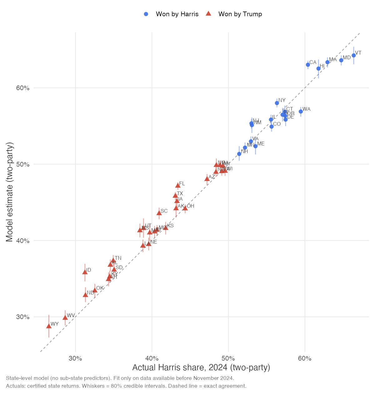
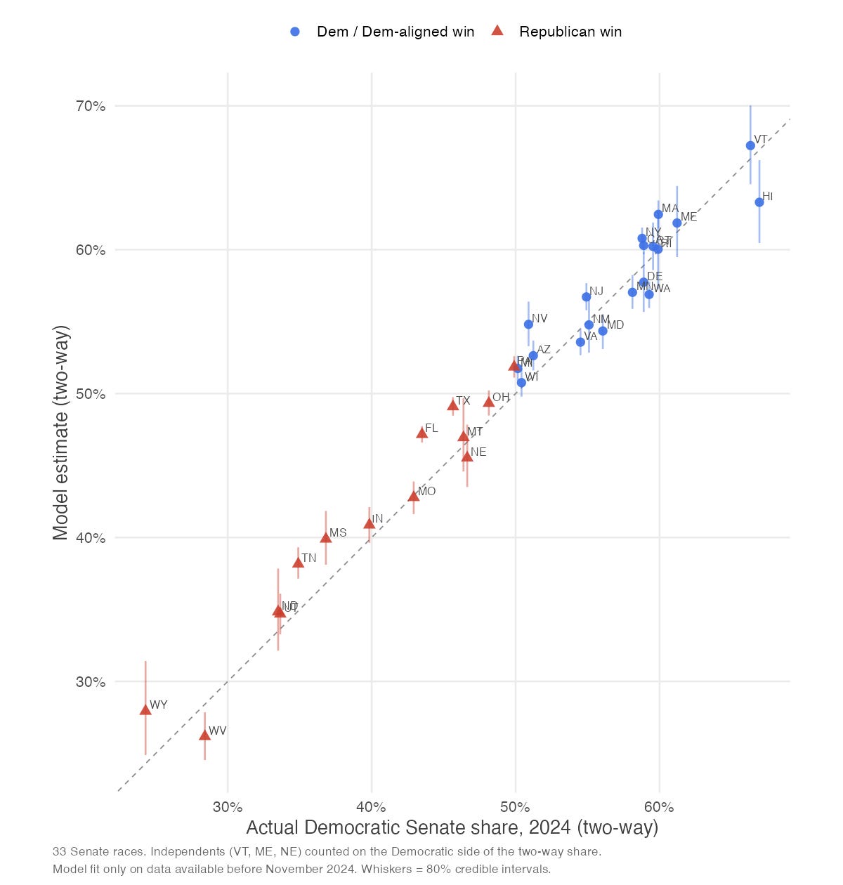
The model being used here (I call it MOSAIC) is a state-of-the-art approach to MRP that balances the sample by past vote and party identity and calibrates the partisan mix of each demographic group using real election returns at the precinct level. For some proof of the method, the scatterplots below show MOSAIC produces well-calibrated election forecasts in out-of-sample elections. Here’s a draft whitepaper describing the model.
The 2024 presidential election
The 2024 Senate elections:
The 2022 Senate elections:
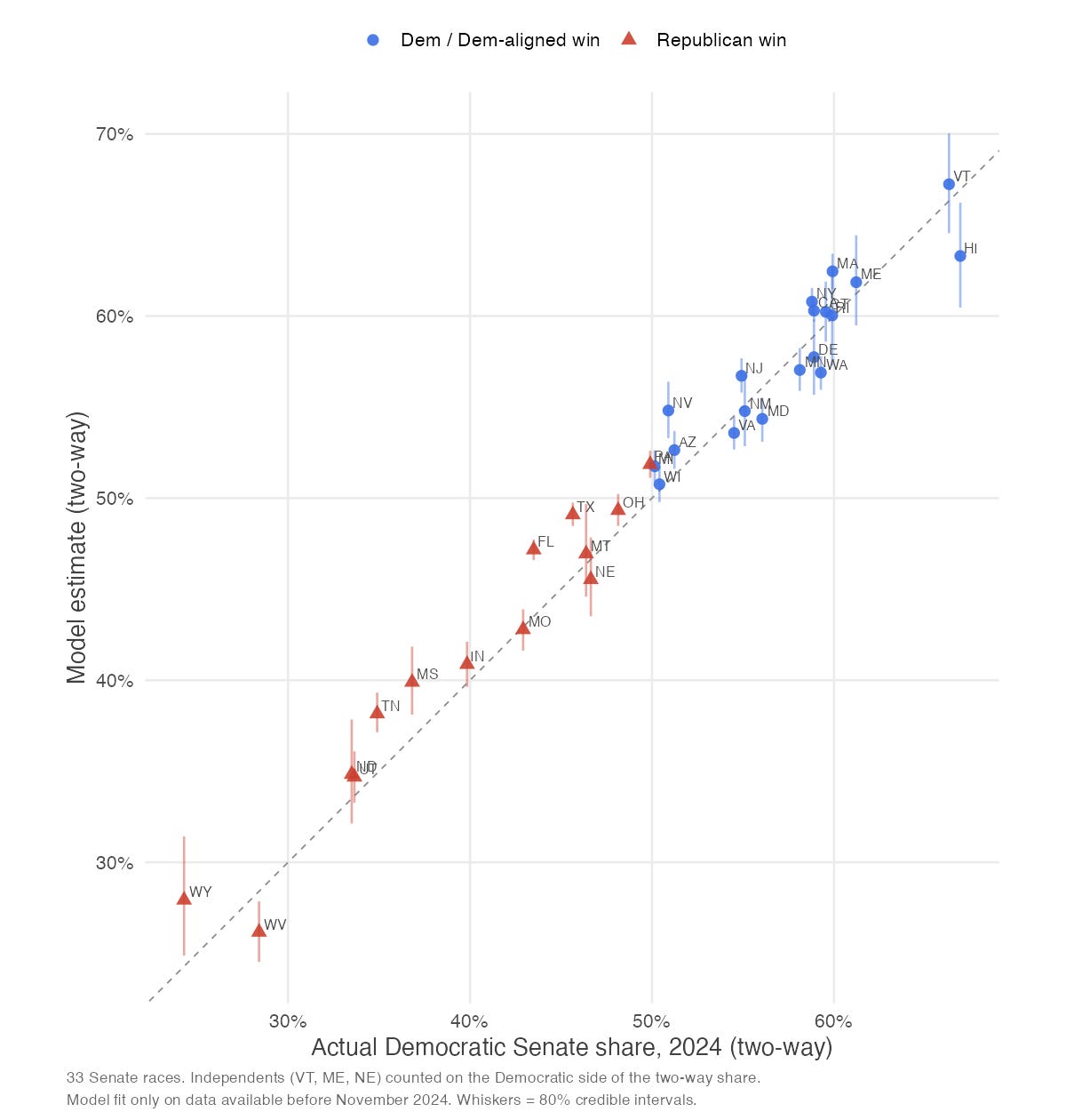
These are promising results. My hope is to issue forecasts for 2026 as additional public proof for the method, but I’m looking for partners to fund additional sample collection in each state (if that sounds like something you’d fund, get in touch).
Subscribers to Strength In Numbers can also expect me to make more use of these estimates editorially this election season. For example, here’s a map showing which party voters in each congressional district feel is more out of touch with the ordinary American. Registered voters in 235 House districts say they feel the Republican Party is more out of touch with the everyday person, whereas voters in 200 districts say the Democrats are the more out-of-touch party:
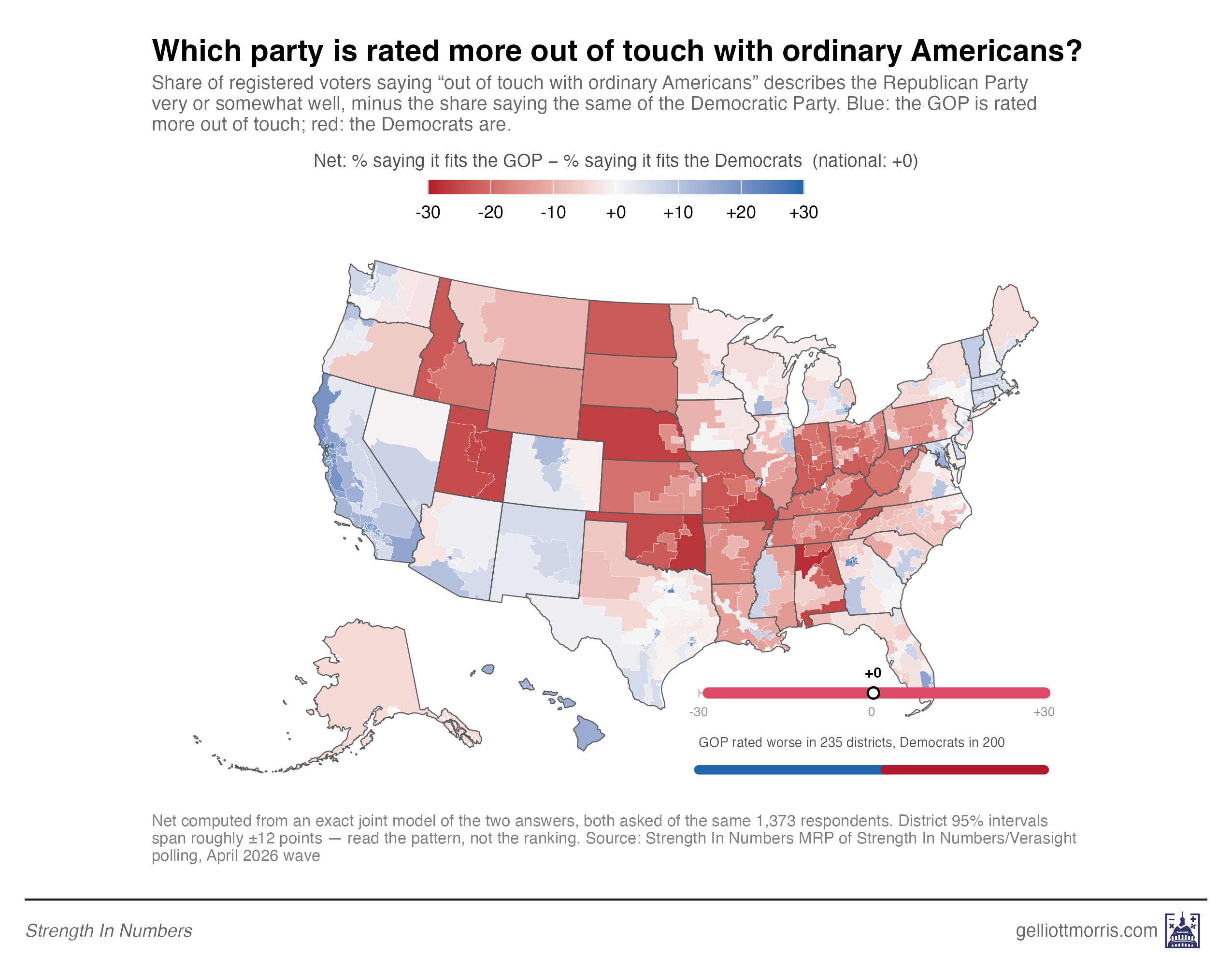
This data runs contrary to a lot of punditry that Democrats are seen as more alien than Republicans. That’s the type of corrective we have been able to issue at the national topline level before, but the district-level picture adds new resolution to our understanding and more angles to the story. More on that soon.
And here’s the current House generic ballot at the district level (though note this is using 2024’s electoral boundaries — I want to update that when I have more time/demand):
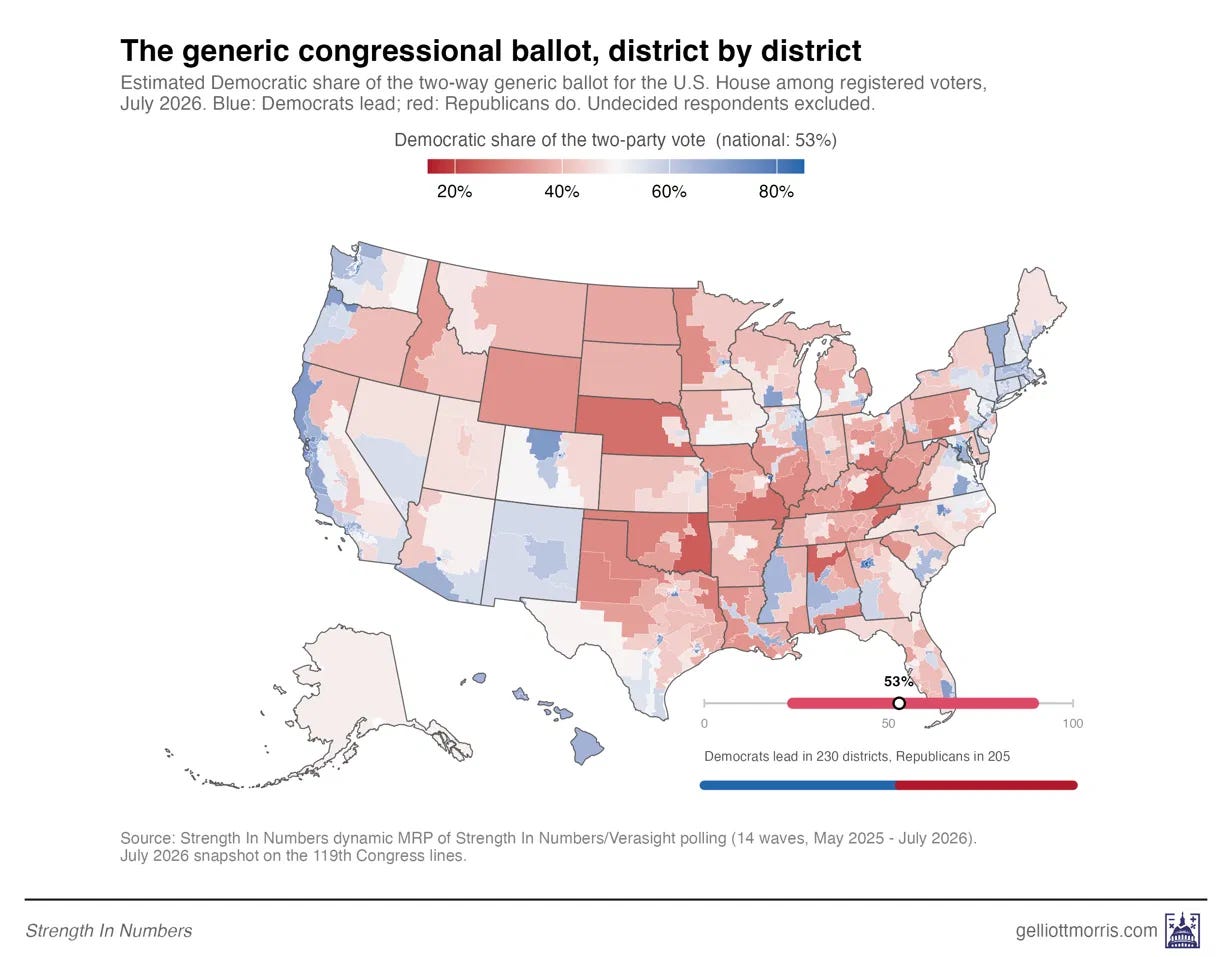
Hopefully this gives you an understanding of what’s possible with this tooling. Ideas are welcome. We can ask… anything you want. If you’re a subscriber to this publication and have a question you want me to calculate district-level estimates for, leave that in the comments below.
And if you’re a firm that wants custom research for congressional districts or other geographies, on issues or the horse race, get in touch.
The degree to which Democrats in blue areas think the Democratic Party is more out of touch is striking; the DNC should pay attention.
" I think the new estimates online today will be particularly useful for campaigns and public affairs shops trying to identify where legislators may be out of step with their voters."
It really illustrates how Congress has gone off the rails.
The only reason these issues (where a strong majority supports a certain position) do NOT become law is that Congress is largely beholden to special interests and the MONEY/CAMPAIGN DONATIONS/PROMISES OF LOBBYING JOBS, which clearly have more influence than do millions of constituents, i.e., WE THE PEOPLE.
Proportional representation and expanding the House would be a good steps toward democratic reform but even more urgent is finding a way to reverse or modify Citizens United.