

Here’s a model of consumer sentiment that doesn’t suck
On the question of why Americans are so glum, the answer is still (mostly) the prices, stupid. But you have to know where to look

This piece is a follow-up to It’s the prices, stupid. You don’t need to have read that piece to follow this one, but it provides some helpful context.
A gallon of milk costs about a dollar more today than it did in 2019. Eggs are running about 45% higher than they were five years ago, rent is up about 30%, and used cars are about 25% more expensive. Across the basket of essentials Americans actually buy every week — groceries, housing, transportation, the un-skippable stuff — prices sit roughly 10 to 15% above where the pre-pandemic trend said they should be, and they have basically refused to come back down.
That gap, between the price level you actually pay at the store and the level you’d be paying if 2020 had never happened, is what I’ve been calling “excess prices.” And statistically and in theory, it does a better job of predicting how Americans feel about the economy than any of the standard macro indicators we usually reach for.
That was the argument I made on Tuesday — that the reason consumer sentiment is in the basement, despite low unemployment and rising real wages and a near-record stock market, isn’t news coverage or social media vibes or voter irrationality. It’s the level of prices, not the rate of change. Inflation falling from around 9% to around 3% doesn’t undo the fact that the supermarket bill is now, and probably permanently, meaningfully higher than it was.
I was overall pleased with the reaction to Tuesday’s Deep Dive, and several economists sent me thoughtful notes about the work (with some cheeky criticism of the spaghetti line charts). There was also some criticism of the model, which offers up an opportunity to do some more explanatory work with this model. Here are the two fair objections I got, that I’ll address in this piece:
Overfitting. Maybe the model only “works” because it was built and tested in a low-inflation, post-1990 environment. The fix for this problem is to explore whether the same setup also predicts sentiment in another high-inflation regime — for example, the 1970s.
The polling variables might be downstream of the same biases pulling down consumer sentiment. My model uses a question from the University of Michigan’s Survey of Consumers that asks people who say the economy is bad why they say that. Specifically, it uses Table 7 of the survey, which reports the percent who say their finances are poor because “prices are higher.” The criticism of this variable is that maybe respondents are just parroting back the negative inflation coverage they’ve absorbed from cable news and social media. The fix here is to strip out the part of price perceptions that news sentiment can explain, and test whether what’s left still predicts sentiment.
The short answer is: neither one of these critiques sticks. The model generalizes to the 1970s about as well as it fits the 2020s, and the price-perception signal stays strong even after the news-explained portion is stripped out. The most plausible mechanism for why consumer sentiment lags mainstream economic models today is that they don’t have data on excess prices, which voters care about in addition to the standard economic variables.
The natural place to start is with the overfitting objection, because it is the more fundamental one. If this is really just a post-COVID story dressed up as a general theory, then the model should fall apart the minute you ask it to explain a very different economy. I chose to back-test on 1972-1983, an era of persistently high inflation, weak real wage returns, and collapsing consumer confidence. If the excess-prices model still works there, it is probably capturing something real.
Test 1: Does the model work in a different inflation regime?
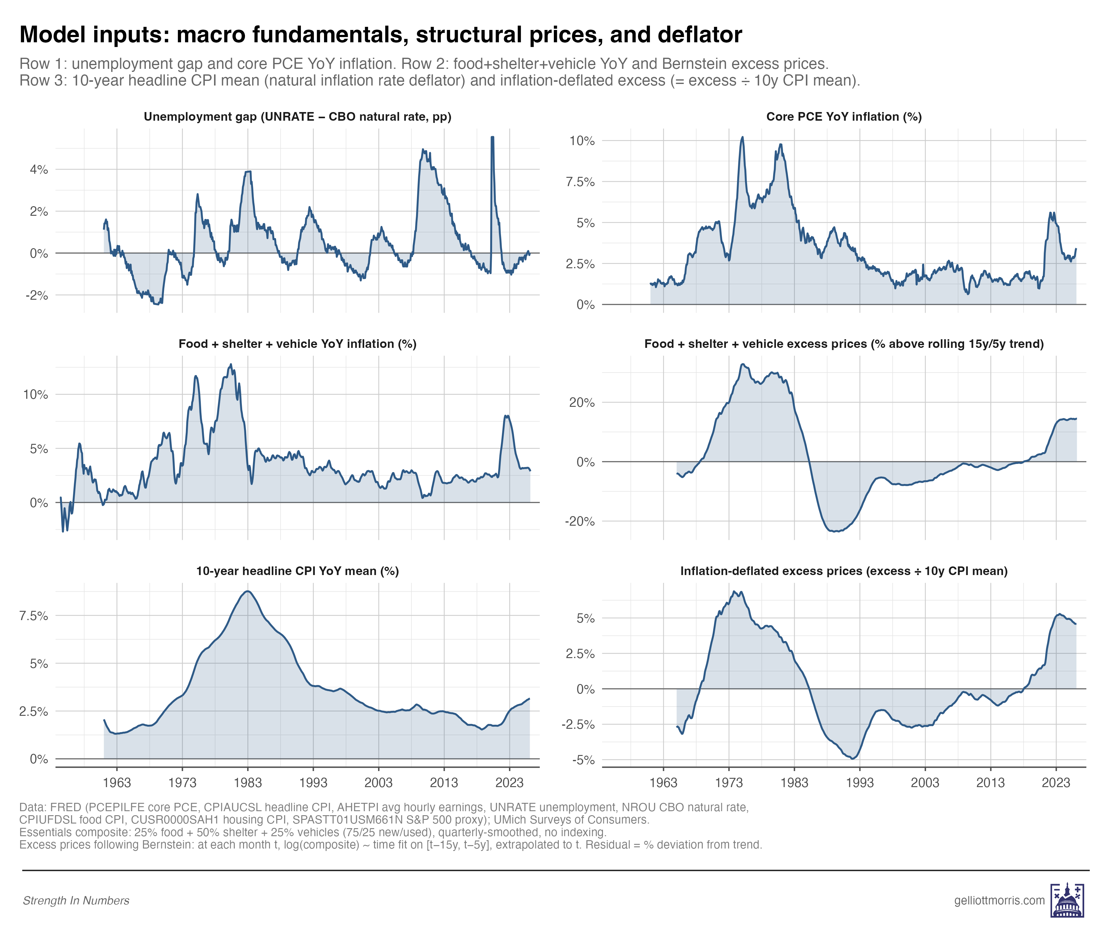
One quick note on the variable, since I’ve changed it slightly from Tuesday’s version. My original “excess prices” measure was a look at inflation per the Federal Reserve’s preferred inflation measure, “Core PCE.” Unfortunately, the Fed (for its own particularly Fed-y reasons) excludes the price of food and energy from PCE — but people spend a lot of money on food and energy! Since we are trying to measure inflation in things the public cares about, we need to include those items, too.
So in this updated model, I use a composite of the things people actually buy a lot of — 25% food, 50% shelter, and 25% vehicles — and compare current prices to expected prices. The way this works is that for any month, m, I take that composite, fit a linear model on all the price data from 15 years to 5 years before m, and predict what prices for these items “should have been” on month m. Then, I take what they actually cost, and calculate the percentage residual between (1) what things cost and (2) what they should. Per Jared Bernstein’s terminology, I call this “excess prices.” I repeat this procedure for every month in the time series from January 1965 to March 2026.
Then, I divide the excess prices for a given year by the trailing average rate of headline inflation over the last ten years. This way, the excess prices variable measures roughly the same thing whether you’re in the late 1970s, when Americans had just had a decade of stubbornly high inflation, or the 2020s, after 30 years of inflation below 3%. The theory behind this adjustment is that a 15% excess in 1978, when inflation had been running 6 to 8% for years, doesn’t shock people the same way that a 10% excess in 2024 does, when inflation had been near 2% for a decade. A 15% excess on a 6% baseline is just 2.5x the prevailing inflation rate, whereas a 10% excess on a 2% baseline is 5x the prevailing rate.
This isn’t just a hunch, by the way. Recent political-science work by University of Texas at Austin political scientists Derek Epp and Christopher Wlezien, “Benchmarking in the Updating of Public Perceptions,” shows that people don’t update their beliefs about the economy based on new economic information evenly in different inflation regimes. They find a similar thing I do: that when the economy turns sour after a period of average (or good!) economic growth, people react more negatively than they do if you get a bout of inflation right after a big recession.
Table 2 from the Epp and Wlezien paper (reproduced below with permissions) shows this cleanly: the same change in objective economic indicators has wildly different effects depending on what people had recently come to expect for economic growth. A two-standard-deviation negative shock to the leading economic indicators moves sentiment by 13 points when it arrives after a period of good times, and just 8 points when it arrives after bad times. That’s a projected 50% larger impact.
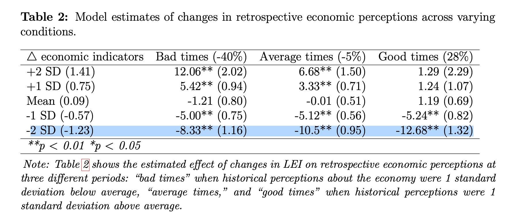
If you apply this theory to inflation, this means that after years of low, stable inflation, the post-COVID jump in everyday prices registered as an extremely abnormal shift in the price level. A comparable shock in the late 1970s or around 1980 would still have hurt, but it would have landed on a public already conditioned to expect higher inflation, so they would have been less bummed. The deflator I use in the variable is, essentially, the empirical version of Epp and Wlezien’s theory: the same amount of excess price shock gets scaled up when the recent inflation environment has been quiet, and scaled down when it’s been noisy.
So you can better visualize what’s going on here, see the graph below. The panel in the bottom right shows excess inflation in prices of everyday household goods, adjusted for period-level inflation.
Tuesday’s piece showed that excess prices predict post-2020 sentiment well. But, fair point from the critics, that was a relatively clean test — both the training data and the test data come from a similar low-inflation regime, with similar information environments. The harder test is whether the same model also works when you ask it to predict a period so different from the 2020s that it might as well be a different economy entirely.
From roughly 1972 through 1983, inflation was running double-digit, unemployment spiked well above natural rates, sentiment collapsed, and real stock returns were negative. Pretty much everything was bad at once. The conventional macro story works fine here — high unemployment plus high inflation equals low sentiment, no further explanation required. Textbook stuff.
So if my excess-prices story were really just a post-COVID artifact, you’d expect a model trained on data outside the 1970s to badly miss 1970s sentiment, because the price-level shock isn’t doing the explanatory work — high unemployment and high inflation are. In this case, if you add another negative indicator on top of these ones — and especially one that is huge in nominal terms — you would get a predicted economic sentiment that was way too low.
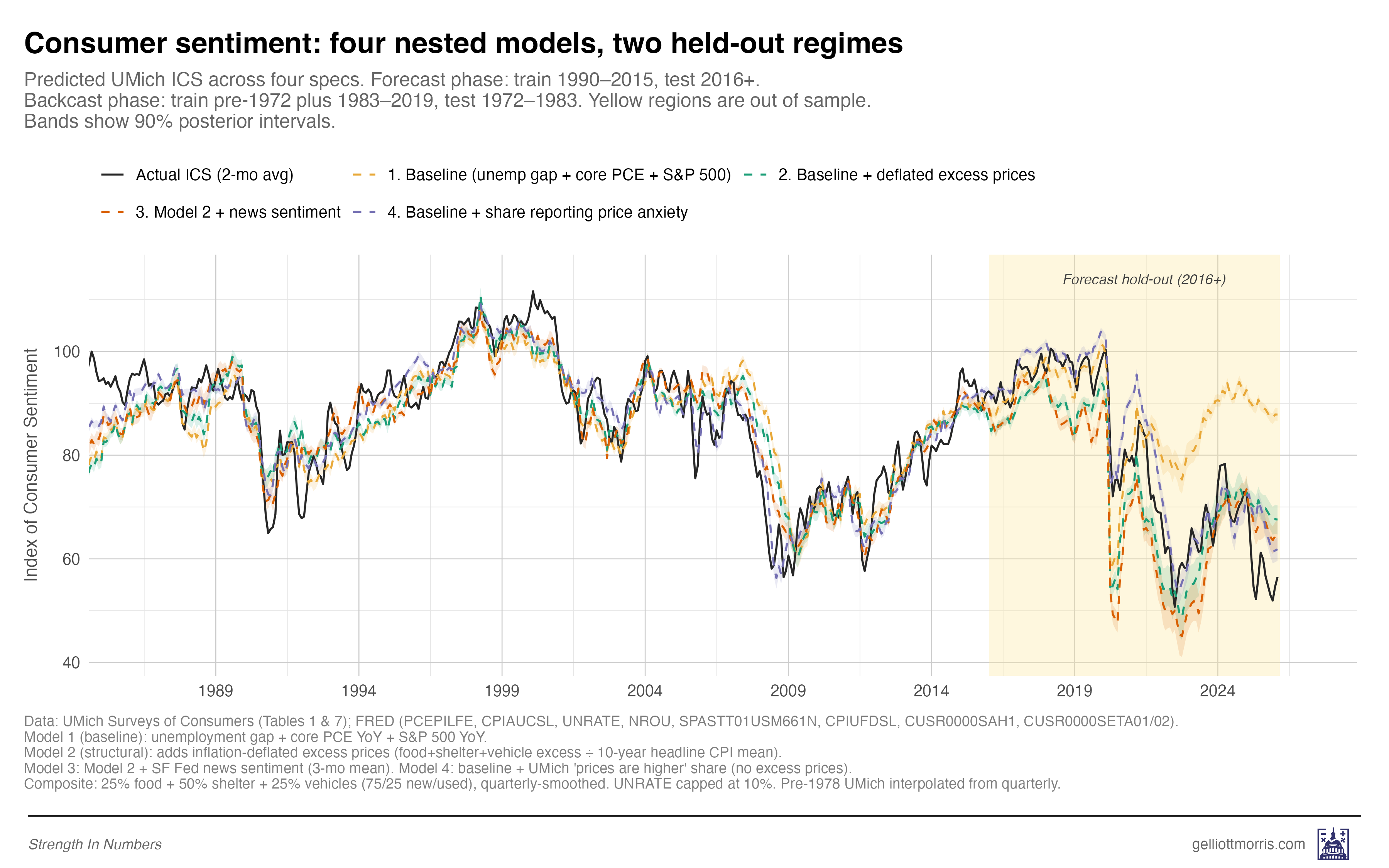
To find out, I trained four nested models on data outside each test window and compared their out-of-sample fit. These four models are:
A baseline “conventional wisdom” economics model: Consumer sentiment is a function of unemployment (above the natural rate estimated by the CBO), inflation (in the PCE), and YoY stock returns.
The baseline model plus my inflation-adjusted measure of excess prices.
Model 2 plus a measure of “economic news sentiment” — how negatively or positively newspaper coverage of the economy is in any given month — taken from the San Francisco Fed.
Model 2, plus the “prices are higher” polling variable from the University of Michigan question I introduced above — the share of respondents who say their personal finances have gotten worse over the last year, specifically because prices are higher.
The line chart below shows the predictions each model would have made on economic sentiment after 2016, trained only on data up to 2016. The yellow line — the baseline model — does worst, while the other models — that add excess prices and attitudinal measures — do better.
Now, here is the same thing, but incorporating holdout predictions for the inflationary era in the 1970s and early 80s:
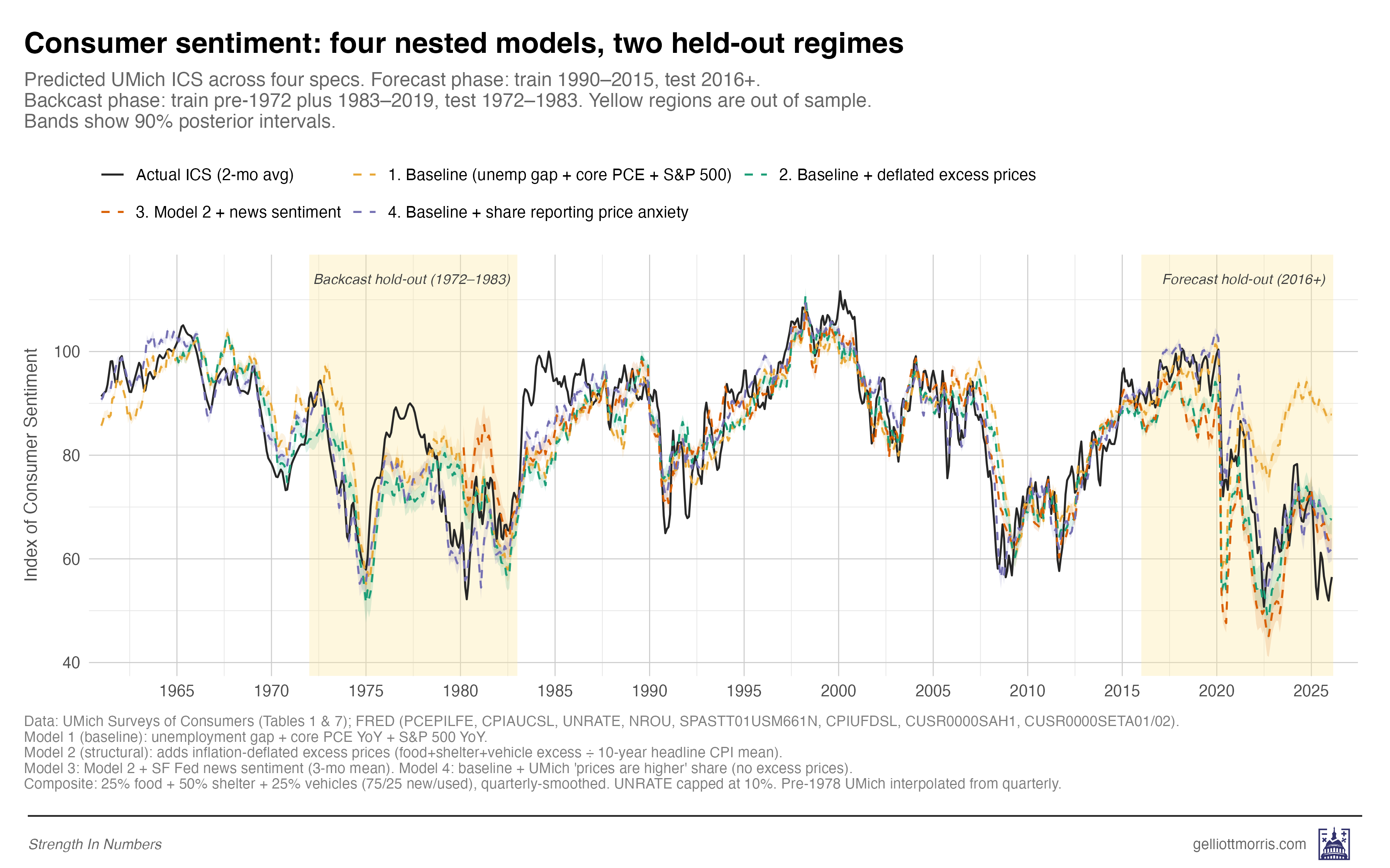
Note how the model does decently well in the 70s-80s, though sentiment is higher than we’d expect across the board. The monthly errors are mostly not larger than you’d expect based on the root-mean-squared errors of each model:
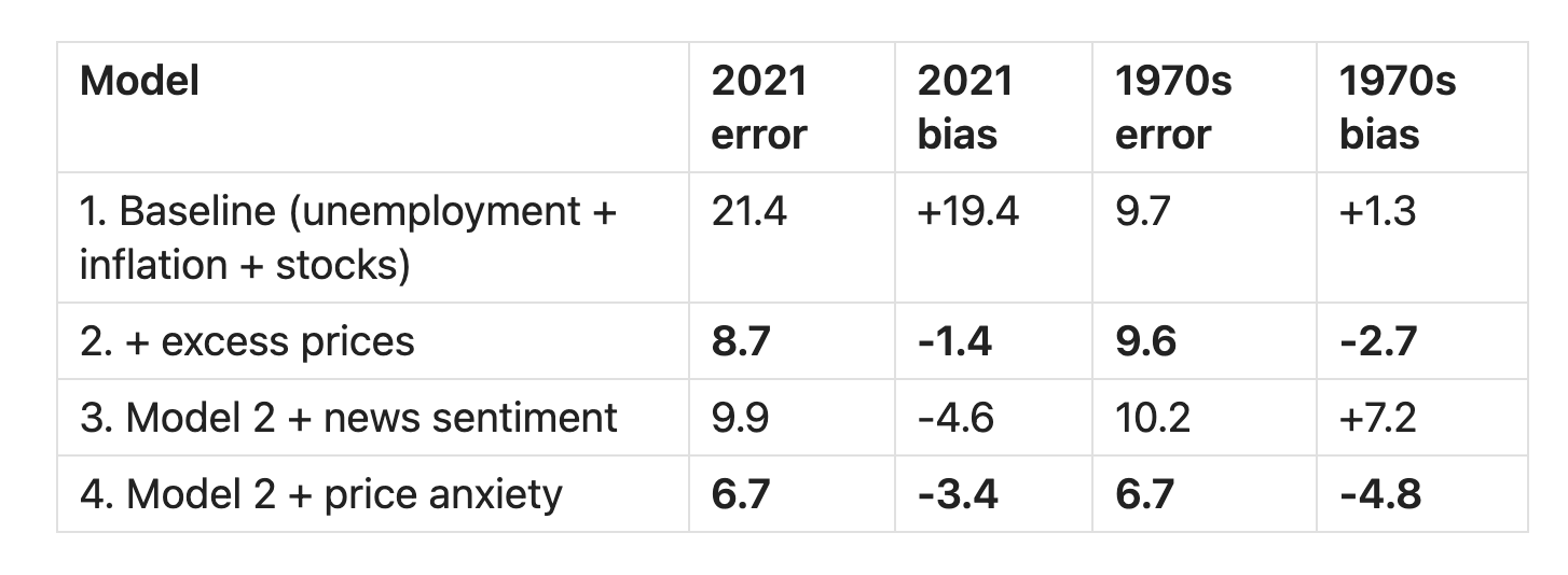
Note: the table above reports prediction error after 2021 for the forecast, but remember that the model stops training at 2016, so it’s not that it just “got lucky” because we stopped training right before COVID!
Two things stand out in that table. First, the baseline model — just unemployment, inflation, and the S&P 500 — fits the 1970s reasonably well, with an RMSE of 9.7 over 132 months, but misses badly in the post-2020 period, where its RMSE is 21.4. And there’s a 19-point average gap between what conventional macro predicted and what people actually told the Michigan survey. Second, Model 2, which is the same baseline plus the regime-adjusted excess-prices variable, performs almost identically across both eras: 8.7 in the 2020s and 9.6 in the 1970s. That’s the same model, with the same coefficients, trained on data from neither test period, fitting both regimes within a few index points of each other.
That, I think, is decent evidence that the relationship generalizes across inflation regimes — not just an artifact of post-COVID overfitting.
The regime adjustment is doing a lot of the work here, and you can see why if you imagine the alternative. Without dividing price excess by the trailing inflation mean, the model would see enormous price excess in the 1970s — prices were extraordinarily high in absolute terms — and would predict that sentiment should have cratered throughout the entire decade. The regime-adjusted version correctly recognizes that 1970s consumers were already used to high price growth, so a given-size excess simply wasn’t as shocking as it would be today.
This is basically the central finding of Epp and Wlezien’s paper, applied to the relationship between inflation and consumer sentiment specifically. The Epp and Wlezien paper suggests why a regime-adjusted measure of excess inflation ought to matter psychologically, and the historical backcast shows that the measure works empirically. The model behaves the way the behavioral theory (with completely separate data!) says it should. Bully!
Also worth pointing out is that model 4, which adds the Michigan attitudinal variable about price anxiety, tracks the full time series incredibly closely. This suggests that once you know what the unemployment rate and SPY returns are, then the only other question you need to know is how stressed out people are about prices, and you can predict the index of consumer sentiment. This suggests that consumer sentiment is largely a function of price anxiety, which is not the way economists typically treat the index!
Test 2: Are perceptions actually downstream of news and social media?
The polling variable suffers from the big weakness that we don’t know whether people say prices are higher because prices are higher, or because they’re being “influenced” to believe that prices are higher. The consumer sentiment truthers responded to my first model, arguing that survey respondents who tell pollsters that “higher prices” are hurting them are possibly just repeating what they heard on cable news and social media.
Well, one way to test this is to look at the Model 3 (red line) results above. Does a model incorporating a measure of media sentiment do any better in predicting consumer sentiment than the baseline conventional model? No, in fact, it does about 1.6x as badly as our excess price and poll-response model in terms of expected error, and 3-4x as badly in terms of average bias. Ouch!
Here’s another test: If price anxiety were just recycled media tone, then the part of it that isn’t explained by news coverage should stop predicting sentiment. So I residualized price perceptions on news sentiment — extracted the part of price perceptions that news tone explains, threw it away, and reran the model with only the residual. Summary of the results below (the important column is the “model fit” column).
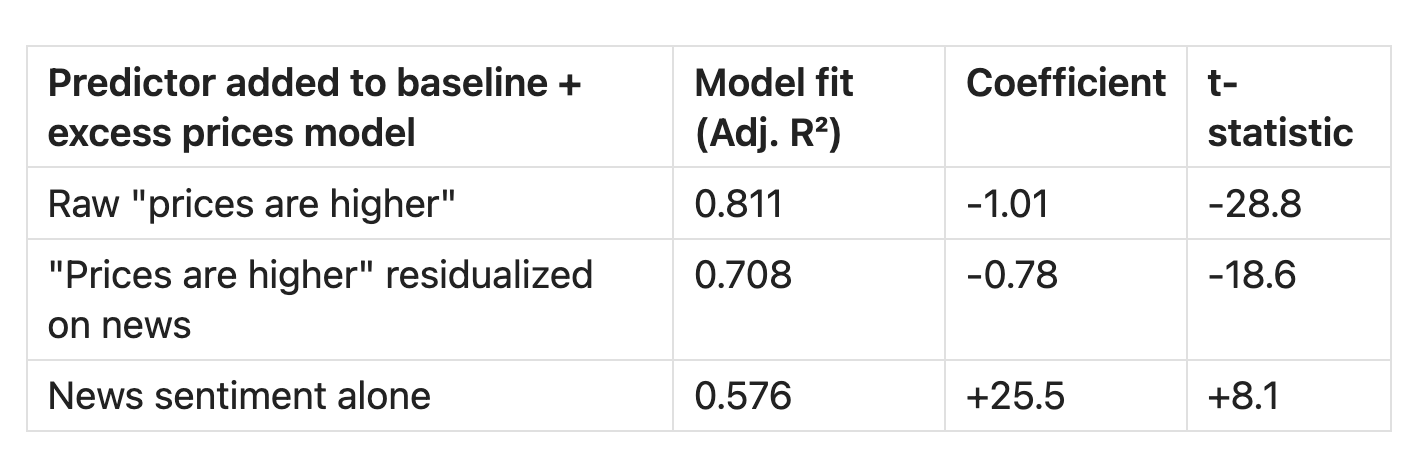
The raw correlation between news sentiment and price perceptions is r = -0.37, which is statistically significant but substantively pretty weak. News sentiment explains about 14% of the variation in price perceptions; the other 86% is doing something else. So when I throw away that 14% and use only the residual, the price-anxiety variable still predicts sentiment with a t-statistic of -18.6. That’s still a powerful predictor, and it still produces a higher R² (0.71) than news sentiment all by itself (0.58).
You can see this visually, too. The news-sentiment series (top of the chart below) bounces around but has more or less returned to neutral over the past couple of years. The price-perception series (middle) shows a sustained 40%+ plateau from 2022 through today. The two series, by any reasonable reading of the chart, are not moving together.
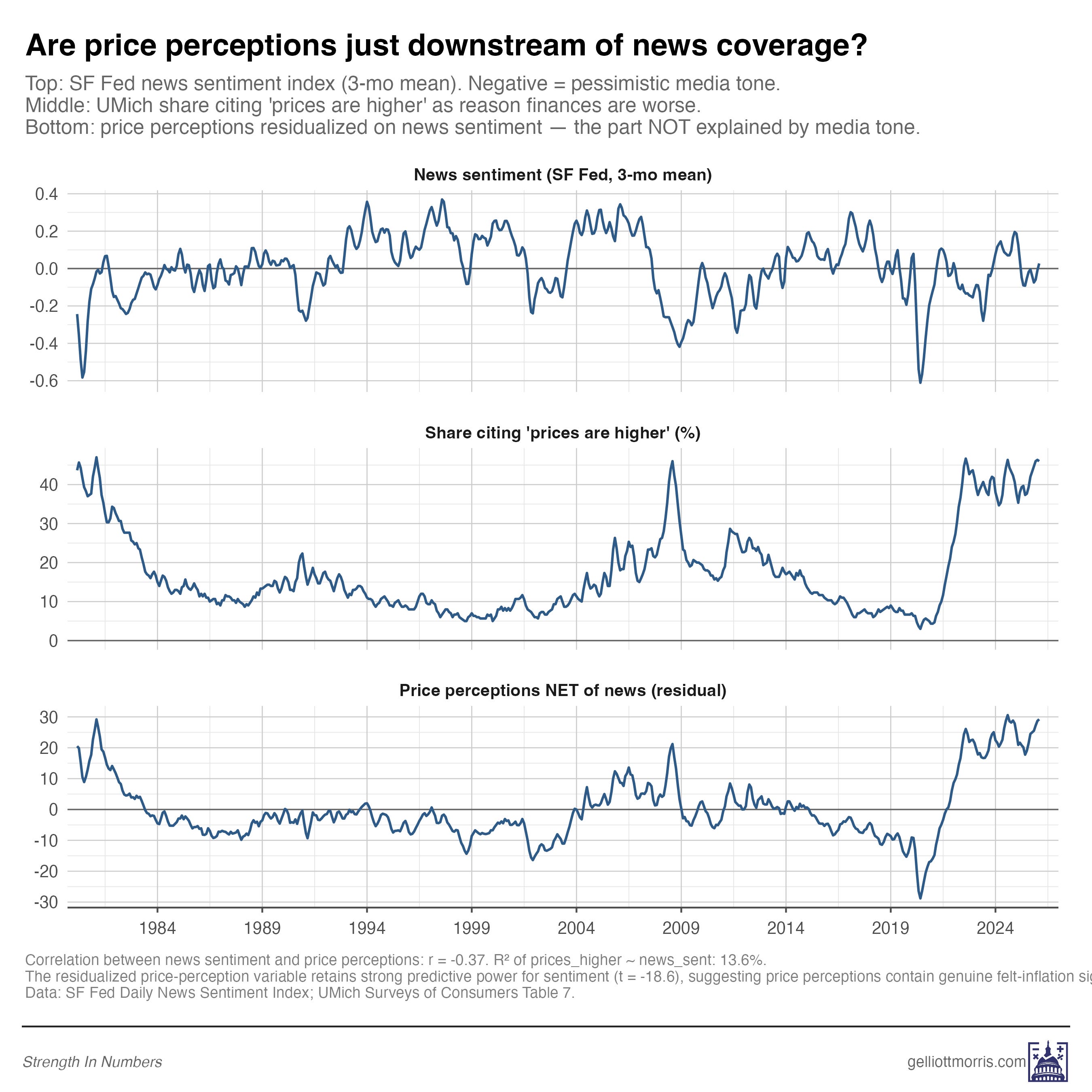
So most of the signal in “prices are higher” responses is independent of media tone. When people tell pollsters that higher prices are hurting them, the overwhelming majority of what they’re reporting is not coming from the news. The inference should be that this is coming from the grocery store, the rental market, and the insurance bill.
2b: What about social media?
One problem with the chart above, however, is that it doesn’t test the role of social media on sentiment at all. The version above only includes news tone, as measured by the SF Fed Daily News Sentiment Index. But a careful reader would point out that Americans in 2026 experience prices through a much looser information environment than just the news. Many people get their impressions of the national economic picture from social media feeds and group chats, too. The SF Fed index captures one slice of the information environment, and a better analysis would try to capture all of it.
That objection is real, and I want to be upfront that the residualization test from earlier doesn’t fully dispose of it. News alone isn’t sufficient to explain the sentiment gap, but news isn’t the whole information ecosystem either.
The broader evidence, though, still points to something more layered than a purely mediated story.
First, the structural excess-prices model explains most of the 2022-2024 sentiment collapse on its own, without any information-environment variables in the mix at all. The Model 2 residuals shrink by 60% versus the baseline, and have little bias when compared to the trend (just 5 index points in 2025). So there’s evidently not a large independent role for the information environment to play, anyway.
Second, even when you do let media tone into the model, the part of price perceptions that isn’t explained by news coverage is still significant, and it still outperforms news sentiment all by itself in explaining consumer sentiment. That’s the residualization test: If the only thing happening in the survey responses were echo of the media tone, that residual should be statistical noise.
But third, and this is the part I think is most directly contradictory to the strongest version of the media-ecosystem theory: if exposure to political and media communication were the primary driver of price pessimism, we would expect the most-engaged Americans to be the most negative on prices. They are not:
The most-engaged Americans are less negative on prices, not more
If political coverage and social media really were driving sentiment downward, then the people most exposed to that content should be the ones most negative on prices. We can check that directly with our own polling data.
In October 2025, I asked 1,567 respondents to our Strength In Numbers/Verasight poll how closely they follow political news, on a four-point scale from “never” to “all the time,” as well as two other questions we can consider proxies for news sentiment (1) “In your opinion, what is the most important problem facing the nation today?” and (2) “Do you approve or disapprove of how Donald Trump is handling prices/inflation?”
We are going to load up this data and see if people who follow the news more often say prices are more important to them, and rate Trump more negatively on the issue. We are also going to load up the response data for my yet-to-be-released April survey, which asked how often respondents post or comment about politics on social media, from “never” to “every day.” The results are shown in the graphic below:
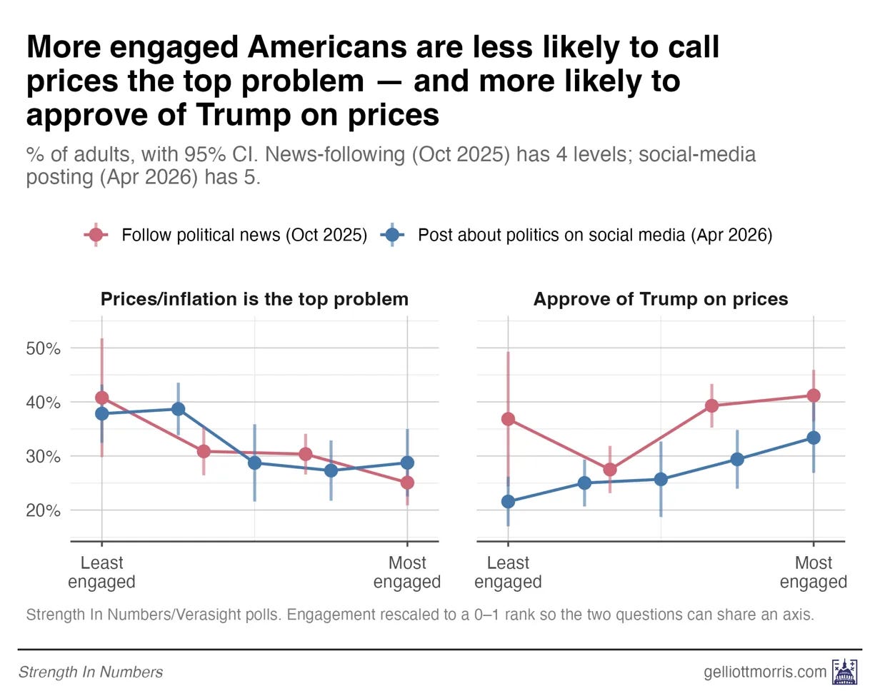
Among the least-engaged respondents in our poll, 41% named prices or inflation as the single most important problem facing the country today, whereas among the most-engaged respondents, only 25% did. That’s a 16-point gap — in the opposite direction of what the echo-chamber theory would predict. The Americans who watch the most news and spend the most time on social media are the LEAST likely to say prices are important and the MOST likely to approve of Trump’s handling of them. People who aren’t online are the most focused on prices and most disapproving of Trump.
To be sure this result wasn’t noise, I ran weighted logistic regressions controlling for three-category party ID and a seven-point liberal-conservative scale. The effect persists: Each step up the engagement ladder cut the odds of naming prices as the top problem by about 13 to 15%, even among respondents with the same partisanship, ideology, race, and income.
I got the same effect on Trump’s approval for handling prices: Each step up the engagement ladder raises the odds of approving Trump’s handling of prices. High-engagement Americans, in other words, absorbed the more positive partisan messaging on the economy. Less-engaged Americans, who consume less of that messaging, are the ones putting prices first.
To be fair, MIP and Trump approval on prices are not direct measures of personal finances in either of these polls. But the basic finding is hard to square with the echo-chamber story, where you’d probably expect MIP to be correlated with negative price sentiment.
The people marinating in news and social media are not more focused on prices, they are less.
People are telling us directly that they care about prices!
I just want to underscore something before concluding, and that is that we don’t really need to be doing all this fancy modeling to explain consumer sentiment. We can just ask people what they think, and believe them! Much of the discourse about the “sentiment gap” assumes that the economic statistical models are right and the people, in aggregate, are wrong in how they’re thinking about the economy.
But what if we flip that on its head? What if the national statistics are just.. missing something?
When you ask Americans who say that their personal finances are worse than a year ago, why they say that, a record high 54% in April 2026 say it’s because of prices. To put that in historical context, here is the full 65-year history of the series (only up to February, since UMich hasn’t updated this plot yet):
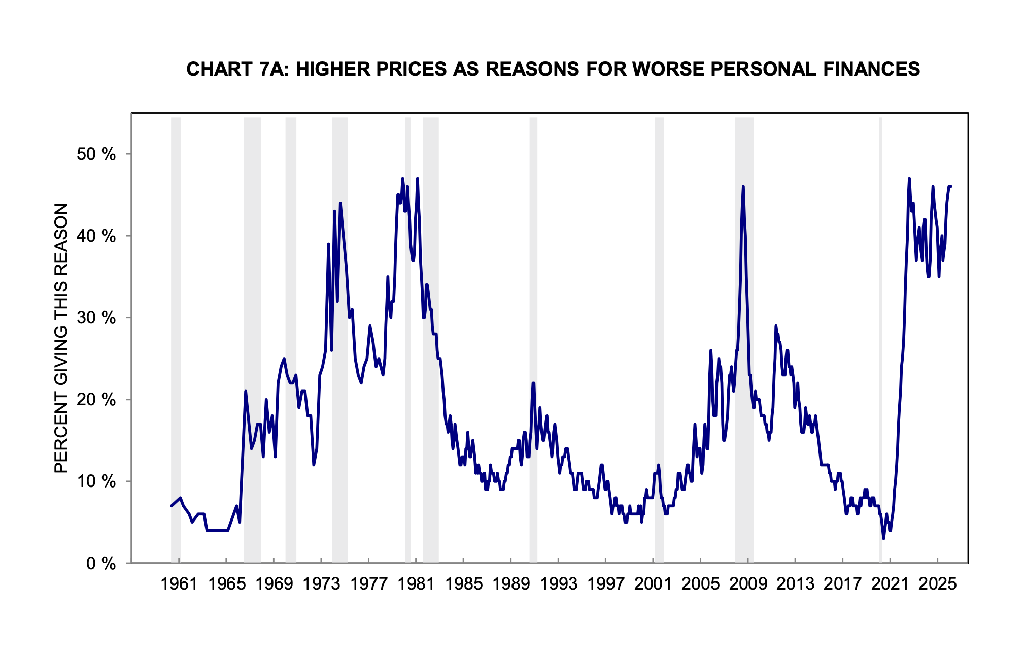
The current reading isn’t just elevated, it is at a level the series has only really matched a few times before, during the inflation shocks of the mid-1970s, during the Volcker years around 1980, and briefly in 2008-09 (when, fair enough, the “high prices” answer was probably overlapping with a massive panic over job losses).
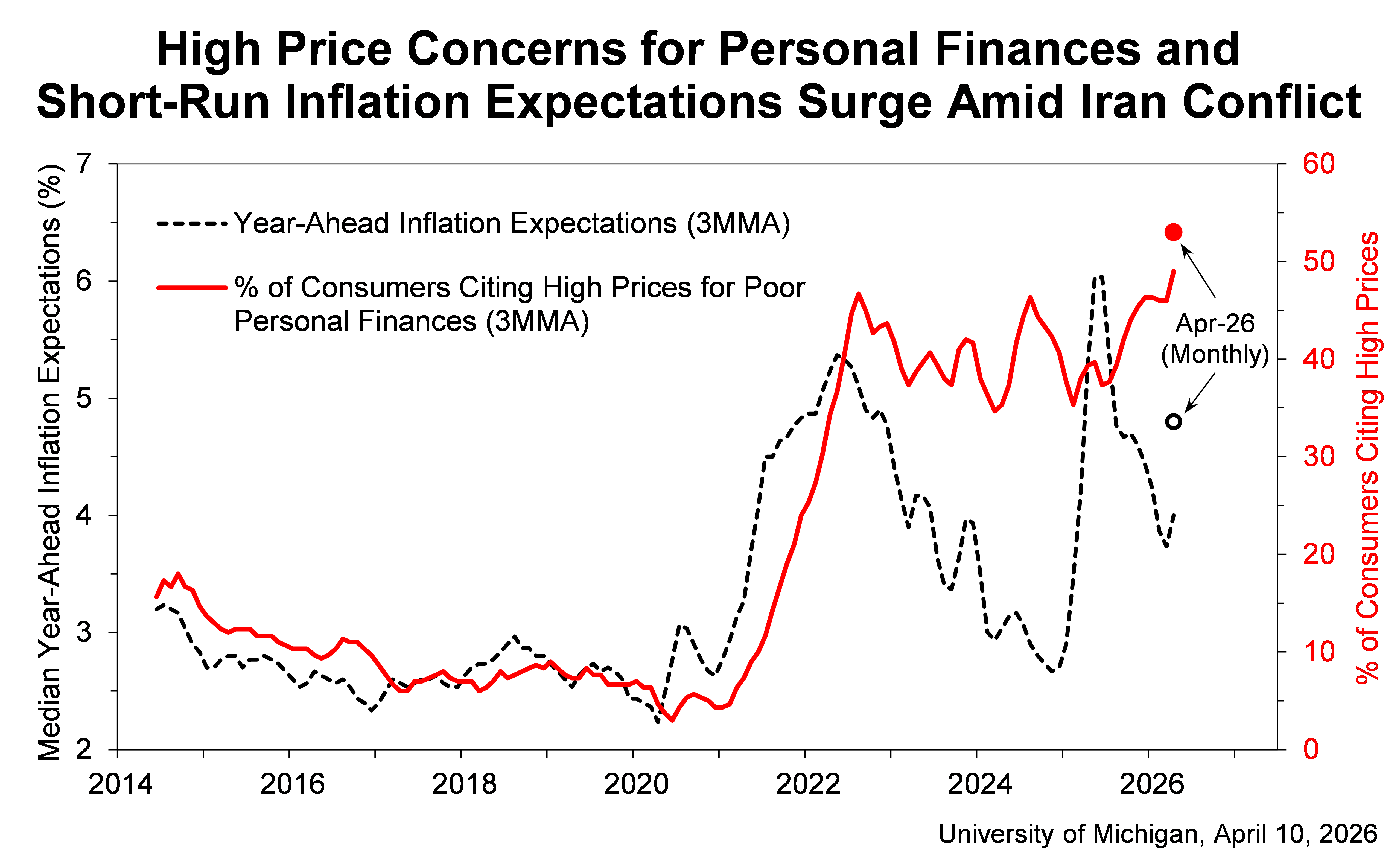
Zooming in on recent history below, the current spike has held at roughly that 1970s level even as headline inflation has fallen from 9% back to something near 2%, and even as inflation expectations themselves have come down. Look at the same series since 2014, plotted alongside year-ahead inflation expectations:
For nearly three years, in other words, the share has been hanging out near the worst sustained stretch of stagflation in modern American history.
That alone would explain the historically bad consumer sentiment very well (as shown in my model 4)!
And yet, in each of these previous spikes, nobody was arguing that the price anxiety was somehow fake, or media-manufactured, or a vibes-based illusion. Inflation was genuinely terrible in 1974, 1979, and 1980, and a lot of Americans really were losing their jobs in 2008. We did not need to construct elaborate theories about why people were misperceiving the economy — people were, in fact, perceiving the economy correctly. This polling at least suggests the possibility they are doing so today, if you get out of the habit of viewing the economy only through the lens of unemployment and year-over-year inflation in the PCE.
And there is, I think, the broader point. To argue that we should ignore what people are telling us directly about prices, you need a pretty strong argument that the polling data is biased, AND an otherwise very convincing explanation for why consumer sentiment is now seemingly divorced from the usual economic statistics (I say “the usual” because my argument is that people just needed to be a bit more creative here).
But what they have offered instead is a series of much more elaborate explanations — that respondents are polluted by Twitter, that they are ignoring their otherwise healthy bank accounts because of news coverage, that some latent vibe variable is doing the psychological driving for fifty million Americans — that turn out, when you actually run the numbers, to be either weak, contradicted by the data, or both.
Here, we may just want to rely on our old friend Occam’s razor and accept the most parsimonious explanation. People are telling us, in numbers comparable to the worst stagflation stretch in living memory, that prices are wrecking their personal finances. They are telling us that consistently, across polls with different question wording produced by different firms, and on their own in social media posts, interviews, and conversations with their neighbors in day-to-day life.
People are telling us they’re upset about prices even as the rate of inflation has moderated and even as media coverage of inflation has cooled off. And if you look at the structural data on excess price levels, they really have a point.
Until somebody produces a good, empirical reason to ignore what millions of people are saying every day, I think the burden of proof sits firmly with the people arguing we should.
Excess prices explain most of the gap in consumer sentiment
To recap what we have so far. The same model that explains post-2020 sentiment also fits the 1970s within a few RMSE points. Price perceptions still predict sentiment after stripping out the news-explained component. And the most media-engaged Americans are less likely to name prices as the top problem, not more. Excess price theory looks like a solid empirical explanation of consumer sentiment, while “social media and news contagion effects are driving dissatisfaction” does not.
Yet this model still has clear limits, and I want to be upfront about them.
The biggest one is this: Model 2 fits 2022 through 2024 quite well — residuals under 7 points across all three years, and 2024 is nearly perfect at +0.6 — but it misses 2025 and 2026 by about 11 and 12 points, respectively. That’s about the same size as the misprediction in the early 80s, so not unheard of, but still worth addressing. Over the last 6 years, excess prices explain the original collapse in sentiment from 2022 through 2024. But they do not explain the renewed softness over the past 18 months. If I’m putting on my speculation hat, that gap is presumably the result of cumulative Trump-related shocks to the global economy (tariffs have created a lot of price pressure and uncertainty that is only just now really impacting aggregate statistics), and it’s possible that news and social media play a role in this remainder, too!
So, a few things this analysis does not prove, and that I am not claiming:
It does not show that prices are the only driver of sentiment.
It does not show that media coverage has no effect — only that price perceptions contain a large signal that is independent of media coverage.
It does not show that spending time on social media inundated with posts about prices has no effect on your psyche. But it does show that people who spend less time on social media are actually more negative about prices.
It does, though, show that excess prices outperform the rival explanations I tested — news sentiment and conventional macro fundamentals — across two very different inflation regimes.
The strongest version of my claim isn’t “prices are the whole story.” It’s that prices beat the competing explanations, and they explain most of the gap.
But the research in this article does show something important that I think people should acknowledge: While the consumer-sentiment gap is not well explained by the standard macro story, a model built around the excess level of everyday prices — food, shelter, transportation, the things people actually buy on a weekly basis — explains much of it. And it explains far more than news sentiment or social media habits do. Plus, it survives a much harder historical test than I honestly expected when I started the project. The fit to the 1970s, with the same coefficients trained on different data, is the result that surprised me the most.
And a broader lesson of this exercise may be that economists and political commentators are very often tracking the wrong numbers, in large part because they aren’t looking at the data that is closest to the people, and that data that best proxies their current anxieties.
In my Tuesday article, I used the metaphor of the drunk man looking for his car keys under a lamppost:
Macroeconomists who insist that the unemployment rate is low, the stock market is up, and Americans should therefore be feeling fine about the economy are a little like the old joke about the drunk searching for his car keys under the streetlight. He’s not looking there because that’s where he dropped them. He’s looking there because that’s where the light is.
Here, the data on how people actually feel about the cost of living — aggregated from individuals’ lived experiences — is over in the dark, and analysts by and large are not all that interested in walking over to it.
Political commentators focus almost reflexively on aggregate statistics and on rates of change. Inflation is down! Wages are up! Unemployment is low! The stock market is near a record! Those are all genuinely true statements about the economy in 2026. They are also, it turns out, evidently not the things people actually care about when determining their views on the economy.
So when analysts keep insisting that the unemployment rate is low and Americans really ought to be feeling fine, and Americans keep responding to surveys saying that, no, actually, things are bad — the gap between those two stories is not measurement error. And it is not, broadly speaking, a vibes-based illusion. It is a category error. Economists are tracking the wrong variables. How people actually say they feel is the ground truth of sentiment, not what you can predict with a model.
If you want to understand why Americans still say the economy feels bad, even though the rate of inflation has come back down to something like normal, the first place to look is not cable news, or social media, or the irrationality of the median voter. It is the price level that people are still paying at the pump, at the grocery store, at the bus station, day in and day out. That number is bigger than it used to be.
Until someone shows otherwise, we can just believe Americans when they tell us the following: they’re stressed out because things are expensive. And if you look at the data correctly, that’s a valid explanation.
If this analysis was useful to you, consider supporting this work with a paid subscription. Paying members of Strength In Numbers get weekly premium posts, bonus podcast episodes, and the satisfaction of supporting independent data-driven political journalism — including our monthly poll (that subscribers can add questions to!).
>> "I just want to underscore something before concluding, and that is that we don’t really need to be doing all this fancy modeling to explain consumer sentiment. We can just ask people what they think, and believe them! Much of the discourse about the “sentiment gap” assumes that the economic statistical models are right and the people, in aggregate, are wrong in how they’re thinking about the economy. But what if we flip that on its head? What if the national statistics are just... missing something?"
OMG, THANK YOU! I really, really wish more folks who are talking about this issue took the time to include this point.
I would recommend looking at this index https://www.primerica.com/public/household-budget-index.html.
Unfortunately they havent updated March or April yet. This intuitively feels right compared to Michigan since people's budgets actually did better under COVID and crashed in the immediate post COVID world before stabilizing.
I am hoping they backfill the trend pre 2014.