

A very detailed map of Trump's job approval
Explore our new interactive map of Trump's job approval, powered by 12,000 survey interviews conducted in 2025 and 2026

This is an extra Thursday post with a quick note about yesterday’s poll and a link to a new interactive tool I’ve been building for the past few months.
Also, I’ll be doing a live conversation about this and other numbers with my friend David Nir of The Downballot today (Thursday, Jan. 22, 2026) at 2:00 PM ET. You will be able to watch live using this link, or just go to the Strength In Numbers homepage. Thanks!
A new poll and new tool for exploring how Americans feel about Donald Trump
Yesterday, we released our latest Strength In Numbers/Verasight poll showing Trump at a 40% approval rating, his worst mark yet. At a -18 net rating, he is even losing ground on his signature issues: The president is now at -12 on his handling of deportations, and -9 each on immigration and crime/public safety. Lots of other interesting stuff in the poll, which I encourage you to read.
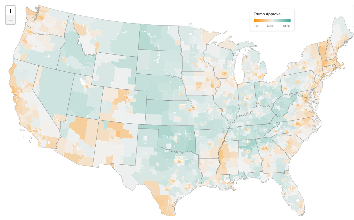
On to today’s business: Over the past few months, I have been working behind the scenes on a big interactive map of Trump’s approval at the local level. National polls are useful for tracking the overall trend, but they can obscure just how much variation exists across the country. A 40% national approval rating doesn’t mean 40% of people everywhere approve, and where disapproval is higher tells us something important for narration and electoral strategy. If Trump is losing ground in cities experiencing an ICE surge, for example, or in Hispanic-heavy areas in the Sunbelt, that gives us another angle through which to explore the consequences of his presidency on public opinion.
So, behold, a very interactive map of Donald Trump’s approval rating. In fact, I believe it is the most detailed public map of the president’s approval rating ever generated:
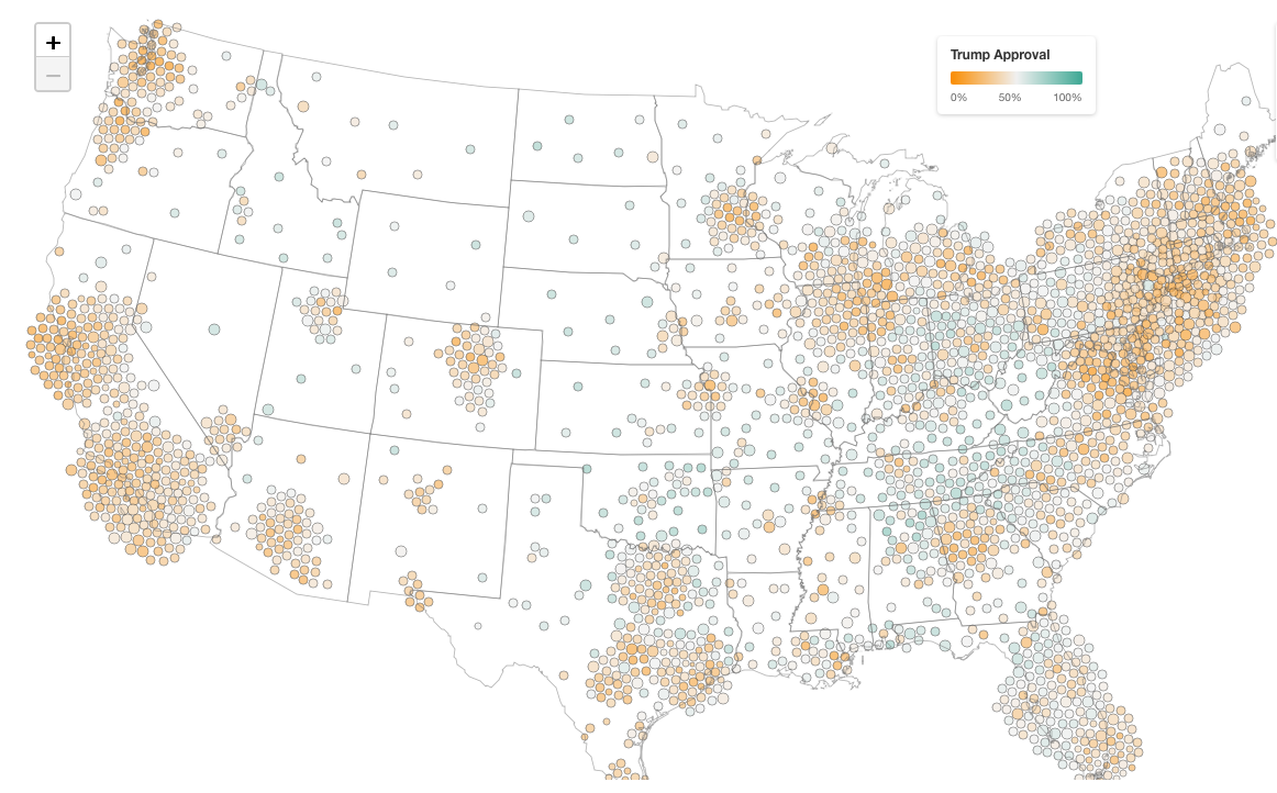
For those of you who don’t like conflating sagebrush and people, the interactive also has a cartogram mode:
Survey-based, model-driven
This map is generated by a statistical model that combines over 12,000 interviews we’ve conducted with voters over the past six months with other data on what type of people live where, and who they voted for in the past presidential election, and comes up with estimates of how people feel about Trump today.
Specifically, we take demographic data from the Census and precinct-level election returns to project sentiment down to small geographic areas called PUMAs — Public Use Microdata Areas, each containing roughly 100,000 adults. The model we use is called an MRP model, which stands for multilevel regression and post-stratification.
The basic idea is that we fit a model predicting approval based on demographics and geography, then use Census data to weight those predictions by the actual population composition of each area. Election results are used to calibrate estimates to sensible baselines, so we have a real-world check against our survey data. It lets us produce reliable estimates even for places where we only have a handful of direct survey respondents.
The result is a map with over 2,400 local estimates of Trump’s approval rating. Hover over any geography to see the estimate and margin of error.
There are a lot of great resources out there for understanding how MRP models work. Here’s one from YouGov, which has used similar techniques to successfully forecast presidential and congressional elections in the past.
Demographic data too!
Because we have Census data on the types of voters that live in every PUMA (race, age, education, income, etc), our model also makes projections for Trump’s approval rating at the demographic level. So you can explore how approval breaks down by demographic group.
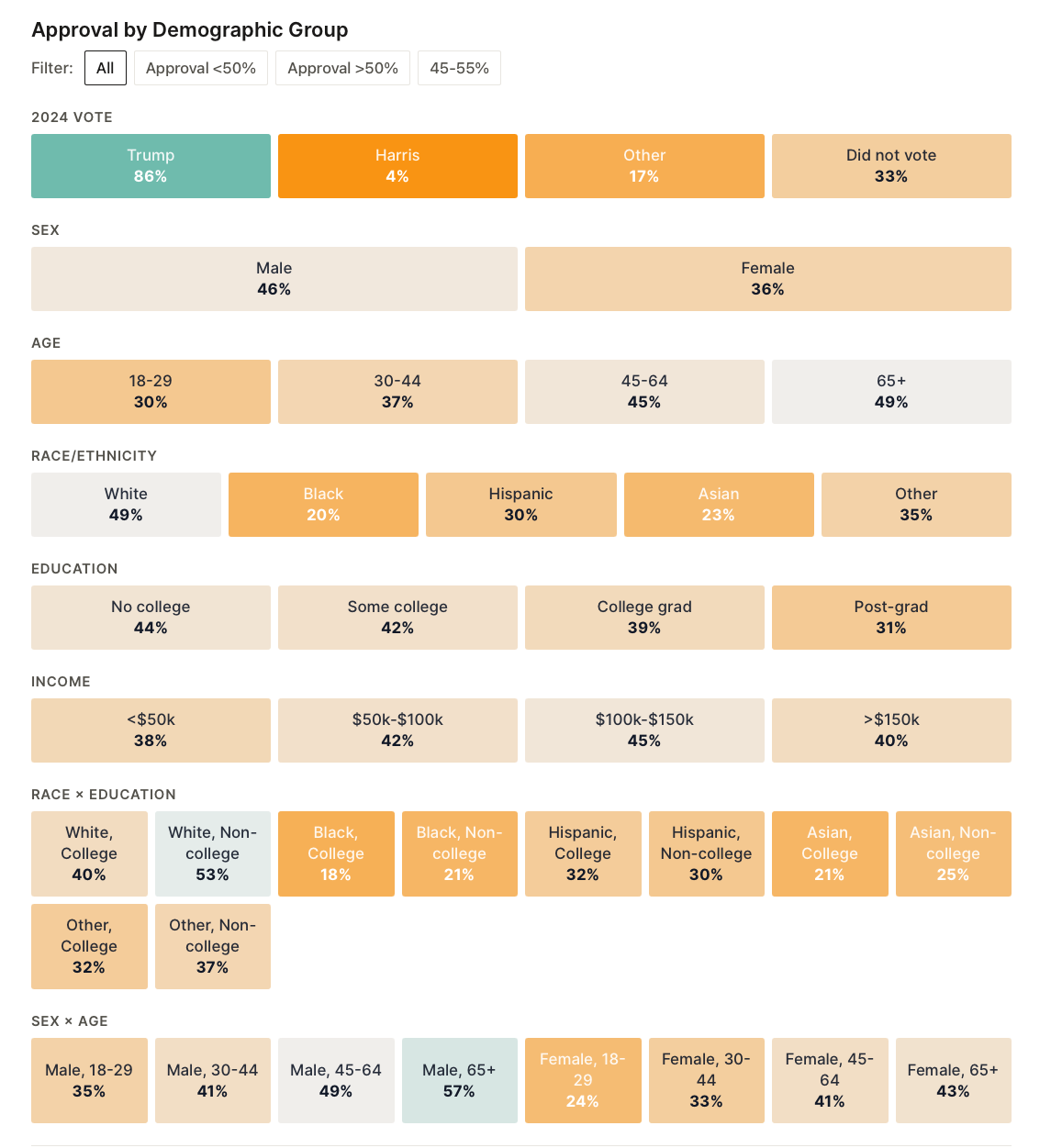
Party identification is, unsurprisingly, the single strongest predictor of how Americans feel about Trump today— Republicans and Democrats live in almost entirely different political universes. But the race and education gaps are also notable. You can toggle through breakdowns by age, race, sex, income, and 2024 vote choice to see where the biggest polarization gaps emerge.
I’ll be updating the estimates as we collect more data each month, so bookmark it if you want to track how local sentiment shifts over time.
Check it out here: Strength In Numbers/Verasight Trump approval tracker.
And if you haven’t read yesterday’s poll analysis yet, that’s here: New poll: Trump loses ground on immigration; Dems lead 2026 House vote by 8 points
And, finally, if you get value out of big interactive data journalism like this (that nobody else is doing!!), please support Strength In Numbers with a paid subscription:
His approval rating should be in the single digits at this point. The fact that 40% of the population still supports him, his abhorrent appointees, their vile policies and the overall collapse of the country means that we are doomed
Love the new interactive DT localized approval rating map! Thank you!!!! This will be helpful to candidates in suppressed states like mine.
And I appreciate you providing an option for those of us who don’t like “conflating sagebrush with people.” (Excellent phrasing, btw.) Hope to catch your live this afternoon.