

It's the prices, stupid
Consumer sentiment is at an all-time low because prices are at an all-time high. The UMich index isn't broken, popular government data just offer an incomplete picture of what people care about

This week’s Deep Dive is a follow-up article to my posts from Sunday and Friday. You don’t need to read them to understand this piece, but they might give you some more context for what I’m doing here and why.
My Tuesday Deep Dive is a weekly premium article for paying subscribers of Strength In Numbers. Subscribers get exclusive posts at least once a week, plus early access to new data releases and bonus podcast episodes.
EDIT: After you read this, read part 2 here.
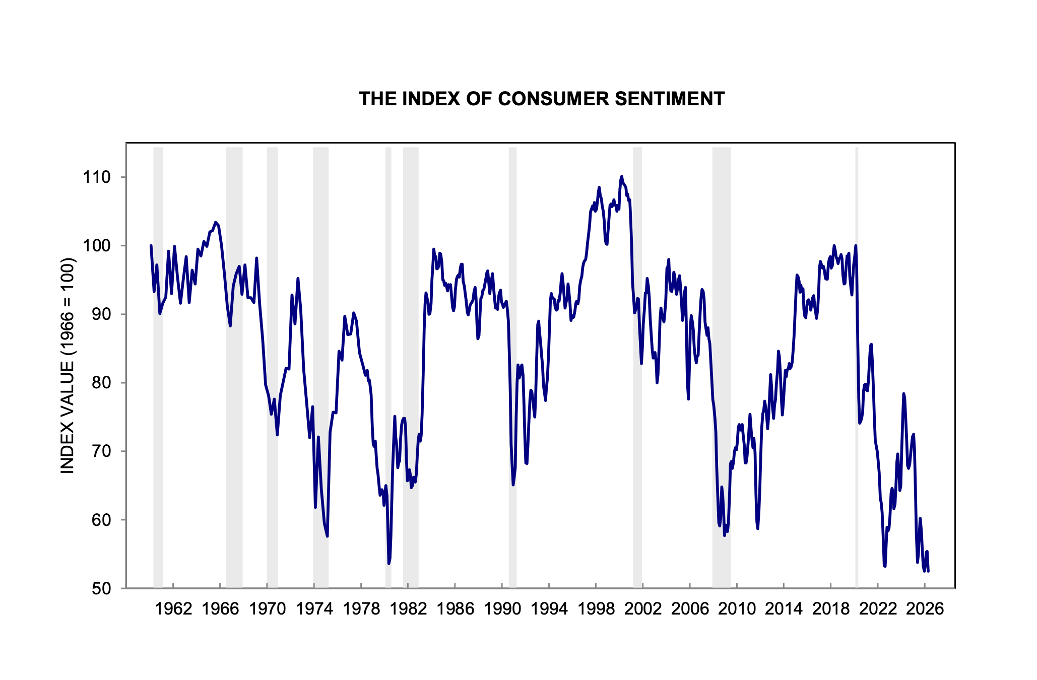
The economist Jared Bernstein and I were not colluding on Sunday when we both wrote about the effects of long-run inflation on consumer sentiment. I guess the topic was on our minds because the new University of Michigan Index of Consumer Sentiment release last week was literally the worst release ever in the history of the survey:
Here’s Bernstein’s post:

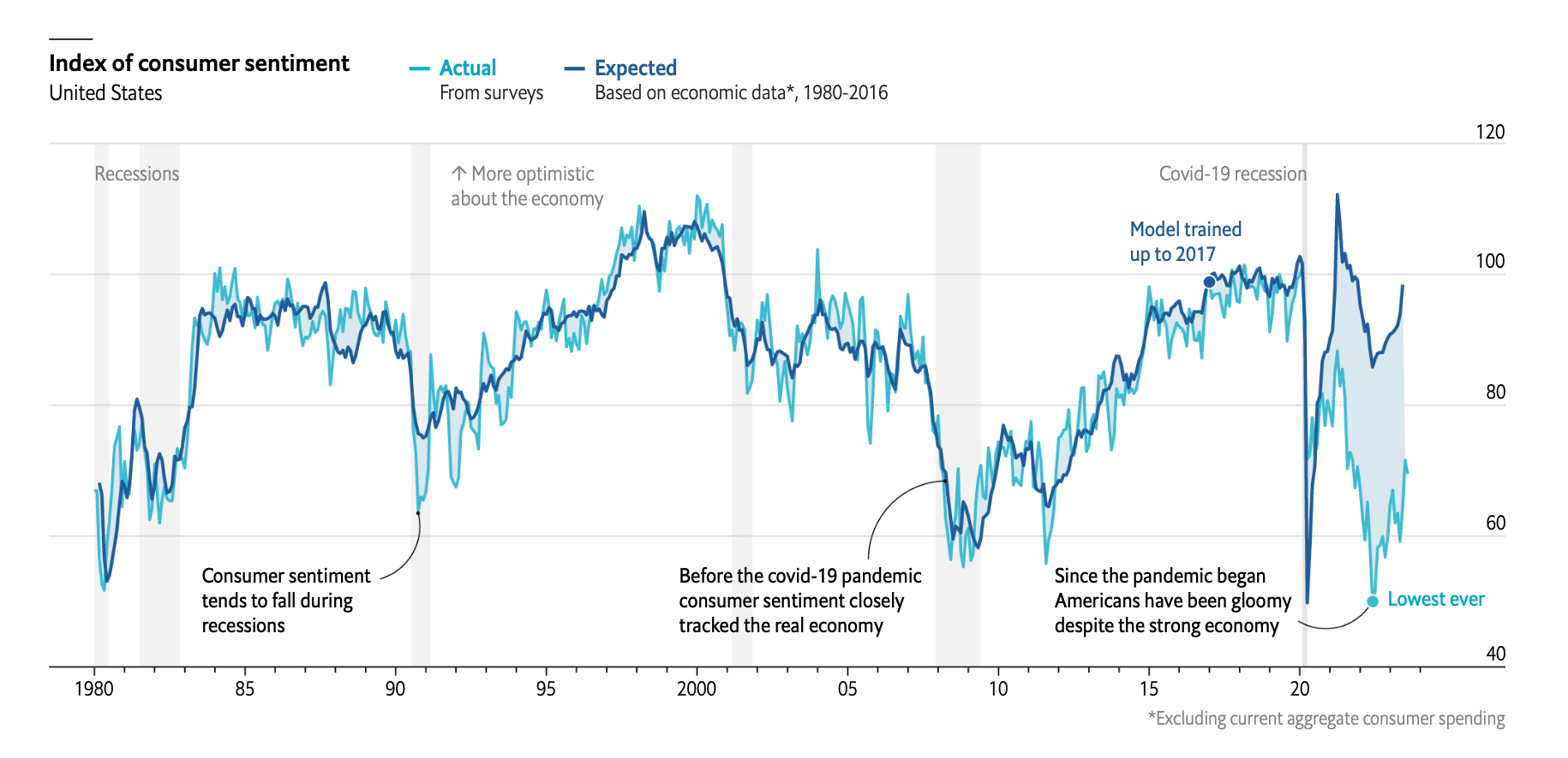
Bernstein and I are both writing about a popular puzzle of economic statistics right now: the broad disconnect between objective indicators of economic growth and consumer sentiment. Here is a chart from The Economist that really illustrates what we’re exploring in this discourse:
People have given various explanations for this disconnect, as I wrote on Sunday. One camp of analysts argues the economic statistics should be believed — that Americans are ackshually fine and the differential is entirely psychological, a product of negative news and social media sentiment.
The strongest version of this argument — call it the Stancil view, after Will Stancil, its loudest proponent on Bluesky — goes roughly like this. The unemployment rate is historically low. Real wages are rising. The stock market is near all-time highs. GDP is growing. By every standard macro yardstick we’ve ever used to measure whether Americans should feel good about the economy, Americans should feel good about the economy. If they don’t, the problem is not the economy. The problem is that they are being told — by cable news, by social media, by partisan operatives, by doom-curious podcasters — that the economy is bad. Under this view, if you strip away the bad-vibes megaphone, sentiment would snap back into line with the fundamentals. In the loudest form of the argument, the “sentiment gap” isn’t real, it’s measurement error produced by the information environment.
A version of this argument was very popular on Twitter in 2024, too, with people arguing the ICS was biased and economic data showed voters would reward Democrats for the post-COVID economic recovery. Welp...
I want to take Stancil’s argument seriously, because the people making it are not stupid, and because parts of it are obviously true. Real wages have outpaced inflation over the last 18 months. Unemployment is low. News coverage of the economy has been more negative than the underlying data would justify (although post-Iran, it’s not clear that’s true anymore).
But as I’ll show below, the Stancil view cannot account for the bulk of the sentiment gap — because even after you control for the news environment, the gap stubbornly refuses to close. Something else is doing the work.
Another explanation for the gap in actual and predicted consumer sentiment is that the vibes are off generally and that this vibes bias is “polluting” (so to speak) responses to surveys. One of my favorite theories is that the vibes are off largely because things are expensive, and you can see pictures of other people buying expensive things on social media, and that makes you feel big sad. People need to stop posting Lambos on Instagram!
But another explanation is that consumer sentiment is down because prices are stubbornly high. This is not something that would be accounted for in official inflation statistics, because those measure year-over-year changes in prices, when what we’re really talking about when we talk about high prices is prices now compared to what they were 3 or 4 or 5 years ago. When the rate of price change goes back down, it’s not like people forget about the original inflation shock.
I talked about this in my interview with Paul Krugman last September:

Back then, I hadn’t dug into the data or done the modeling to really prove (or disprove!) this hypothesis. But now, I think we have the data and analytical strategy to show pretty concretely that low consumer sentiment is being driven by high prices.
One of those variables is what Bernstein posted on Sunday — a new measure of medium-term excess inflation above expectations:

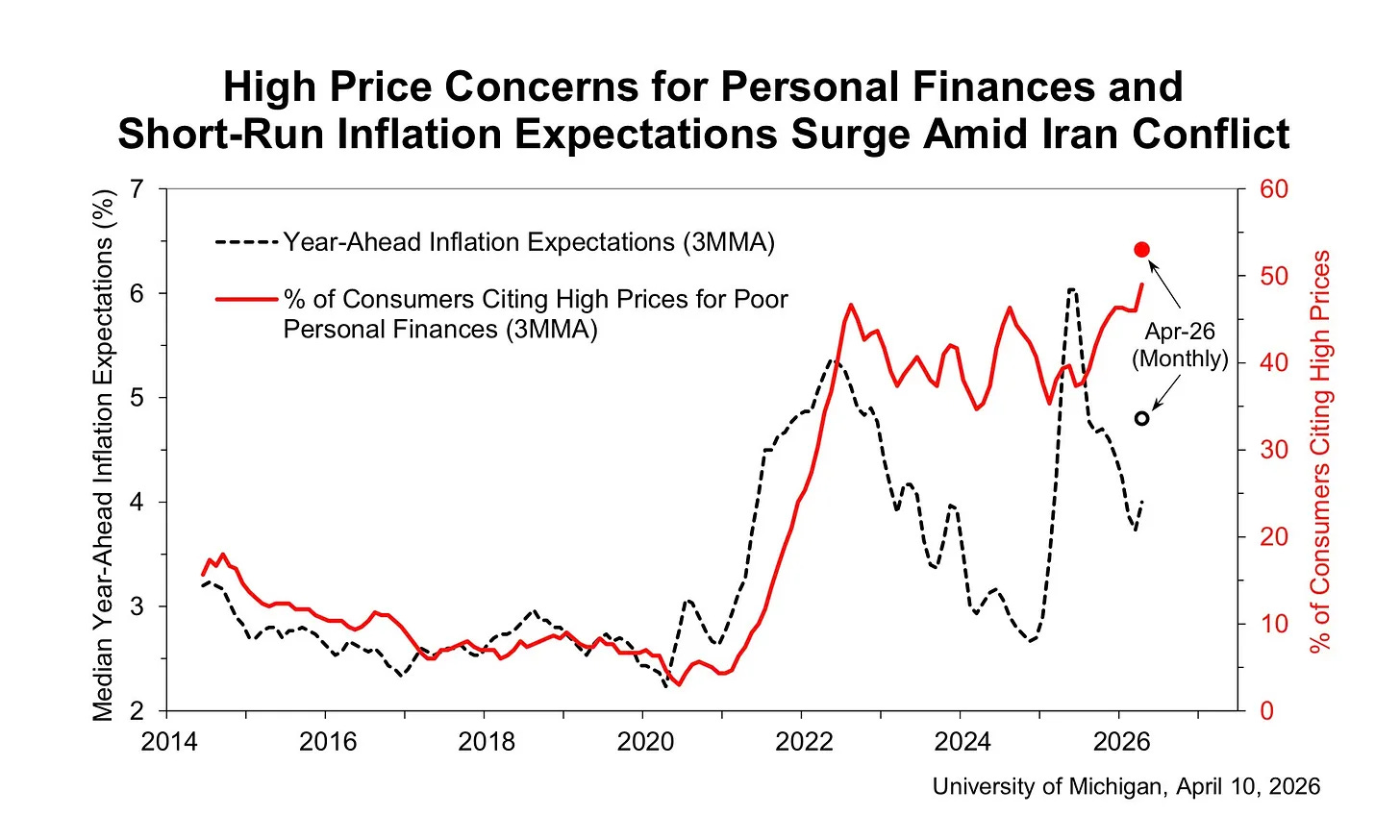
The other is what I shared: the percent of Americans who say high prices are hurting their personal finances is at an all-time high:
The preliminary April reading above is about 54% (that’s 54% of the 50% of people who say their personal finances are getting worse) while the record previously was <50.
So we’ve got two independent measurements of the same underlying dynamic, both flashing red while consumer sentiment plunges. Let’s get real nerdy and dig into the hard data on what actually explains consumer sentiment today.
Here’s the spoiler, so you know where we’re headed: the single best predictor of how Americans feel about the economy is how Americans feel about prices. The second best predictor is with actual structural data on prices. It’s not unemployment, not the S&P 500, not the year-over-year rate of inflation or the tone of economic news coverage. Prices — specifically, the share of Americans who tell the University of Michigan that higher prices are making their household finances worse than they were a year ago — beat every other variable I tried, in every specification I ran, by a comfortable margin. The rest of this piece is me showing my work.
So, why is the index of consumer sentiment so low when aggregate economic statistics are otherwise pretty okay-ish? Because people don’t like paying so much money for things. Yes, it really is that simple.

I’m not going to paywall this article because I want as many people as possible to digest this data and my arguments. But if you have the ability, please consider supporting my work with a paid subscription to Strength In Numbers.
1. Prelude: gas prices and consumer sentiment
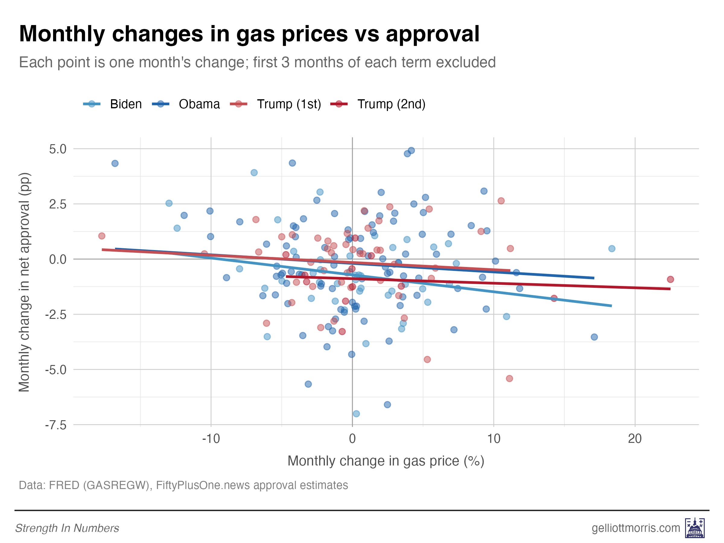
Before getting into all the fancy modeling and data processing for this piece, let me revisit what I wrote on Friday. I showed that there is a negative relationship between gas prices and presidential approval, as shown here:
And I teased the following:
Next week, I’ll take a look at how presidential approval ratings over the last decade have responded to media sentiment. Are voters responding to prices, or news coverage of prices?
Stick with me for a second, because this will be supportive evidence for the main argument in the next section. I built a statistical model to predict the month-over-month change in a president’s approval rating from the change in gas prices over the same period, plus the contemporaneous tone of economic news from the San Francisco Fed.
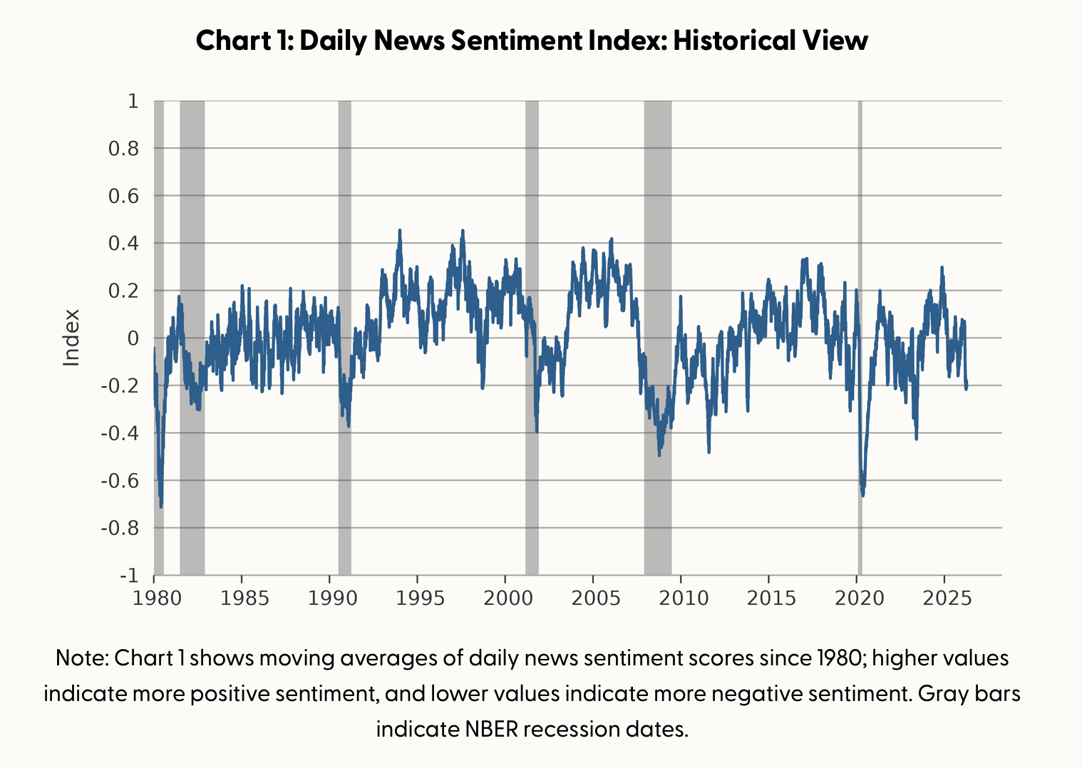
The theory for this model is simple: Expensive gas should drag approval down, whereas a more positive news environment should push it up. And that’s basically what we see. Here are the results by president, across four terms from Obama through Trump 2:
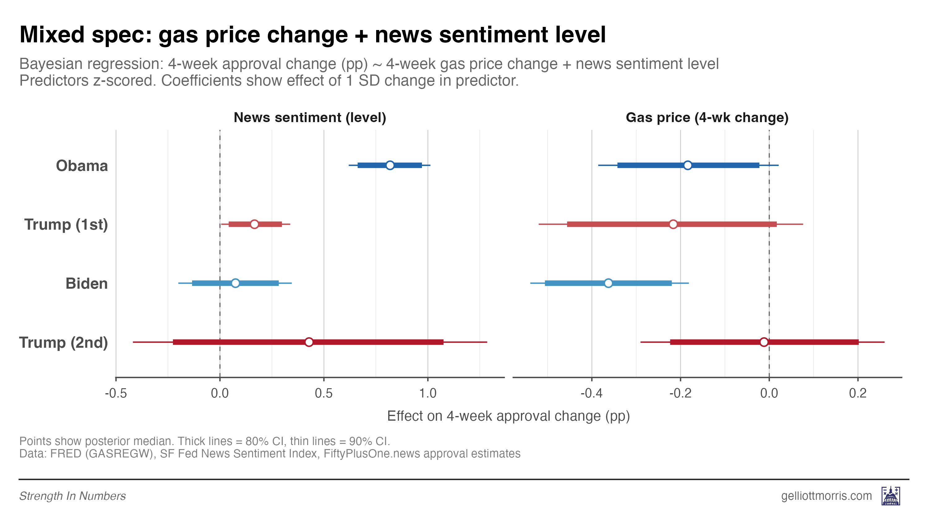
A one-standard-deviation rise in news sentiment — the gap between an average month and an 84th-percentile month — is worth about half a point of approval. A comparable rise in gas prices costs the president about 0.2 points. Some of these coefficients are statistically noisy, mostly because of sample size.
This news sentiment index turns out to be roughly as predictive of presidential approval as monthly change in CPI or the S&P 500. I also ran one model pooling all presidents and adding more macro-economic variables. The results are visualized below. News sentiment is positive and green, inflation and stock market crashes are negative and red.
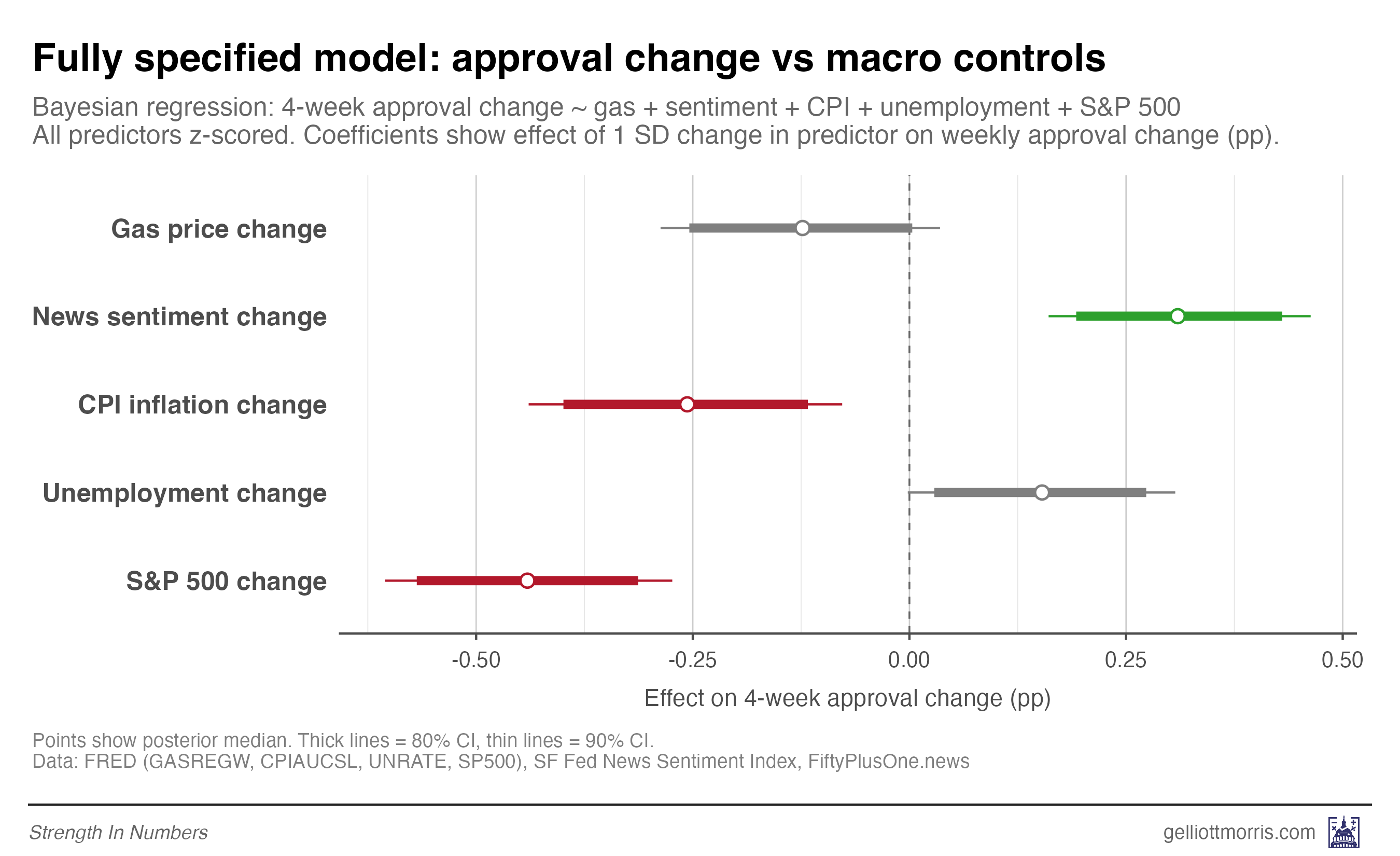
The real lesson from this exercise is that gas prices matter, but they are not the only things that matter. And news sentiment, the other headline variable in this section and the Stancil boogeyman, turns out to be a pretty weak driver in its own right of how people feel about the president.
And if the sentiment of economic news articles is only weakly predictive of how people feel about the president, should we really expect it to fully explain the much bigger gap between hard economic data and the University of Michigan’s Index of Consumer Sentiment? My hunch is that the news-narrative theory simply can’t carry all that analytical weight.
Well, we don’t have to theorize! We can just do math!
2. Anxiety about prices is driving down consumer sentiment
This is where Bernstein and I re-enter the chat. I argue that the disconnect between the official numbers and how Americans feel about the economy comes down mostly to one thing: nominal prices. It’s not the rate of price change that’s bothering people. It’s the level. When you fill the grocery cart, pay the rent, cover the utility bill, or renew the car insurance, you’re paying today’s sticker — not today’s sticker minus last year’s. When you compare what groceries cost today to what they cost in 2019, things still look terrible even though inflation has cooled off. As I said earlier, people don’t forget the original price shock just because the rate of change stopped rising.
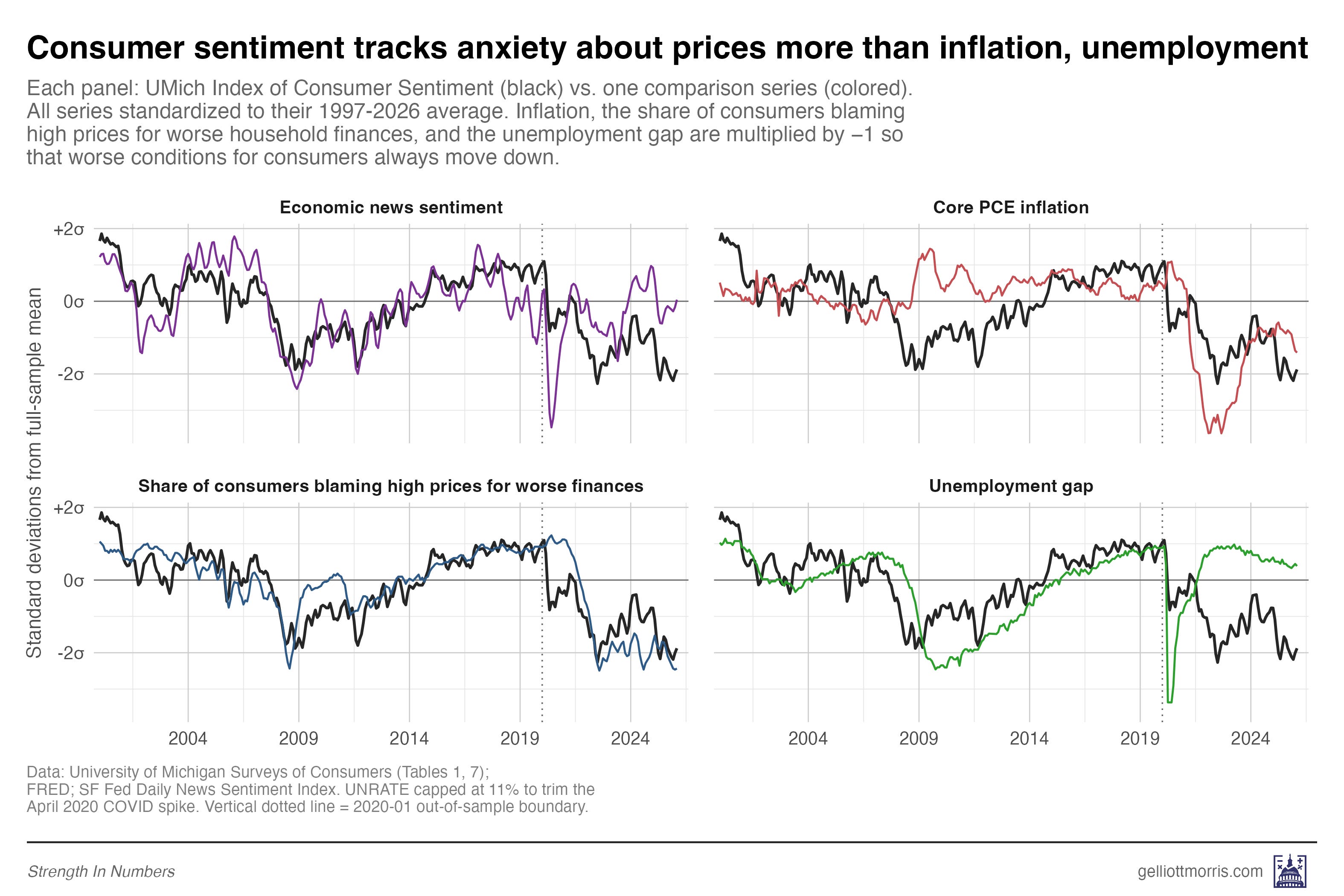
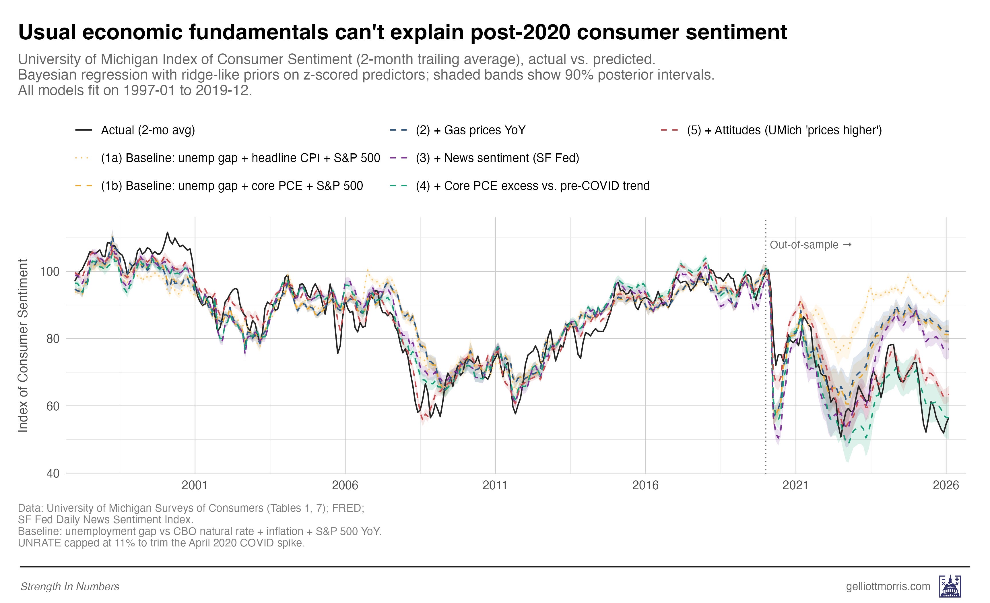
But inflation is a popular data series and the default way people think about prices. And that’s why we’ve only seen charts that look like the following. The black line in this plot is the 2-month rolling average of the UMich Index of Consumer Sentiment (ICS from now on). The light yellow dotted line shows what you would predict the ICS would be based on three variables:
The unemployment gap — how far the current unemployment rate is above or below the CBO’s estimate of the natural rate for a given time period (this helps us account for the long-term secular decline in the unemployment rate)
Year-over-year change in the consumer price index for all urban consumers
Year-over-year change in the S&P 500 — self explanatory
These variables enter a Bayesian predictive model that is trained on all dates from January 1997 through December 2019. Then, based on the relationship between those variables and the ICS on those dates, we can predict what consumer sentiment “should be” for the period from January 2020 to April 2026. That prediction is shown as the thin, dotted yellow line on the chart:
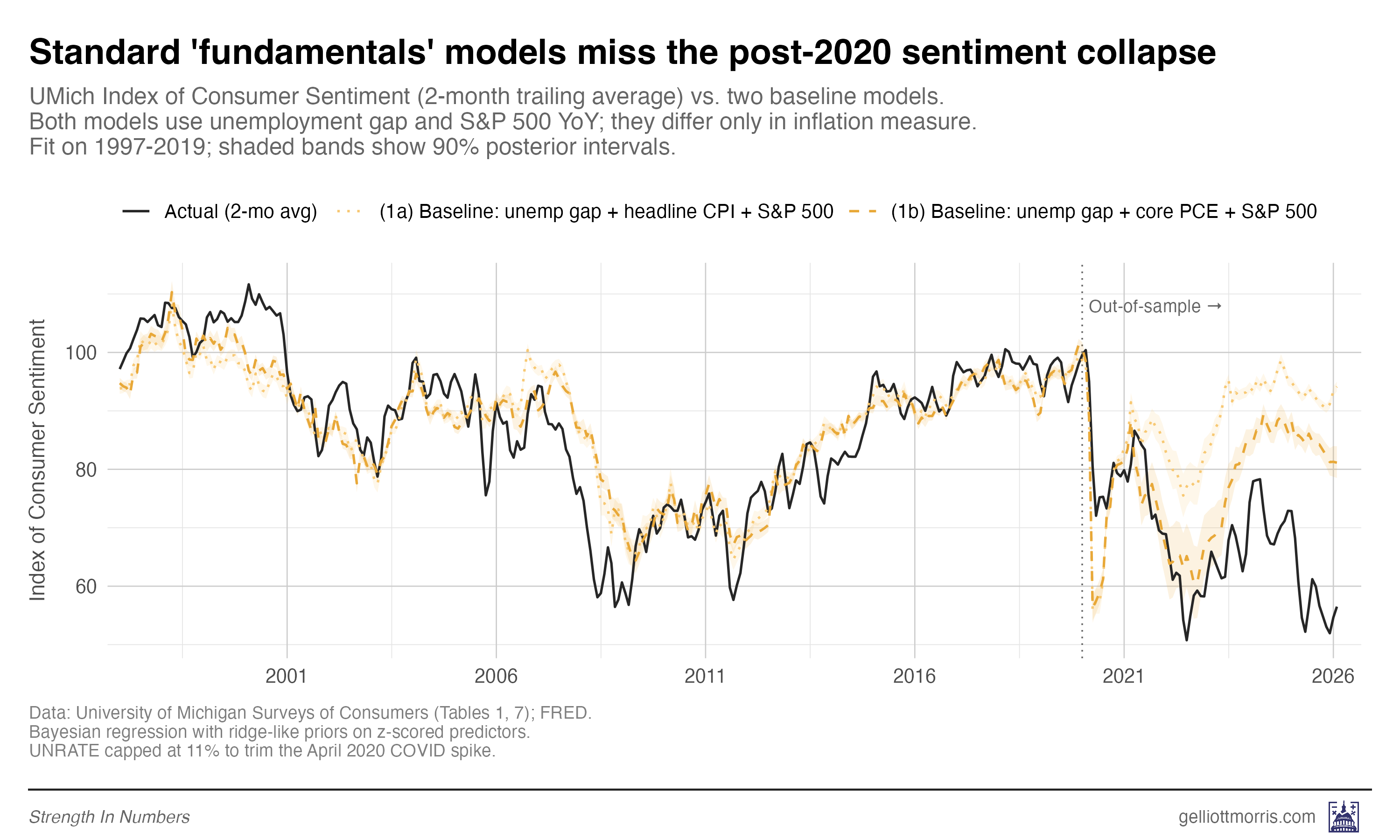
Note the large gap between the thin yellow line and the black line. That’s the gap shown in the Economist chart, and what we’re trying to explain.
But what’s this? Another dashed yellow line below it — that looks like a much closer match to the post-COVID ICS data? That’s right! This model swaps out the change in headline CPI reading for year-over-year change in core PCE prices — the Fed’s preferred inflation measure that omits noisy changes in food and energy. This turns out to offer a much better forecast of prices post-COVID — and also, as we’ll see, in historical back-testing (so it isn’t a fluke).
Now we can start adding other variables into our model to predict the ICS. Instead of just hard national economic statistics, what if we include that news sentiment variable from earlier? Per the chart below, it seems like a pretty good match!
In total, I train six models, each layering in a new variable on top of the last, so we can see exactly how much of the post-2020 “sentiment gap” each piece of the data explains.
Here are the six models, from simplest to most complete:
Baseline using headline CPI: unemployment, headline CPI, and the S&P 500. This is the naive macro setup.
Baseline using core PCE: same thing, but swapping headline CPI for core PCE — as discussed above
Plus gas prices: Model 2 plus the year-over-year change in regular gas prices.
Plus news sentiment: Model 3 plus the San Francisco Fed’s Daily News Sentiment Index, which scores economic news coverage on a positive-to-negative scale.
Plus a measure of cumulative price inflation in the last 5 years: Model 4 plus the percentage gap between the current level of core PCE prices and where the pre-COVID trend said they should be. This is my version of Bernstein’s excess price variable. More on that below.
Plus felt prices: Model 4 plus the share of Americans who tell the University of Michigan that higher prices are making their household finances worse off than a year ago.
And a brief segue on the price trend mentioned in #5. Bernstein runs a linear model on the monthly CPI readings from 2014 to 2019 and then projects what the CPI “should be” for 2020-2026. That gives us a graph that looks like this:
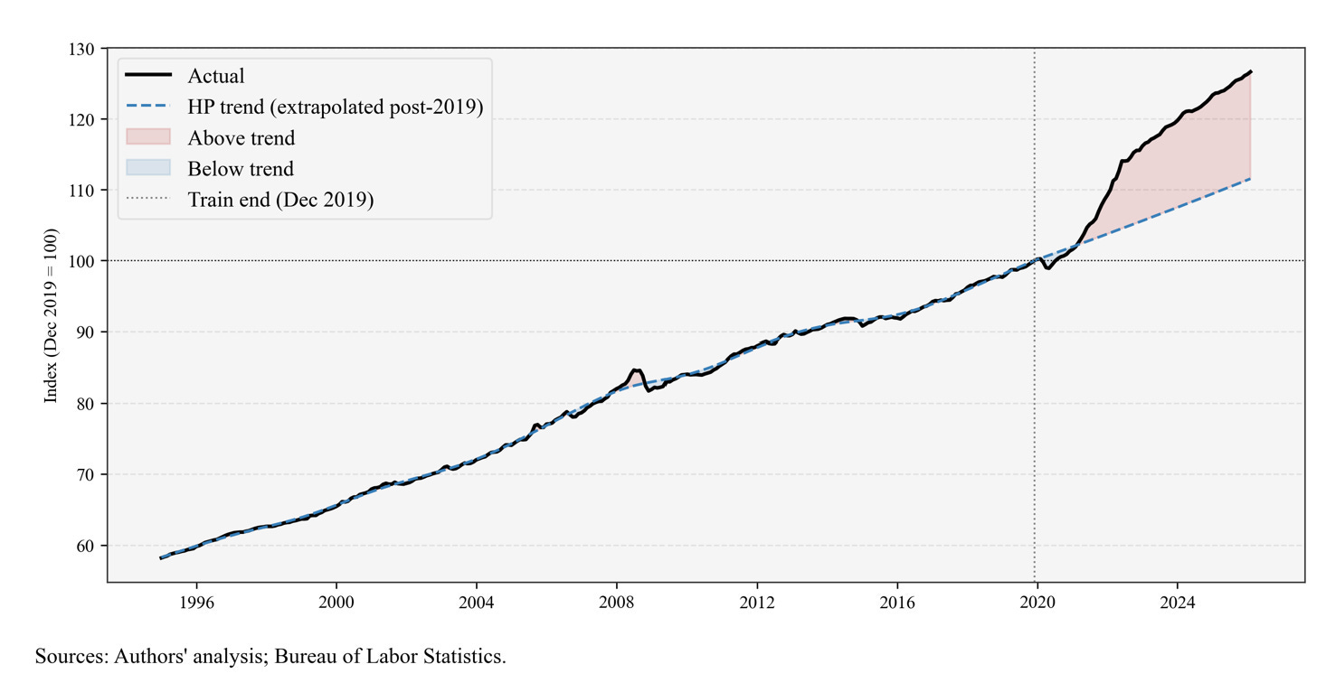
Here is my version of the same calculation, but using Core PCE instead, since I found it’s a better predictor of consumer sentiment:
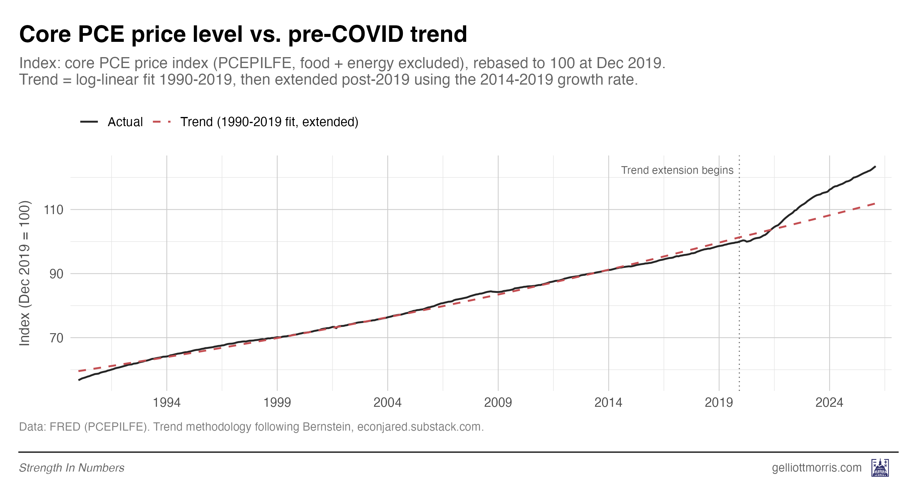
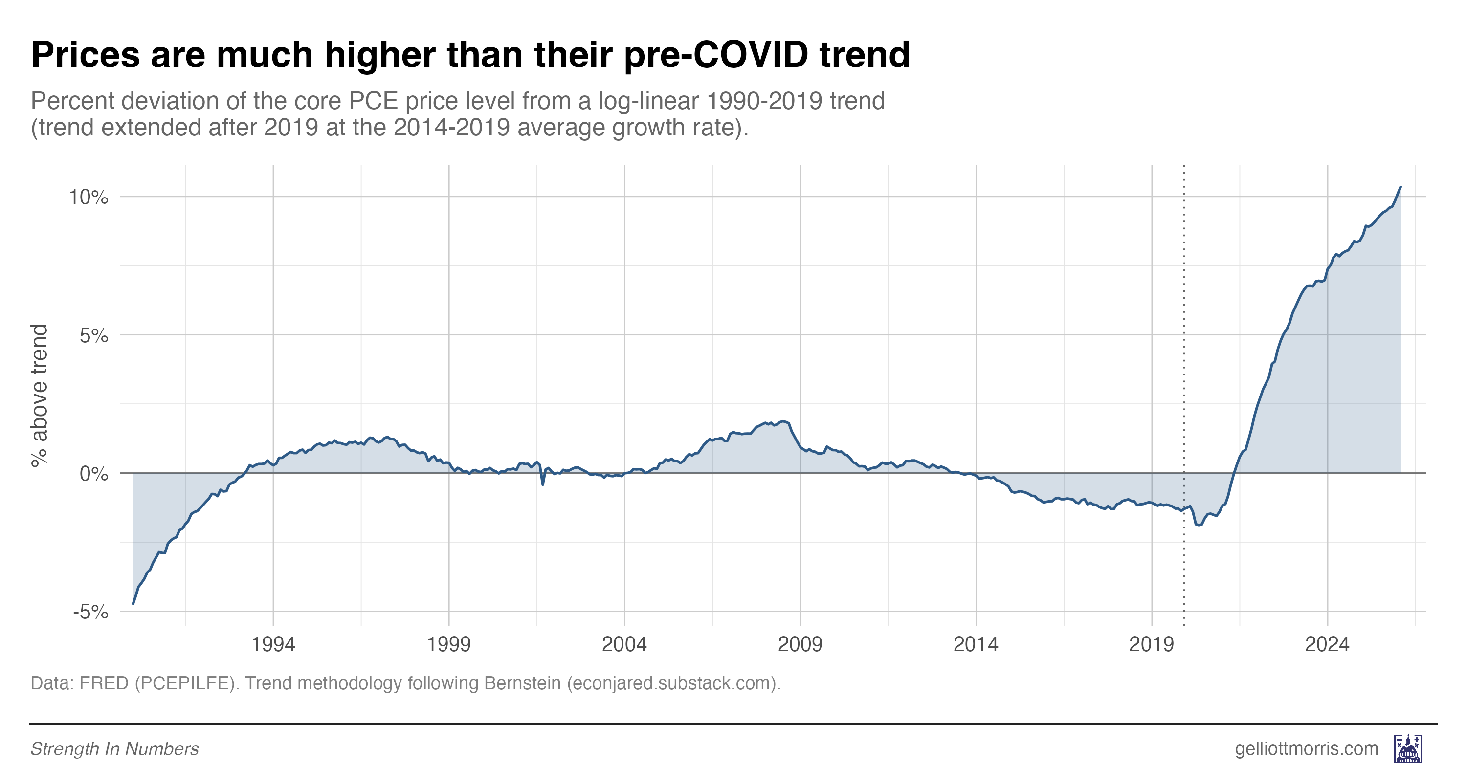
The gap between the black line and red dashed line in the plot above is a measure of how much extra Americans are paying for everyday goods and services than they would have if inflation had stayed steady at the normal 1990-2019 rate (around 2%). Even though inflation has cooled off, prices as measured by the PCE are still 10% above what they would be under the pre-COVID trend. You can see that clearly here:
So now we’re gonna run all our models: the standard fundamentals models, the fundamentals plus gas prices, plus news sentiment, plus excess price inflation, plus attitudes (the percent of people saying high prices are impacting their finances).
Here is every model’s out-of-sample prediction, plotted against the actual UMich reading:
And here’s a version that might be easier to read:
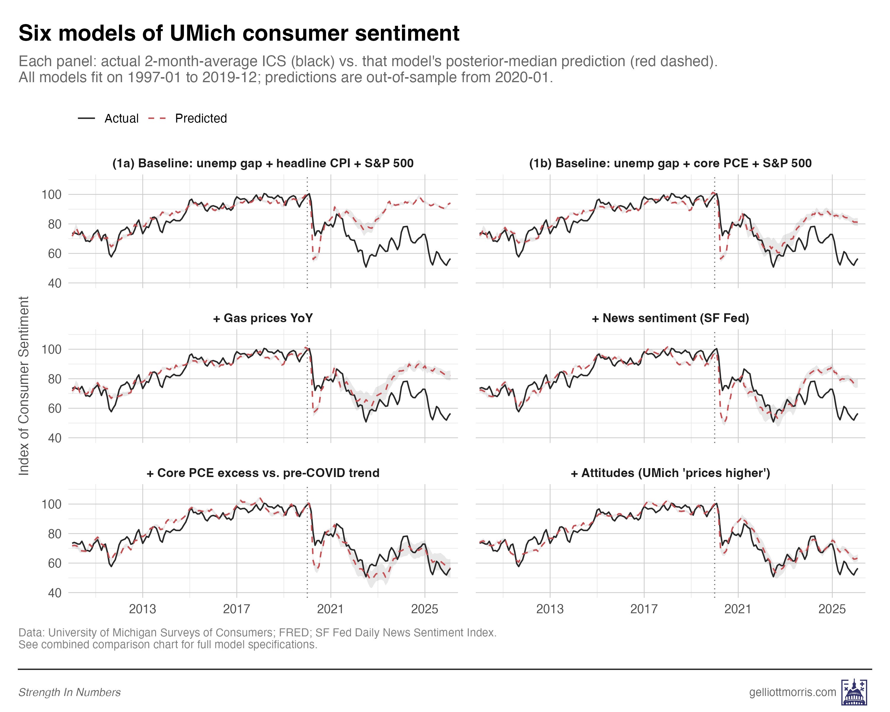
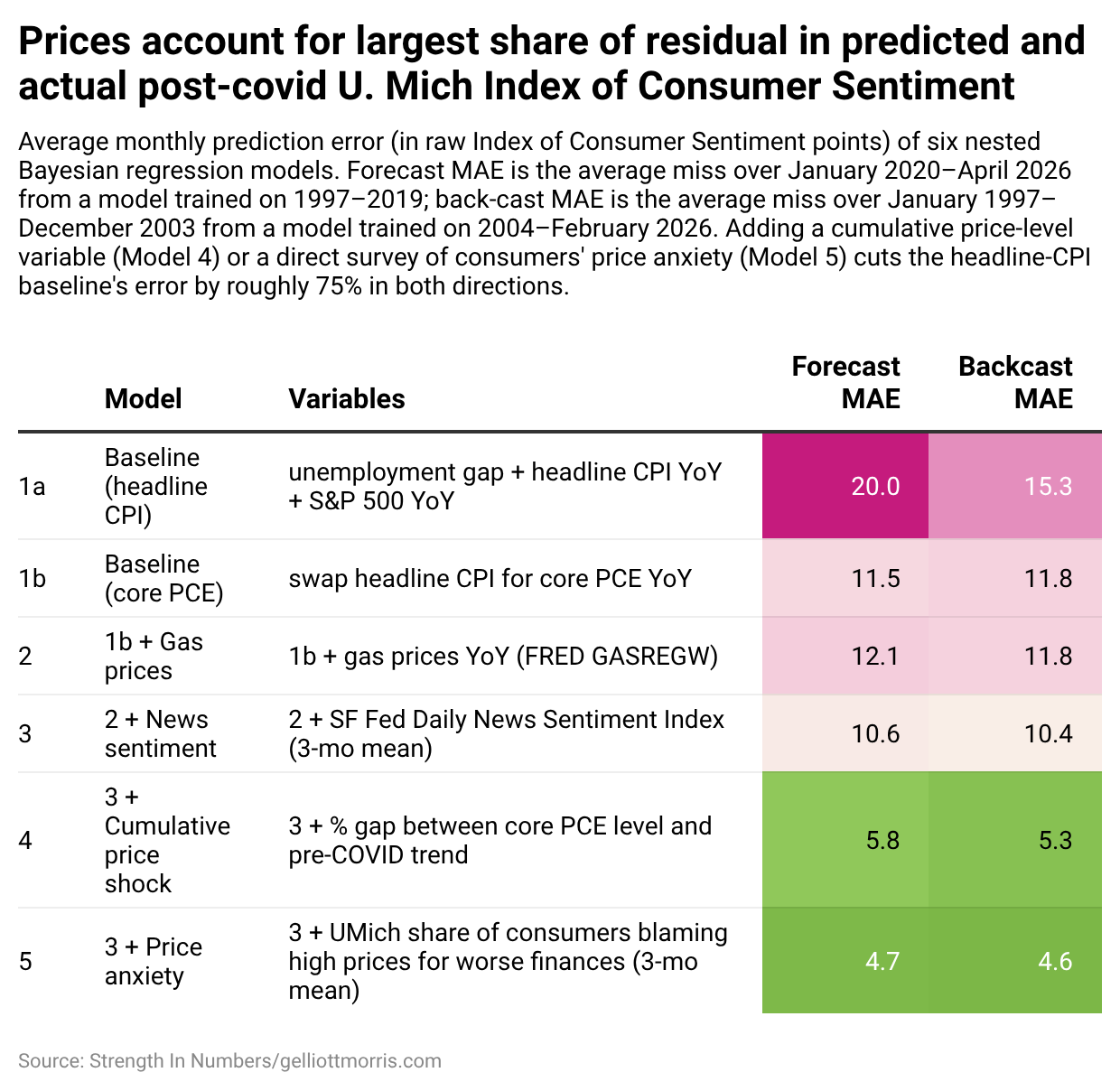
The headline result is that the models using felt prices and cumulative prices both close almost all of the post-2020 sentiment gap — while the standard macro models miss by a mile.
The baseline model using headline CPI misses the post-2020 monthly ICS readings by an average of 20 index points. Switching from headline CPI to core PCE cuts that gap roughly in half, while adding gas prices barely helps.
The first big result of this inquiry is that adding news sentiment decreases error, but the model still under-predicts sentiment’s collapse. If all of the “vibecession” was due to news media coverage, this error would be zero. But note that in 2025 and 2026, there is still a huge gap between press coverage and how people feel the economy is working for them.
It’s only when we add a measure of price levels — either the structural Bernstein-style cumulative price shock or the direct survey of how consumers feel about prices — that the models catch up to reality. Predictions from those models are shown as the red and teal lines of the main plot:

These are very good predictions! Mean absolute error post-COVID with these souped-up models is just 5.8 index points using Bernstein’s excess PCE metric, and 4.7 points using my direct measure of price anxiety. And these are twice as good as the third model, which takes the baseline predictions and adds the news sentiment readings on top.
The single best predictor of consumer sentiment in any model I ran is the share of Americans who tell the University of Michigan that higher prices are making their household finances worse. A one-standard-deviation move in that variable is associated with a 5.4-point drop in the sentiment index, on average, holding everything else constant. That’s larger in magnitude than unemployment, inflation, the stock market, news sentiment, and even Bernstein’s structural data on price shocks.
The thing that best predicts how Americans feel about the economy is how Americans feel about prices. (And if you don’t have that survey data, then the best predictor is the hard data on prices.)
There’s one more subtle piece of evidence worth pointing out here, because it bears directly on the “it’s all news coverage” theory. When I add the felt-prices variable to the model, the coefficient on news sentiment shrinks by about a third — from +4.80 per standard deviation in the news-sentiment-only spec, down to +3.17 per standard deviation once felt prices are in the model alongside it. News sentiment still has its own independent signal even after that shrinkage. But the shrinkage itself is telling: a meaningful chunk of what “news sentiment” was picking up in the simpler model was actually price anxiety bleeding through into the tone of coverage.
This is self-explanatory because most of the time, when reporters are writing economic stories, they are writing about prices. A story about how Americans are stretched thin at the grocery store is a story about prices. When cable news runs a segment on gas hitting $4 a gallon, they are writing about prices. Some of the “media narrative” channel that analysts want to blame for the sentiment gap is really just the same price story, dressed up in a different variable.
That doesn’t mean news coverage has no effect of its own — it clearly does, and the +3.17 coefficient that survives is real. But it does mean the gap between “the economy is fine and the vibes are bad” and “the economy is not fine because prices are high” is smaller than it looks. A lot of the “vibes” are prices.
3. Stress-testing the model
Because models can be overfit to the era they’re trained on — picking up relationships that happen to hold in one window but fall apart in another — a good out-of-sample forecast in one direction isn’t, by itself, proof that you’ve found a real structural relationship. Maybe the felt-prices variable just happens to line up with sentiment in the post-2020 window because both series cratered at the same time for unrelated reasons. Maybe any two series that both fell off a cliff in 2022 would look like they explain each other. The only way to rule that out is to ask whether the same coefficients that work in one regime also work in a very different one.
If our models generalize well, they should work in both directions: at the beginning and end of our time series. If I train models on the recent era (2004-2026) and use them to predict the late 1990s — a totally different macro regime, with a dot-com boom and unusually high sentiment — predictions should still be in the right ballpark.
Here is how the six models do on that back-cast:
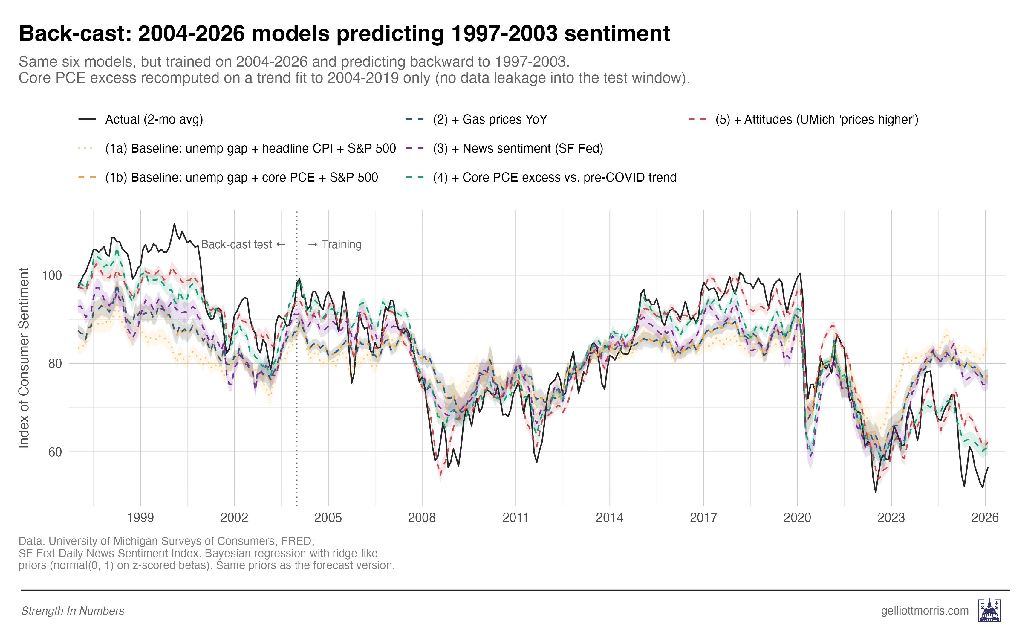
We see the same story. The three baseline models (headline CPI, core PCE, gas prices) all under-predict late-1990s sentiment by 11 to 15 points. Adding news sentiment barely helps. But adding either the Bernstein cumulative price shock or the Michigan attitudes variable closes most of the gap. This is reassuring: The models that work post-2020 are the same models that work in 1997.
4. It’s the prices, stupid
So what does all this mean?
First, if you are trying to model consumer sentiment — or presidential approval, or the generic ballot, or anything else that depends on how Americans feel about the economy — and you are using headline CPI as your inflation variable, consider using Core PCE instead. Even better, calculate a cumulative-price-shock variable.
Second, the debate about whether the post-2020 sentiment gap is “real” or vibes- and media-driven is mostly a false choice. The vibes are real, and they are tracking something real: prices that are still roughly 10% above where the pre-COVID trend said they should be, and that have barely budged in three years. News coverage matters at the margin. The labor market matters at the margin. But the thing doing most of the work is the price level — and the lived experience of the price level.
Finally, the big takeaway from this is that sentiment metrics aren’t made up/manufactured/useless just because aggregate statistics on economic growth are “disconnected” from perceptions. This investigation suggests that people who believe this are simply looking in the wrong place, consulting data that don’t tap into the price anxiety of the average American.
This is a little like the old joke about the drunk searching for his car keys under the streetlight — not because that’s where he dropped them, but because that’s where the light is.
Just because unemployment is low doesn’t mean Americans shouldn’t be bothered by the fact that a gallon of milk, a tank of gas, and a month’s rent all cost meaningfully more in absolute dollars than they did five years ago. Yes, unemployment and CPI inflation are poor predictors of consumer sentiment in 2026 — but that’s because they tell us nothing about how everyday Americans feel about price levels.
Poor economic sentiment isn’t about the news media and politics, or social feeds and people driving Lambos on Instagram. Or at least, it’s not mainly about those things. When it comes to how Americans feel about the economy today, whether you are measuring using objective structural price data or the polls, it’s the prices, stupid.
If you’re a frequent reader of Strength In Numbers, I’m confident you will get a lot of value out of a paid subscription. Paid subscribers get access to Deep Dives like this one, plus the full archive of everything else I publish.


THANK YOU! All during the 2024 presidential campaign, when the Democrats kept crowing about our great economy, I was screaming at the screen, "People can't afford to live! It doesn't matter what your indicators say!" It was hugely frustrating, and I believe this inability to understand/acknowledge/address the real and punishing economic situation faced by many USians is in great part why people are alienated from the Democratic party.
It's the prices, stupid! Yes, yes it is. It really is the prices.
I have explained to so many people that the RATE of inflation coming down (back when inflation was actually coming down) doesn't mean PRICES are coming down. It just means prices aren't going up as quickly. People don't understand the distinction, and honestly it doesn't matter much to them if prices are staying high.
When politicians laud improvements in the inflation rate and DON'T RELATE IT TO PRICES, they sound elitist and out of touch. It's very simple, yet they don't seem to get it. It's the PRICES. Groceries, rent, gas, electricity, cat food, college, major appliances, you name it. Services too, from car repair to lawn mowing to vet bills.
Anecdotally, it's the prices. I've stopped buying Costco cakes because v they are $4 more than they were a couple of years ago..They are luxury items which I could still afford, but I can't justify that expense, and I am very privileged in my income and quality of life. When I go to the grocery store, I am shocked. I remember what prices were and compare. Macro indicators have nothing to do with my choices. It's the costs that I see and remember that shape both my attitude and my choices. Higher prices are perceptively real in ways that macro trends are not