


This article is cross-posted from the Data Lab, a new section of Strength In Numbers for extra charts, general polling wonkery, and methods work that doesn’t fit neatly into the normal editorial vertical. If you’re the type of person who wants to know how our polling is done or reads election forecasting methodologies, the Data Lab is for you.
Emails for posts on the Data Lab vertical are off by default, but you can easily toggle them on here. If you have a post to contribute to the Data Lab, email me.
Most Data Lab posts are free, but the occasional deeper ones are for paying subscribers, whose support makes all of this possible.
It seems like the polls are always wrong these days.
Last night, U.S. House Representative Chris Pappas won the Democratic primary for New Hampshire’s seat in the U.S. Senate by 32 percentage points. But one poll, from the University of New Hampshire, had him winning by just 13 points — a 19-point miss — and another from Democratic polling firm GQR had him up 56 — a 24-point error. While the polls were good on average, that average hides a lot of variance in performance at the level of the individual poll.
And who can forget polls of the Wisconsin primary last month? The final polling average at FiftyPlusOne had Francesca Hong up 20 points, but she ended up losing by about 1. The same night, the final KSTP/SurveyUSA poll of Minnesota’s DFL Senate primary had Democratic House Rep. Angie Craig up 2 over MN Lieutenant Governor Peggy Flanagan, who then won by 19.6. That’s a 22-point miss (and in the opposite ideological direction of the Wisconsin error — a fact that went almost entirely unremarked upon).
In response to these misses, people are again freaking out about the polls. The New York Times called Hong’s loss “stunning.” Tom Nichols of The Atlantic floated the possibility that polls now carry a systematic pro-progressive tilt (based, as far as I can tell, on a sample size of two elections).
Yet there is no real evidence that polls are any worse now than they have ever been. Primary polling has always been particularly fraught; the average Senate or governor primary poll from 2014 to 2024 has missed the final margin between the top two candidates by 13 points.
Instead, what’s happening is that journalists are paying intense attention to primary polls and expecting a level of precision they simply cannot provide. As I argue in my book on polling and democracy, the right response to misses like this isn’t to cast all polls aside, but to lower your expectations for precision.
But don’t mistake this for a claim that the polls are All Right. One thing that has certainly changed in polling recently is that how pollsters process their data matters more than ever. And the recent misfires show how. When I reanalyzed one pollster’s individual-level data from Wisconsin, what I found was not that the polls had too many progressives in them, but that the published toplines were generated using a suboptimal adjustment procedure.
When I re-weighted the same interviews to a voter-file picture of who actually turns out for an August primary, the error on the margin fell from about 24 points in the raw files to about 10 points — a reasonable “error” in a race that saw multiple candidates enter and exit in the final week, and when there was a lot of consolidation against the left-wing candidate in the final days. Most of the pollster’s twenty-plus-point polling error was not in which voters they talked to, but how they counted them.
And that’s not just a primary-polling story. That’s a story about how the entire polling industry has changed over the last decade. The old model of polling — where you randomly dial 1,000 people and make small adjustments to your sample — is dead. Instead, all polls are models now.
This is a post I’ve been working on for a while. I’m sending it out now, as a mid-holiday-week Deep Dive, and preparing some thoughts for tomorrow on the Republican Party’s midterm convention (which they’re calling “Trumpapalooza”) happening September 9–10 in Dallas.
The following premium post is ungated for the public by paying subscribers to Strength In Numbers. Premium members get access to exclusive analysis and a private community for readers on Discord where we discuss election returns, political news, and general politics wonkery through the lens of data.
Polling has changed from a design-first to a modeling-first problem
You can think of every poll as sitting somewhere on a one-dimensional spectrum. At the far left end of this spectrum, polls are purely “design-based” instruments — where a pollster spends the most time thinking about how they gather a representative sample of the population, rather than how they can adjust their sample to make it representative after gathering the data. In the design-based world, everyone in the population has some non-zero likelihood of answering your survey, which you can equalize with smart design techniques (such as stratification by party registration or geography, etc).
In the pure design world, no adjustment to the sample is needed because the sample is the population in miniature. This model of polling — where people are assumed to be marbles in a bag that you can randomly sample — has been dead for decades. Emil Hurja developed rudimentary adjustment procedures for polls in the 1920s and early 1930s!
At the other end of the spectrum is pure modeling, where a pollster’s raw sample looks nothing like the population and they have to deploy a variety of statistical techniques to force it to make sense. A firm might use some combination of weighting — where individuals who are unrepresented in the sample, based on comparisons to population benchmarks, get more weight in a weighted average of responses, and overrepresented groups get less — and formal modeling (like MRP) to adjust its sample to be “representative.”
At the most extreme point of the model-based world, a pollster collects a convenience sample (maybe through some sort of opt-in survey marketplace, or at their local grocery store) and runs the data through a mess of models and raking algorithms to come up with something that, in backtesting, roughly matches the population on several benchmarks. If you use MRP, you can process unrepresentative survey data using official Census benchmarks for demographics, and rely on other pseudo-official benchmarks for things like past vote and party ID to align the sample politically.
Most polls today exist somewhere along this spectrum from design to modeling. YouGov, for example, pioneered a non-probability sampling technique called “matched sampling“ to conduct its surveys, and uses a very detailed weighting system for calibrating responses to population benchmarks. The Pew Research Center weights its online probability panel by a dozen variables — a heavy, if increasingly typical, lean on modeling — despite also investing hundreds of thousands (millions?) of dollars of R&D on making sure the people invited to the panel are representative of the population at recruitment.
And the New York Times/Siena poll, which had previously heavily invested mostly in the design of its surveys (for example, by sampling respondents based on their predicted party affiliation or registration), recently adopted a state-of-the-art and firmly “model-heavy” weighting procedure called “energy balancing.”
The thing that has happened in polling over the last 20 years is that collapsing response rates have pushed nearly every pollster hard toward the modeling end. But the rise of internet- and text-based survey providers has also helped along the transition. Pew’s telephone response rates fell from 36% in 1997 to 6% by 2018. Peter Enns and Joey Marshall of Verasight put the response rate for even the most rigorous probability surveys at 1.6% to 3.4% today.
When only 1 out of every 100 people are answering your poll, design-based inference can only go so far.
As a result, we are living in a world where all polls are models now. Not 100% modeling, certainly, but at least 50% or 60%. (Those numbers are just guesses; one way to get a real number would be to calculate the error of the NYT/Siena microdata before and after weighting, and then calculate the reduction of error due to “modeling.”)
This shift from design-first to model-first polling is important because it changes how you, the reader, should evaluate pollsters. Because the quality of raw data has decreased so much, when you see a new number fly across your social media feed, it is ever more important to ensure that the person generating that number is an expert adjuster of polling data. You don’t want to end up in a situation where you are trusting data from someone who is literally making up responses for voters based on vibes.
“Probability” vs “non-probability” doesn’t matter as much when all polls are models
A related transition in the polling industry has been the shift from “probability” methods to “non-probability” ones. This distinction was useful when “probability” was synonymous with “representativeness” — especially compared to “non-probability” polls — but that is no longer true.
For the uninitiated, “probability-based” surveys are those where everyone in the population has some non-zero chance of being interviewed for your poll — e.g., random-digit dialing, or its modern cousin, mailing postcards to people with a survey URL. “Non-probability” surveys are those where some people can never be selected, like an online panel that only includes people who signed up at some website.
In this report for Verasight, Enns and Marshall argue that this distinction can no longer serve as the heuristic for whether a survey is any good. They write that the whole case for probability sampling rests on one assumption: that the people who don’t answer are basically like the people who do. Enns and Marshall’s argument is that this has stopped being true (it basically never was, hence why weighting exists) and that once this assumption is broken, the math that made probability sampling special stops working. (Full disclosure: Verasight conducts the polling for Strength In Numbers.)
Enns and Marshall also make the point that weighting probability samples doesn’t rescue the probability-ness of it all, and it can actually make estimates worse. Their example is to assume less-educated people are underrepresented in your sample, and also assume the ones who did answer are more politically interested than the ones who didn’t. Weighting that group up doesn’t make the missing people magically appear in the sample — it just hands more influence to the unrepresentative respondents who showed up in the sample.
So Enns and Marshall want readers asking two different questions instead: first, what is this firm doing to keep non-response from being systematic — how it reaches people, how many times it tries, how the invitation is worded, what it pays? And second: how have its past surveys held up against known benchmarks, elections being the most visible one of all.
The Verasight crew points to a 2025 analysis by Enns, Amelia Goranson, Jake Rothschild, and Gretchen Streett which found that high-quality non-probability firms actually did better than probability firms in the 2024 presidential election. If you grouped all probability and non-probability separately, probability samples missed the Trump-Harris margin by 3.3 points on average while non-probability samples missed by 4.1.
But if you split those non-probability polls by whether the pollster belongs to AAPOR’s Transparency Initiative or files its data with the Roper Center, the error for transparent pollsters drops to 2.3 points — making them the most accurate group in the entire study, probability pollsters included.
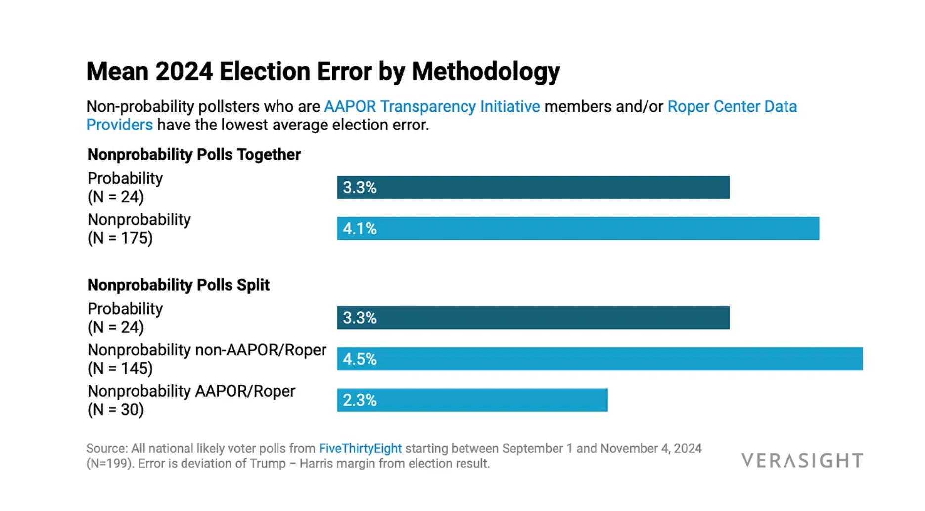
The upshot here is that how a pollster gathered their sample did not separate the good polls from the bad in 2024. Instead, what mattered is the whole of the data-generating process for a survey: how people were recruited, how questions were worded, and how their responses were aggregated to a single statistic.
And the lesson was much the same in 2020, when non-probability pollsters also beat the probability crowd.
In 2018, Pew found that picking the right weighting variables matters far more than picking the right statistical method for coming up with accurate estimates.
But it’s not a model-only world; even the best-performing adjustment procedure, according to Pew, removed only about 30% of the original bias in the sample. The honest read on polling today is that both how you gather and how you process data matters. There’s no longer a “gold-standard” method.
And, frankly, you don’t have to look far to see how obsessing over whether a survey was probability-based can lead you astray. The American National Election Study is a probability poll, run by academics, with a 2020 response rate of 36.7% (media pollsters HATE HIM!). The ANES’s weighted 2020 pre-election estimate still put Joe Biden ahead by 11.2 points (he won by 4.5). That 6.7-point error was the worst in the study’s modern history. When the ANES team went back to find out why, they found “non-ignorable unit non-response” — that Trump supporters were less likely to answer, and less likely to finish the interview if they did, adjusting for all other demographic and geographic factors.
There are other examples. Ann Selzer’s final 2024 Iowa poll had Kamala Harris up 3 in a state Donald Trump carried by 13. The Washington Post‘s 2020 Wisconsin poll had Biden up 17 in a state he won by six-tenths of a point. And somewhere I previously worked, we vetted one probability-based online panel for state-level election polling, and its estimates were routinely too high for us to have any confidence in its ability to forecast future opinion.
How you weight your data can really impact results
To make this all a little more concrete, here is an example of how much uncertainty in polling is caused by genuine uncertainty about the political or demographic characteristics of the population being sampled.
Our Strength In Numbers/Verasight surveys are weighted to Census demographics and to a three-year running average of party identification from Pew’s NPORS reference survey. Last month I reverse-engineered those weights and re-ran our May through July 2026 waves under different benchmarks for party composition — varying both what year NPORS surveys a pollster used, and how it calculated the Democratic/Republican shares of the electorate.
These decisions moved the Democratic generic ballot average by up to two percentage points. Our published generic ballot across those waves was D+7.1. Updating the party target to the 2026 NPORS vintage moved it to D+7.9. Pushing independent “leaners” into their parties moved it to D+8.7. Pinning the full five-way party breakdown moved it to D+9.2.
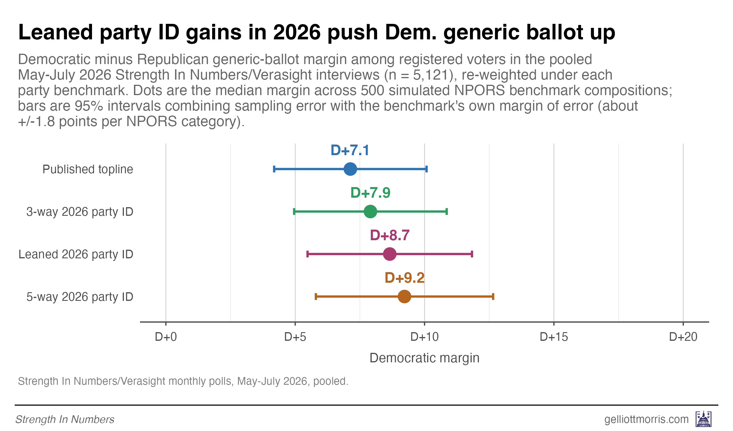
That’s two points of margin that are entirely up to our discretion as researchers. Weighting by party ID using any of these methods is a defensible choice. There’s no single “right” way to referee these choices.
How should pollsters deal with this added uncertainty?
If the results of the polls now hinge so much on how people are counted, then pollsters should update the way they communicate their estimates to the public. They should show not just the topline population percentage for each response, but also the range of potential percentages that could be “right” under different, completely valid weighting procedures. Studies of polls in 2020 and 2024 show that transparency is correlated with accuracy.
Here are a few things I’m trying in my own polling in 2026 and on:
Publish more than one number. If a different but equally defensible set of assumptions moves your topline, show that too. Our generic ballot is D+7 one way and D+9 another, and readers deserve to know about this level of uncertainty. I know why pollsters normally don’t do this: It’s a lot of extra work! But you don’t know what the precise point estimate should be, and readers deserve to know that.
Sensitivity testing: Check the variables you can’t weight on. Nobody publishes an official count of how many liberals live in America, so pollsters can’t weight by ideology — but you don’t need a target to find out whether your topline is fragile. Just add different variables to your weighting scheme and watch what happens to the results. In Wisconsin, we found that weighting the ideological makeup of respondents to past exit polls moved the August margin of victory for Francesca Hong by about 11 points after demographics and party were already locked down. If somebody had done that analysis ahead of time, they could have communicated about how we didn’t know the ideological makeup of the primary electorate, but that it mattered a lot for accuracy.
Simulate non-response. Rebecca Andridge, Brady West and coauthors proposed a procedure for this in 2019: the “measure of unadjusted bias for proportions” (MUBP), which simulates what the “true” population proportion for a survey variable might be depending on the correlation between non-response and certain attitudes. West and Andridge have since shown it works on real elections, testing it against 18 actual pre-election polls. More on applying this to real data in my write-up of the Wisconsin poll miss.
None of this makes polling more accurate, but it does make pollsters more honest about their potential (in)accuracy.
Getting this wrong has real costs for democracy.
It would be easy to read all of this as an argument that polls are broken and you should ignore them. But that’s actually the opposite of what I’m arguing.
A well-conducted public opinion poll is the only instrument we have that reports what Americans actually want from their government — as opposed to what people on social media are saying, what the loudest faction of a primary electorate wants, etc. The case I made in my book is that polls can represent the public when politicians can’t or won’t.
But that only works if we’re honest about what a poll is — and what a poll is has changed significantly over the last few decades. The old heuristics for quality — design-driven, probability-based — are dead. There is no gold standard anymore.
In this new wild west of survey research, pollsters should use every tool in their toolbox to explain potential error in pre-election estimates, so that the public can “unlock” the use of surveys for other democratic purposes.
Think about what the last year of Donald Trump’s presidency would have been like without the knowledge that nobody likes him and few Americans support his agenda. Polls have been a key part of the fight against the excesses of Trump’s second term as president.
The point, then, about these recent misfires, isn’t that polls are always wrong. It’s that a poll’s topline is the end product of a long chain of decisions — about whom to contact, who answers, whom to count, and how to weight them — that all impact results. As response rates have fallen and sampling has moved online, these “researcher degrees of freedom” have become impossible to ignore.
The polling community has a lot of work to do to explain to the public why it has erred recently, and why those errors do not define the utility of the whole industry. It can start by admitting to itself that the old world of polling is dead; All polls are models now.


If there were a pro-progressive bias in polling, it should probably show up in polling within primaries more often, but that's not what happened in several races this summer - hell, DSA was freaking out that Claire Valdez was going to lose a week out, and she won by almost 20 points.
"There’s no longer a “gold-standard” method."
Thank you 🙌